ContrastのTwitterイラスト検索結果。 10,510 件中 139ページ目


@iannocent 's Artwork "Ancient Angel" is masterful in the use of its strongly contrasting color palletes; especially with how ancient and formidable the Painter of Realities feels compared to the bright, light and pure @angelsofaether Sapientia.
https://t.co/Ava0WkyQX2 https://t.co/AEkIcpnxc6


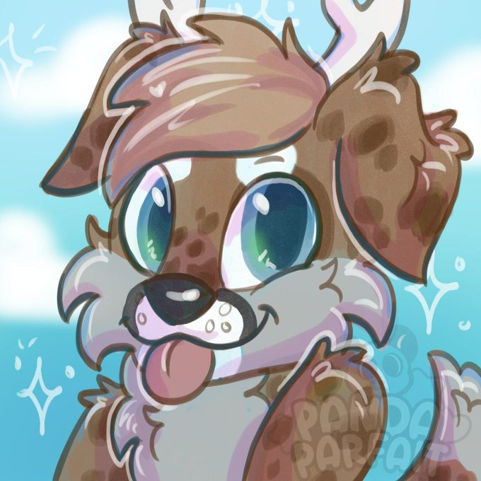
Two more cuties finished today! Love the contrast in these 2 💙☁️


He's just a fun character. I dunno? He's got a weird power set that does a lot to contrast him with Superman while still being tied to him. https://t.co/GVemHzU3hI


@Toastie_TV "Great contrast of how America and Japan approach character design."
(Look at me, I can cherry-pick info too! Maybe don't treat entire cultures as a monolith?)


The second time I have had the chance to bring to life this awesome character design !! so happy with how it turned out and how it contrasts with the other piece I did of her a Lil ago,
Power Vs Balance Vibes!! ⚔️✨😤#ArtistOnTwitter #DnD #pathfinder2e #armor #TTRPG #TTRPG


@YGuncannon To contrast with the comparatively skinny suits of the stories' heroes


I love the light work on the piece, the contrast, the textures and the amazing choice of colors! Like the striking red background which really makes it pop! The title of the piece makes me instantly think about a lore story within the AoA world, a story about the ancient past! 🤍 https://t.co/0BdI0IoC1a


Alice is a nod to #Seattle as a port city where @Starbucks was born, an icon of pop culture and urban lifestyle whose logo is a #mermaid.
The cup contrasts with the fantasy of this mythological creature while referring to it.
1/2


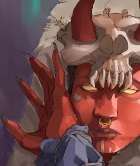
One, I absolute adore my oc Scorn. Two, I'm incredibly proud of the shading and contrast I've done so far.


the contrast between variants from the big two is so funny to me because marvel is like “we shall have a gay on a pink background and repeat that for all of them like we did last year” and then dc is just like “FUCK YOU WERE PUTTING THE QUEER ON A PRIDE FLAG, LETS GO,”


Back in high school, while my drawing friends were mostly practicing the art of Clamp, I went the other way and learned the style of Love Hina and Negima. There's a huge contrast to how it is in UQ Holder now, I want to learn a new style and break away from my old habits 🗿🗿


@sogolzmr Hi Sogol, thanks for the tag!
Here r my latest artworks~ I've been trying to improve my rendering and pushing the contrast more! Next month will be something new 👀✨️


Morroyo is in his early 20's when he arrives in Limsa from the Sagoli. He had an argument with his shaman father (and Nunh) of his clan and left. Morroyo was pretty hotheaded and headstrong in his youth, a contrast to the calm and wise Healer he'd grow up to be. #FFXIV https://t.co/10lvhZWQdx

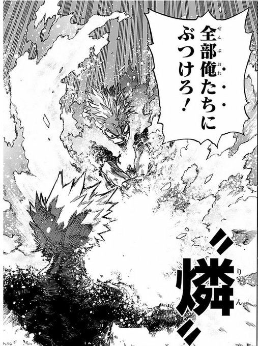
Last chapter made me realize that all of Shoto's techniques are named in Japanese, in contrast to Endeavor's (and Dabi's by extension) that are all in English. That's a neat character trait, probably influenced by his mother's family's japanese motif


The "New light" series really started in 1974 & got continued in 2021. The pause came from the difficulty of capturing the contrast via film and hard paper copies. It only came into its own when you have the opportunity for digital finishing. "New light" truly is new light.


One more for the night.. I’ll have to experiment with this more.. going to hop over to the iPad and do some artwork for my super secret dark art account @hellspastels 👀 #digitalart #scribble #contrast #cnft


Sería un personaje memorable precisamente por contrastar con las personalidades más extrañas de L y Mello
¿Qué opinan?


@redwingseries Colors! How will your colors effect your environment? My series is very space themed, and so the MC has a contrasting pale silver hue which helps him stand out against the purples, pinks and blacks