jarringのTwitterイラスト検索結果。 595 件中 15ページ目

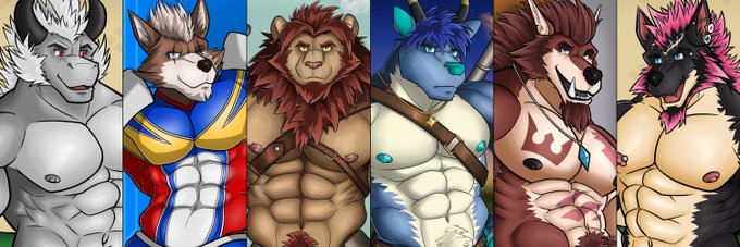
Just a new Twitter header... The difference in quality across these samples is rather jarring (you can easily sort them by date by looking at them) but I will make yet another one once I have enough suitable artworks ;3


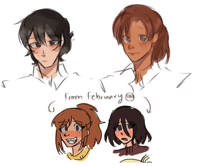
2 from last year and two from this year
Yeah the most jarring thing is going on my DA or my artfight page and seeing the art just casually change somehow every year https://t.co/xI0qx4Rp6K


Its been one full year since I've started Vtubing! 💕🐇 Its really jarring for me to see just how my art style has evolved over that year. From barely understanding how to use digital art, till now.
#ENVtuber


I'd say that CG anime can look jarring when they try to make it fit in a 2D situation, however, if CG is the entire workflow of the animation, it will work significantly better. I think people are concerned about the fact that the new DB movie will look like the bizarre anime CG.


ENNEAD season 2//
Horus' falcon form is so stoic looking but the bird he sent to Seth is so cute, the contrast is so jarring!! (˃ ⌑ ˂ഃ ) I wonder if he knew what the bird was going to look like...did he purposely choose the fluffiest bird to send to protect his uncle? 😭😭


There was this ancient old currently not-canon version of his design before he was turned toxic, and I guess something nicer like this *could* be found in Amaranth, but it still feels jarring


Ah yes, a grand specimen of my character. A.N.N.E isnt just a robot. She's an A.I that operates the goings on of the Hades space station. She can remote into multiple of these bodies at a time for social interaction in the event that a large imposing A.I May seem a bit jarring.


Been a while since I doodled up a shonen! This is Kai Danzaki who, despite being undead, continues to have a positive outlook on life. His cheerfulness can be a bit jarring considering the type of content he likes to share and cover (horror stories). Inspired by @taraadevlin!


I'm not worried about character designs because I know they won't change much but I'm really hoping Hazbin's beautiful bg designs stay the same or are at least replicated closely enough by whoever is working on the show as of now. It's gonna be jarring if this all looks different


In relation to my tweet from last night,
here's Thundurus (Incarnate form) 'Strike-ified'!
Hm...I kinda like how it came out!
Still pretty jarring to draw a full detailed humanoid body and then just --cloud--
Tempted to do the other two!


Going from 0 to this, was kinda jarring, to be fair this was a remake of the first game, and there wasn't a lot, but I prefer this over some of others tbh, combat was dumbed down, music was still kinda a bop, but this was kiryus first story, and It wasn't bad! Kinda all over the


Jaw drop i havent drawn mikashashies in so long so seeing the difference is so jarring #mikasasha


FedUp: Radcliffe Has Hammers For Hands Now
I drew this comic to experiment w/ new work flows, so apologies if the differences in each page are jarring.


Humble brag for both Marc and I: we got better over the years, both him and I, because at some point we had more detailed versions...
... and ended up having to simplify them to match the style of the old ones.
It was jarring and we got bad feedbacks in beta tests ahah


Hello #PortfolioDay, I am known as Marc P.I.
Or Marcos.
I like creating focused, visually striking images, though I may at times deliberately make them rather absurd and jarring.
📷 https://t.co/YDAmDRSjnM
🎨 https://t.co/twnZLFLZ0e
🖼️ https://t.co/VMcDRQC3HS


For enemies especially, Boktai doesn't have a lot of official reference material. So I tried to translate some of the details from Ikuya Nakamura's promotional art into the model. This way the 3D won't appear jarring.


QRT with your range
Oof this is jarring to look at https://t.co/sLRsqHLHTJ