visuallyのTwitterイラスト検索結果。 15ページ目


Vampire @Heliyaart a visually striking piece. The dark art symbolism in this piece immediately struck me. I want to delve into the detail and find out more . The expression on the woman's face as she cradles a skeleton as one would cradle a baby brings this work together





The Cookies of Darkness are proof that you CAN make a group of characters predominantly red and put them in mostly red environments and still have them be visually interesting, Hazbin Hotel’s style just sucks


SAKI CARDS GO SO HARD
fav: it was a given ... this one is just so gorgeous. i love the colors and setting and her expression and detail; everything is so good
least fav: i feel like they could have gone harder considering it's a 4* :[ its not very visually striking unfortunately

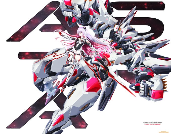
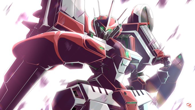
@TheFrenchNugget Didn't make that big a leap this year visually (focused mostly on perspective angles and efficency this time around) but here you go!


MEIKO!!! meiko <3 <3 <3
fav: the colors are SO pretty here!!! i luv the bright blues and I luv when the artists try smth a bit different
least fav: this was hard to decide on bc meiko is so good but. this one's background is so busy but so visually uninteresting im sorry girl


sasaki and miyano is so good
they also visually read as eiji and ash to me! its cool


Man, Kyo-1 is such a weird character in KOF 2002 UM.
Many of his supers and specials have weird different properties based on the button you pressed (like being comboable, or having high or low invulnerability), but nothing tells you that visually, they look the same lol


The year in which I discovered texture brushes… and that you can visually crop the canvas inside procreate instead of punching numbers 😶 https://t.co/vU5MvcwuIK


@EwylanaR Thanks for this!
Hi I’m liz! I’m really proud of how I’ve really refined my art process this year.
Next year I’m hoping to release my webcomic so it’s very different to my big processed style seen here but I’m hoping I can make a beautiful comic visually & story-wise!


👂 👀 What you say is not what people hear or understand so representing it visually will help show people that you understand something. We are visual thinkers by default.
✍🏼 Learn more from my program Sketchnote All the Things https://t.co/V7DRxcYyQR

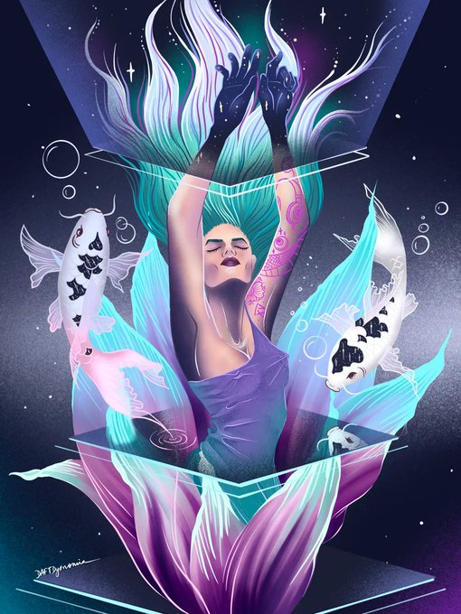


@daftdysnomia creates art that is visually entertaining, fat with story-telling, and pays tribute to age-old & modern societal context. Their subjects are lawless, cosmic, and truly mesmerising.
#SundaySpotlight
https://t.co/IbdtyRDNGx


of what is possible. Your work is not only visually stunning, but it also helps to shape and define the digital world we live in. of what is possible. Your work is not only visually stunning, but it also helps to shape and define the digital world we live in.

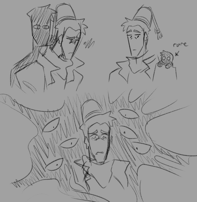

the worse judas feels, the worse his shadow gets visually
to clarify, judas' shadow in my interpretation isn't a real being at all. it's just an artistic representation of a part of judas https://t.co/O35xLWQsKO


@GayAsAPretzel ok um. tsukasa. i love most of his cards (obviously excluding rmd & island panic those are my real least favorites) i actually love both of these cards but the 2nd one just doesn't feel like tsukasa to me?? it's visually beautiful but idk something about it is not tsukasa


Okay, so visually, I still like the second one better. But I really want the text readable in its entirety, which you can't really do on the second. Or maybe you CAN read enough? Uhg. I feel like if Krita's text tool was easier to use, maybe I wouldn't be struggling with this?


I'm often visually exploring this theme of Awareness, Consciousness, and trancendence as in this iPhone digital sketch I call "Enlightenment Aura" #flickr https://t.co/tkTspmita0


Beware of Trains directed by Emma Calder. I really abstract, surreal and experimental piece. The use of mixed media (2d animation, model trains, photos etc) was really visually striking



@miyuru_fnf These are different characters visually but it would be nice if you can draw these two from the Mod, “Contrast Shock”.


God, that new Mr. Video Game Movie trailer was so visually stunning.
----
#MarioMovie #MRVIDEOGAMESWEEP


Trying a new style, what do you guys think? the dot shading always make me giggle because its so much fun and pretty visually :33
#art #digitalart #paintingstyle #polkadot