typographのTwitterイラスト検索結果。 141ページ目


What if the visual identities of the Olympics were all typography and color? Exercise from 1964 to 1997: Set in Arteria Compress Bold, Ardoise Narrow ExtraBold, AW Conqueror Inline (not as good as the original), "60s Sans" Demi.



'Salem's Lot by Stephen King.
Plus original art by Steve Crisp.
This typography really gets my nostalgia neurons firing.
#horror




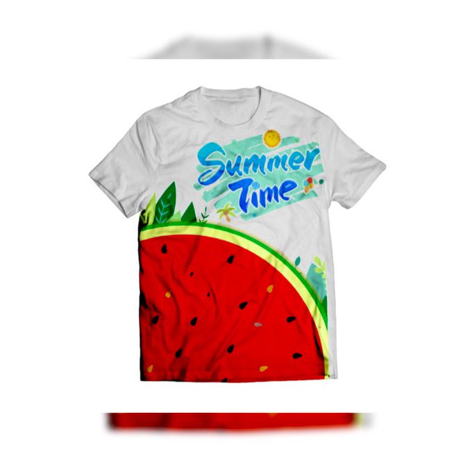
The shape of a watermelon with seeds is clockwise along with trees and watercolor theme with blue gradient color typographic text.
#summer #summerday #summerdays #summerseason #summer2021 #art #artist #artwork #digital #digitalart #digitalartwork #illustration #illustrator


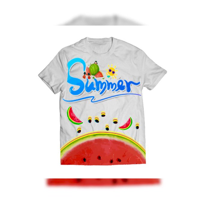
A shape of a watermelon along with the seeds is cut in half crosswise and blue typographic text with a curved line.
#summer #summerday #summerdays #summerseason #summer2021 #art #artist #artwork #digital #digitalart #digitalartwork #illustration #illustrator #photoshop #shirts
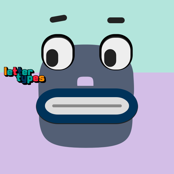

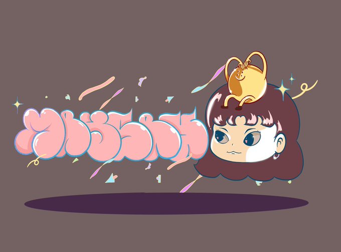


Nametag and ding-dong head design by me for my Artist friends.
#knn5
.
#ArtistOnTwitter #typography #graffitiart #characterdesign #procreate #illustration #FontsOnFriday #graffiti

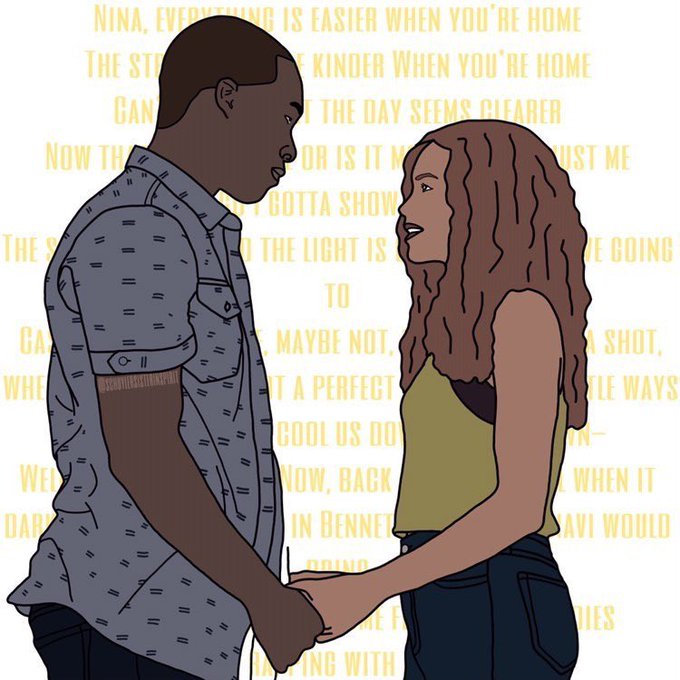

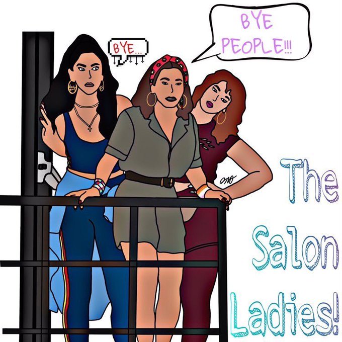

Today we present @daisymegthomo, our featured artist this #FanartFriday!
Integrating typography in her simple, colorful artworks, the results are a beautiful and stylish image that states the essence of each scene.
What do you think of these?


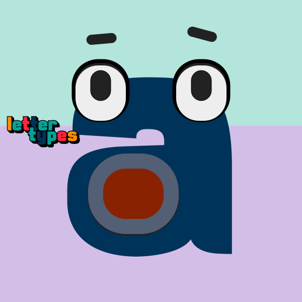
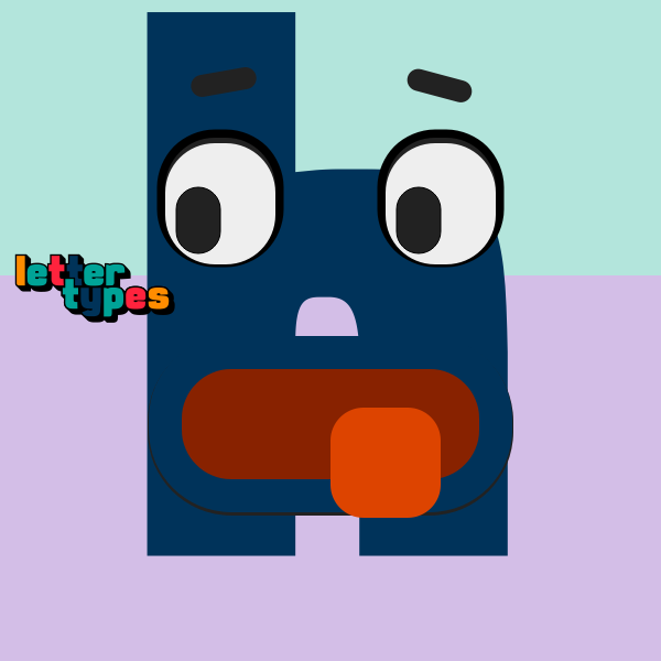


Numbers from my take on the #36DaysOfType was kaafi fun. #mermen #inclusionMatters #BIPOC
#anweshSahoo #theEffemjnare #art #nfts #NFTart #36DayofType2021 #typography


Typography is an art form that I suck at.
Anyways, introducing Sonic the Triplets. Once just a joke, now you should expect me to make artwork of these three regularly.
Meet Sloppy, Blokey and Pokey!
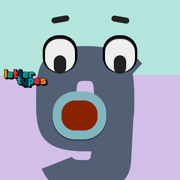

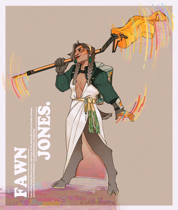
redesigned my oc fawn for a new scifi rp - huge thank you to @smacktalk__ for all the help, especially with the typography 💖



@izzakko My name is Favour, I make paintings, typography and illustrations