CONTRASTのTwitterイラスト検索結果。 143ページ目


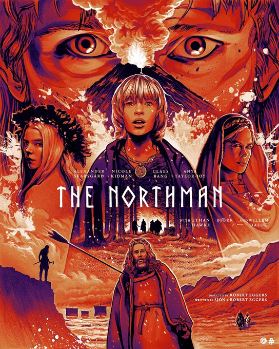

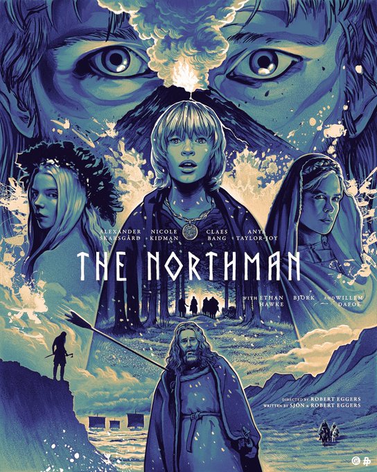
Color variants of #TheNorthman. I often play around with color to see what moods I can elicit using completely different palettes. The blue version with red splatter was my original direction for the final piece but I went with gray with white splatter for better contrast.


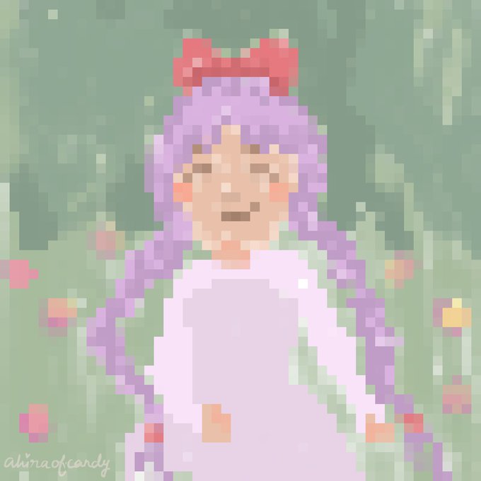
Playing around with the colour blocks. different canvas sizes = how detail a work could be. These are not perfect at all regarding the colour choices/hues/contrast n lots of jaggies.. huhu just an experimenting phase for me n it was lotsa fun ;~;
15x15 / 120x120


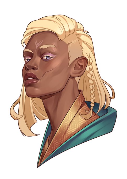
Additional portrait of Mel for @bronsautracks I just loved this contrast ✨ #DragonAge


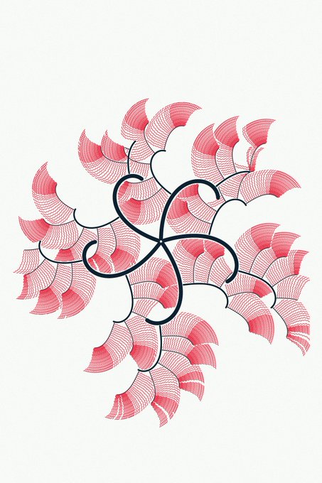
Today work:
- fix a bug on pixels[] (thanks @matt_circles for the help)
- increase ref canvas size
- add random
- check if dimensionless is OK (it is!)
- add rules/starting conditions
Hard to find good balance between clean, dirty, complex, contrast🤔

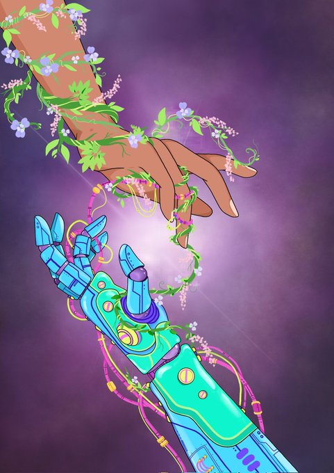
Made it just in time for @PKudiwal 's #ContrastingWorldsContest 😁💙
This piece showcases how technology is co-opting our natural environment.


On different monitors, the same picture has different contrast, it sucks. Here are better colors


The striking contrast between these two images is still so funny #pokemon


@taanntawan (2) I felt attracted to this beautiful piece the first time I saw it. I love the sun as an artwork element bc it gives me a sense of hope and warmth. The purple flowers also provide a beautiful contrast!


Wow, contrast! Amazing what going from grey to white does. Will need to maybe adjust my colors a little more in post with the new context 🤔
Loving how Kalista looks now, at least!


Tagged again, by @PinkeyKim ✨✨QRT one cool and one warm artwork💙❤
Get to show off some more contrast 😌✨✨💖
I tag these amazing people:
@LeaffyBun @NOT_THE_BEEEES https://t.co/RyeJogTi0D


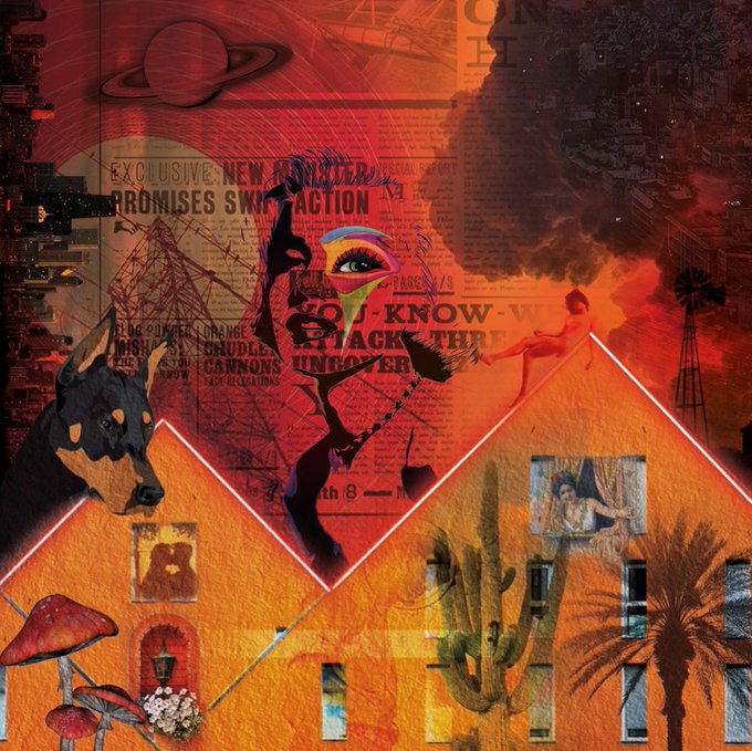
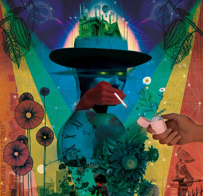
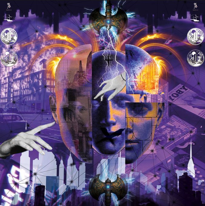
Let's start with some of the works by @Sinemylms_: a mixture of modern and classic iconography, surrounded by some interesting color choices. The selection of contrasts help to balance the backgrounds and reinforce the themes for each piece.
https://t.co/b3EkcmPDdc


🔳 Mochi Abstract Collection 🔳
Contrasting colors and exotic square based shapes. How do you interpret it?
https://t.co/UHSYaS7q5e
https://t.co/sL1qQA12pl
#NFT #nftcolletion #abstractart #abstractnftart #digitalart #NFTs

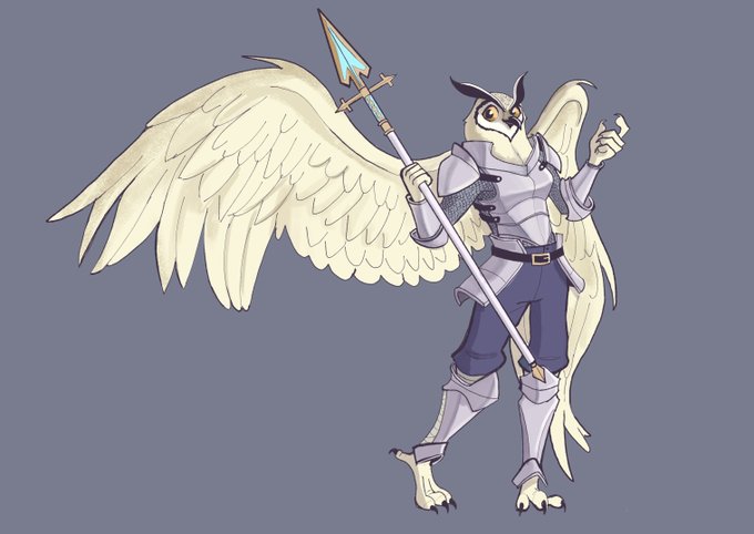


@avekno are tampa based multidisciplinary abstract artist known for their unique approach to texturized and bold contrasting colors in their graphic design work while incorporating strong emotion in each piece.
Welcome to Commun'Art friends!!!🤍


Kill-Vearn sheds a ton more blood in the anime than the manga. It’s a stark contrast to the anime’s early days, when blood seemed a no-no. On the other hand, it’s been established that Kill’s blood is basically magma, so maybe it’s OK to show since it’s not human blood.


[OC - Adopt]
June, one of the adopts I got from @kartased~
Already drew her with her cute side, but not the murderous one so... 👀
(Characters with a drastic contrast between the appearance and the personality are one of my weaknesses 😤)

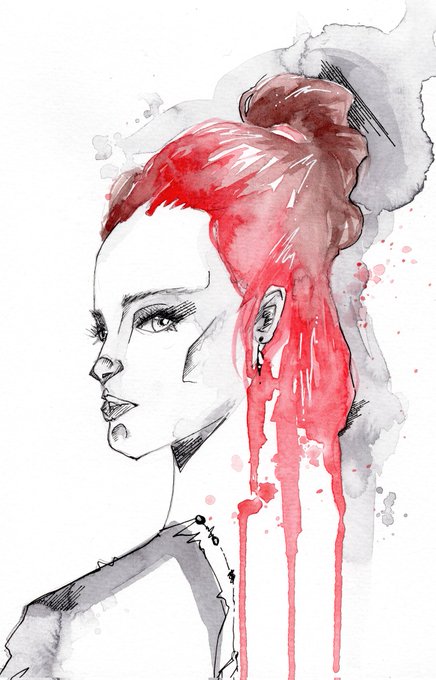
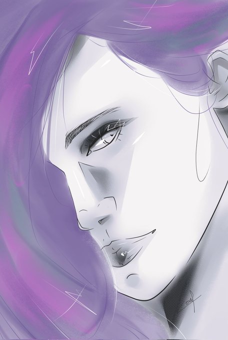


Contrast between 🔥❄️
Doing this trend by @SimpinStolas recommendation too! I have to do more illustrations!! 🔥🔥❤️ tag @alienaliart @pastelprizm @artdoer93