ContrasのTwitterイラスト検索結果。 10,816 件中 150ページ目


Is it me or the colours in my procreate drawings look very muddy? idk why, i keep trying to make them contrast and to use more brilliant tones like the ones I'm used to but the end result is always kinda meh 🥲 maybe it's the brushes idk


I enjoy a warm light/cool shadow contrast too much so for a second I was like, can I even do this???
QRT, one cool, one warm. https://t.co/AXpmSsAlzJ


I think when magneto gets to the MCU . Even though they could have done this at fox. I would love to see the compare and contrast of these two guys . #magneto #doctordoom . I always felt like no one at the avengers /spiderman could add to this duo.


SE VIENE!
El próximo viernes, a las 21:30 tendremos a @PSuzume_ dándolo todo en No Pintamos Nada!
Hablaremos de los pros y contras de los diferentes lugares en los que hemos estudiado arte, dibujaremos, haremos caso a las cartas que nos tiréis... DE TODO!
https://t.co/QUSgc6ZZT3 https://t.co/lkdxTASJSy


[ ocs ] I didn't realize Church had scene kid hair until I tried to translate it to realism and the contrast between that and his outfit is so goofy


@CelestialFang While I adore the dark/horror aesthetic I cant help but think of this??! The composition and way you used contrasting colours is absolutely gorgeous- I could stare at your art all day and not once be tired. (Also, while I love the fanart you make, your og art fills my brain good)


Y'all I think we're getting close to a stable persona design for once.
There's something about the simplicity of this that makes me happy.
Let's see if we can add some yellow hehe contrast


Speaking of aliens.Currently working on the purple one from my spacegirl painting.Dropping the saturation and contrast so that it is pushed back in the painting and doesn't compete with the spacegirl and other foreground elements.


@bavugar I'm Nastya from the best city on earth)) I came to the NFT at the beginning of the year to share my free art, in contrast to the fact that I draw to order. I raise pressing issues and crazy fantasies and embody them in fantasy worlds))

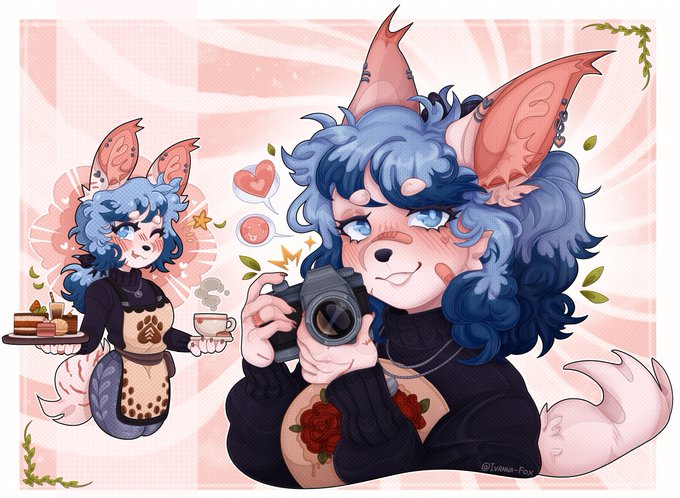
📸🌺Finally, a party just for me!
In contrast with those attending, I'm quite happy 🌺📸


@ShadowMistery3 Y en el anime igual, miren los tonos que usan, los personajes morenos les ponen pelo blanco, marrón o negro ya que da más contraste y se ve más lindo artisticamente, y personajes con pelo rosa tenemos a Sakura y Chica que son caucásica y queda vien el contraste.


"I draw what I like."
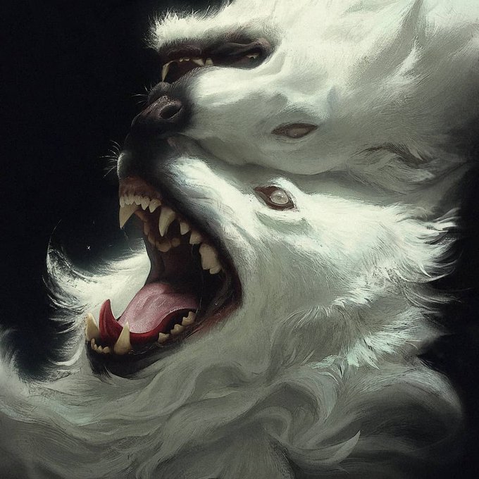
And we like what you draw Nonnydoge! The digital artist catches the viewers' attention with intriguingly composed and expressive animal portraits: Nonnydoge directs our gaze through sharpness, hard & soft edges and contrasts.
#beautifulbizarre


old ocs im redesigning... i cant pick the witch's hair colour! i love the dark red but the blue contrasts w her pink friend ;<


this is the first sketch of a new character! I really wanted a boy who wears makeup very well, but he has absolutely terrible taste in clothes 😤😤😤
it's charming and contrasts with Diego, who dresses stylishly
....and to be honest, his clothes make me want to get rid of it.

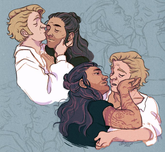
The contrast was off so I'm reposting 'cause I'm that nit-picky 🤡✌️ #ourflagmeansdeath #ourflagmeansdeathfanart