TypefaceのTwitterイラスト検索結果。 602 件中 16ページ目


Can someone identify this typeface? It's in my own file from a couple months ago but I outlined the letters and now I can't remember. Extremely me!!!


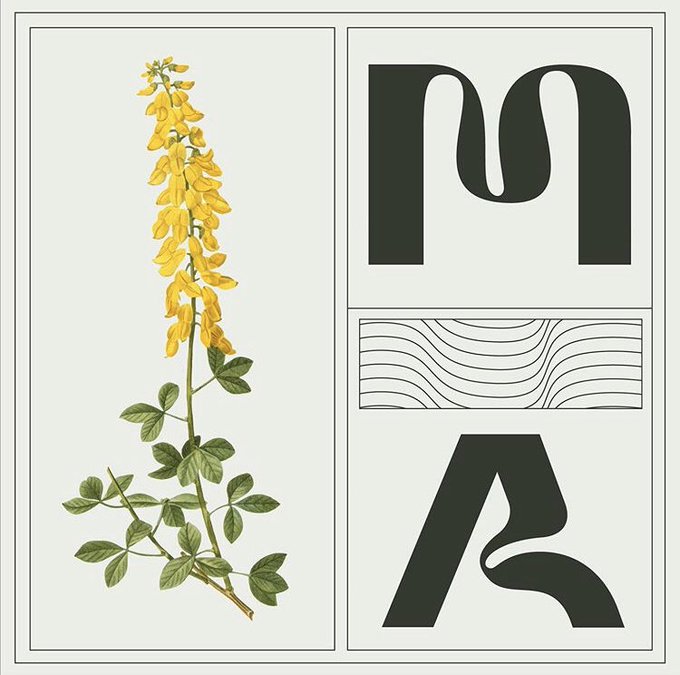
MIDASS © //// Typeface
Feedback, RTs and likes are very appreciated.
https://t.co/bZVCbQ9250
If you are looking for some graphics, contact me in Dm.


BlackJack Typeface by My Name is Wendy Studio
https://t.co/aEam9zBq3Z


https://t.co/ATTZIlbO1n — Andrei Robu @AndreiRobu is the king of patterns. A super start of type illustration. Fantastic and super happy. And typefaces! oh so sweet https://t.co/YfbuNEy9FI


@emfails @WashingtonNFL Congrats on your role! Does content include team logos, typeface, uniforms, etc? Because I hope you get to OFFICIALLY design my Wolves concept (shown on the WSH Journey website) if it is selected as the name and design!


Help me, Helvetica—you’re my only hope! ✨ Learn about design with anthropomorphic Western fonts as your guide in this fun manga for Ages 10+!
Pre-order WHAT THE FONT?! – A MANGA GUIDE TO WESTERN TYPEFACE at the link! #MangaPreorders #7SeasBooks
https://t.co/OvvNx3mXAz


“Grandheron Sans” (https://t.co/fbHi5Zk8Ze) by @andresimardfont is a static grotesque typeface with a DIN-like technical look. Some letters (afklvyAJKMNVXY) sport distinct angular details. 18 fonts, each with 953 glyphs: this legible family is quite well equipped. #366fonts (268)


“Six Minutes” (https://t.co/ZcpgA3e050) by Lola Herst for Rawblind Basetype might not seem like much, but this casual handwriting typeface packs a punch—supporting Greek, Cyrillic, Vietnamese & most other Latin-based languages. 2287 glyphs—3 alternates per letter. #366fonts (267)


No idea what typeface they used on Noli Mi Tangere, so I just traced the letters from a photo I found online & used it as inspiration to create the others. Screened cap @mimiyuuuh #pabebe pose from her #TikTok vid, downloaded a photo of Rizal... hours of sketching... and VOILA!

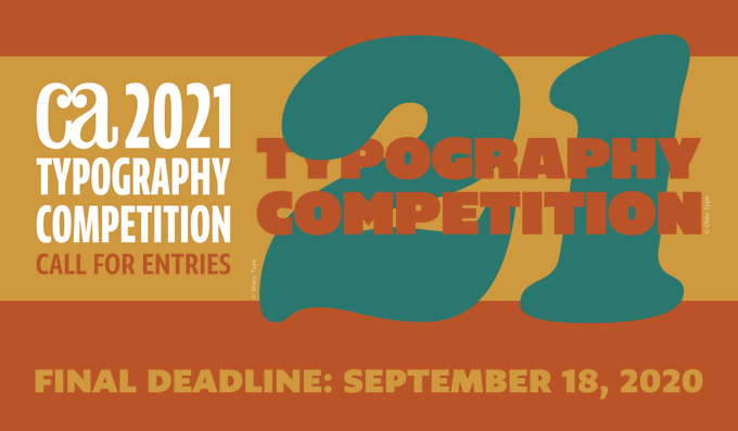
We’re still looking for the best type-centric design and advertising work, typefaces and hand- lettering—to immortalize in our 2021 Typography Annual. Enter by this Friday, September 18th to be considered! https://t.co/jIc6BXV24c


Signifier’s forms are daring, precise and refreshingly radical. Its digital construction is laid bare, a typeface of today, shaped by contemporary technology.
https://t.co/EuVnScfTpr


This week's #TypeTuesday is this colourful, geometric typeface #MadeAtShillington by #ShilloLON graduate Imogen Sheppardson for her 'Mumbai Culture Festival' branding project.


after thinking "hey, i havent drawn joy in vtuber form yet" i started drawing and kinda just kept adding stuff, and then i thought it would look cool over a typeface, and. uh.. i went overboard a lil bit @MarbleCantus this was fun tho

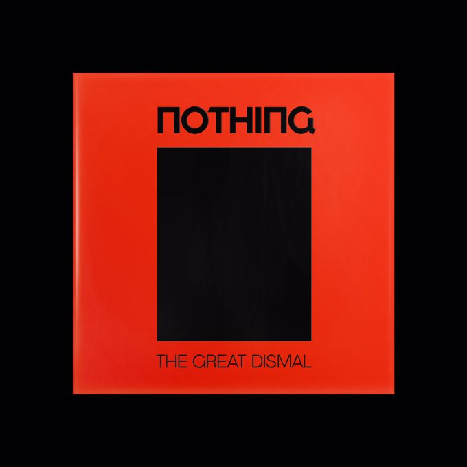


All the type is set in one of 2 typefaces I designed specifically for this release, both heavily influenced by old Soviet lettering


#Grotta is a #font family created by Due Studio 🇮🇹 It is an irreverent, contemporary and neo-Grotesk typeface with strong geometric accents and sharp contrasts in its form. It can now be purchased from @type01_ curated marketplace https://t.co/tIVfeuOnrK #type01 #typedepartment


Hanol Typeface by Bouk RA
https://t.co/MWKvFWDzxm
.
.
.
#grafikmedia #graphicdesign #typography #type #typedesign


Briar Display Typeface Design by Barrett Reid-Maroney
https://t.co/MWKvFWDzxm
.
.
.
#grafik #graphicdesign #typography #typeface #typedesign


Type Design by Designer and Lettering Artist Alec Tear
https://t.co/MWKvFWDzxm
.
.
.
#grafikmedia #graphicdesign #typedesign #typography #typeface