visuallyのTwitterイラスト検索結果。 3,311 件中 16ページ目


@GayAsAPretzel ok um. tsukasa. i love most of his cards (obviously excluding rmd & island panic those are my real least favorites) i actually love both of these cards but the 2nd one just doesn't feel like tsukasa to me?? it's visually beautiful but idk something about it is not tsukasa


Okay, so visually, I still like the second one better. But I really want the text readable in its entirety, which you can't really do on the second. Or maybe you CAN read enough? Uhg. I feel like if Krita's text tool was easier to use, maybe I wouldn't be struggling with this?


I'm often visually exploring this theme of Awareness, Consciousness, and trancendence as in this iPhone digital sketch I call "Enlightenment Aura" #flickr https://t.co/tkTspmita0


Beware of Trains directed by Emma Calder. I really abstract, surreal and experimental piece. The use of mixed media (2d animation, model trains, photos etc) was really visually striking


@miyuru_fnf These are different characters visually but it would be nice if you can draw these two from the Mod, “Contrast Shock”.


God, that new Mr. Video Game Movie trailer was so visually stunning.
----
#MarioMovie #MRVIDEOGAMESWEEP


Trying a new style, what do you guys think? the dot shading always make me giggle because its so much fun and pretty visually :33
#art #digitalart #paintingstyle #polkadot


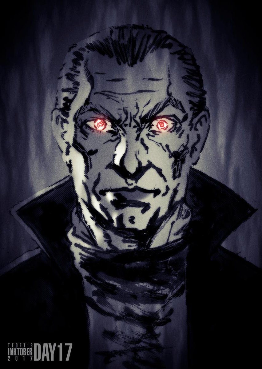
@peikonlainen @EevilStoo Yeah! His portrayal of Dracula is visually so simple yet wonderful.


Disney’s TREASURE PLANET turns 20 today! It opened in theaters on November 27, 2002. Two decades later it remains one of my absolute favorites. A visually stunning and poignant story about fathers and sons, and finding your own path. Of course, the song “I’m Still Here” is a gem.


I did hair as well for fun! I mixed all 3 hair and then I mixed just the first two and it was more visually pleasing for me.


@SinderVTuber My absolute favorite part of my model is the stars inside of the wings and the hair gradient, it turned out so pretty and on the menhera one making the hair more solid coloured to allow the outfit to stand out more visually
Also just the entire menhera outfit qvq


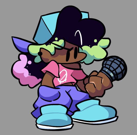
Been a hot minute since ive drawn the best character ever (unbiased)
Im tryna experiment with how i wanna show off asha’s powers visually


The next deity appears... 7th #NFTart Coming soon @KodaDot. #NFT collection, a series of #goddesses visually interpreted in my own way.🧚♀️@bsx_finance $KSM $dot #PolkaDot #NFTartist #NFTCommuntiy #art #DigitalArtist
Collection link: https://t.co/tBYkMHg6YJ


@samk0006 what we're not gonna do is cancel the most visually ambitious of the 4


@WolverSteve @xmentas @toldyall2 @MaraRanger @Geek_Girl_Comic @The1stBAT @JamesGavsie @Xmenfilmlovers @Shadewing @blackbaroness24 @TheUncannyEXP @mrjafri @112Shehulk @powerofxmen @itsthewolverine Grade “W” on the detailing, some of his drawings visually jump out at you
🖌✨
Stay fierce this Turkey Eve, Bub
\\\😏🤜🤛🤠///
#WolverineWednesday


1/ 🏡82House x Owange🍊
First of all, it's nice to introduce Owange, who is so visually cute.
We first got our eyes on the cute art, but the real power of Owange starts now.
Continue in Thread🧵👇