FontのTwitterイラスト検索結果。 155ページ目


#AnalogiasDeArte #TwitterCultural Illustrations du "Chef-d'œuvre inconnu" de Balzac par Picasso (1930) & par Paula Rego (2010) Chez Paula Rego, les peintres sont des femmes qui font leur autoportrait. Elles ne sont plus des muses inspiratrices.


" Jeune fille de la pluie "
Le soleil perce timidement les nuages et la pluie diminue mais aucun des deux ne souhaitent totalement disparaître : Ensemble ils font naître un magnifique arc-en-ciel !
Je me suis surpassé 💪
Beau week-end !
#digitalart #rainbow #landscapepainting


The Bonbon by Prio Nurokhim Aji
https://t.co/uNmp5Ve4cS
#typography #freefont #font #comicfont #digitalart,


@laquetedewilan Je pense que le 3 ressemble un peu trop au logo du danger biologique. En partant sur le principe du 7 mais avec des couleurs c'est ça qui évoquerait le plus un blason, les autres font un peu trop "logo d'entreprise de tech" 😅

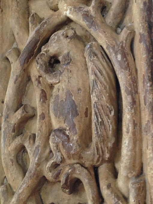
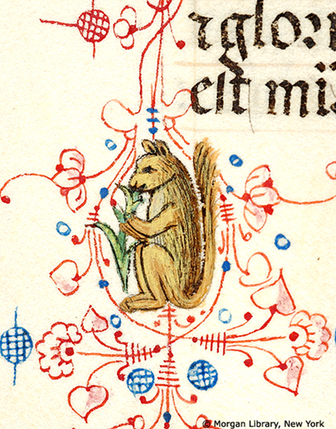
#SquirrelAppreciationDay Trunch, St. Botolph, Norfolk font canopy, interior SW column, c. 1500; MS M.0080, fol. 149v, Milan, 1450-1475, Morgan Library: "Pen flourished initial D with foliate extenders inhabited by squirrel, holding branch to mouth with front paws."

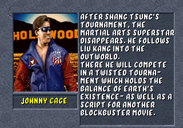

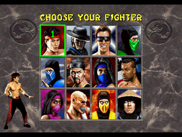
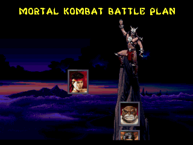
Looking at some of the often overlooked Sega ports of Mortal Kombat II - 32X and Saturn, to be exact - I realized there's a couple of fonts that I haven't ripped yet.
To the untrained eye, they're similar to the original MKII arcade font, but different enough for me to rip em!


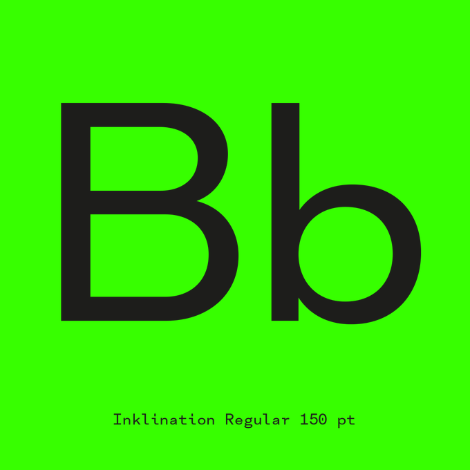
Inklination font family.
https://t.co/xvBOJvA14J
#NewReleases #fonts #newfont


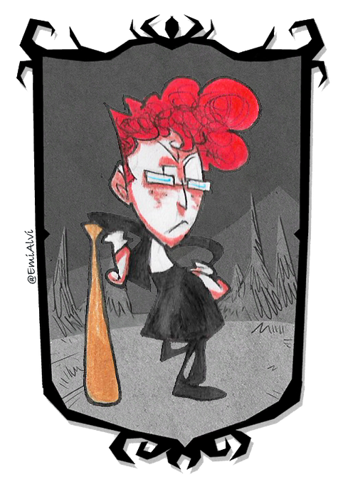
these doodles are actually old and i might change the portrait once i fetch the don't starve font. i think about her a lot tbh (and by the way, this is wednesday the hooligan. you can read her description on tumblr) #DontStarveTogether #myart


@Ruka_Bartender @nintenderu @Shitsuki_Kage @5teel5tyle @ktnaimelesgens @TheKaon @hello_patrickF @Meidelev @AnachanLagamine @JimmyNijs @Kaiju_4u @SamManleyArtist @JamesBearArt @Ori_Hadar @RayRo_Art @deadlockartt @Scherezde3 @MYEYESBLEEED @WrigglingV @VirusOfHope @ZygoteDreams @hegeraw @CaptainElizaye @celinev_art @ZephyPearl @_Perspex @Oddly_Art @ChibiRaiden1 @JesselyArt @SuMachina @Collaptar @LinkieArt @ArcadiaAube @kingwyatts @DatLoon @DianeTruc @gouwyak @akasdraawr @CommuArtFR @La_Tchi @CaillouCreatif @DragiBloups @tomillustrateur @Ailec00071922 @Alcypi @AsaminoYoru @2KAo5 ok omg quekquese je vais bien pouvoir montreyr :(
OK !!!! ils affichent pas forcément souvent ce qu'il font mais ils sont dans mon coeur et trop fortiches ptn (Ruka je t'aime)
@HolyLian @weebinsomniaque @CanardfreshDisk


Je sais que le chara-design de Liella convainct pas forcément beaucoup de gens mais j'aime toujours beaucoup le dynamisme des poses que font les personnages.


#ARTSHARE
PARTAGEZ CE QUE VOUS FAITES EN DESSOUS, QUE CE SOIT DESSIN, PHOTO, PELUCHES CUSTOM (J'adore les peluches), MUSIQUE etc...
N'hésitez pas à jeter un œil à ce que font les autres aussi !!! ⬇️⬇️⬇️
-
Je commence, je suis Yoyo et je dessine !!!


Ajout des dernières cartes promotionnelles #DragonBallSuper Card Game #Dbscg Fr
>>
https://t.co/7g5w6deAdX
>>
Avec le Covid, les tournois se font en ligne , voir info ici :
https://t.co/QDJLk9UIJx
Bon vent sur Dbzcollection


Finally finished that #WonderWoman pic. Here’s the process.
Initial doodle. Composition edit once I thought it had legs to go somewhere. Inks & colours. Since I thought of it as a cover for @DCComics I threw in the Title Font.
Be nice if it was an actual cover. Maybe some day.


폐허가 되어 무너져버린 우리의 머리 속을 표현한 것일까?...너무도 직설적이지만 그런 경험을 가져본 사람이라면 공감할 수 있는 Tania Font의 작품이다...

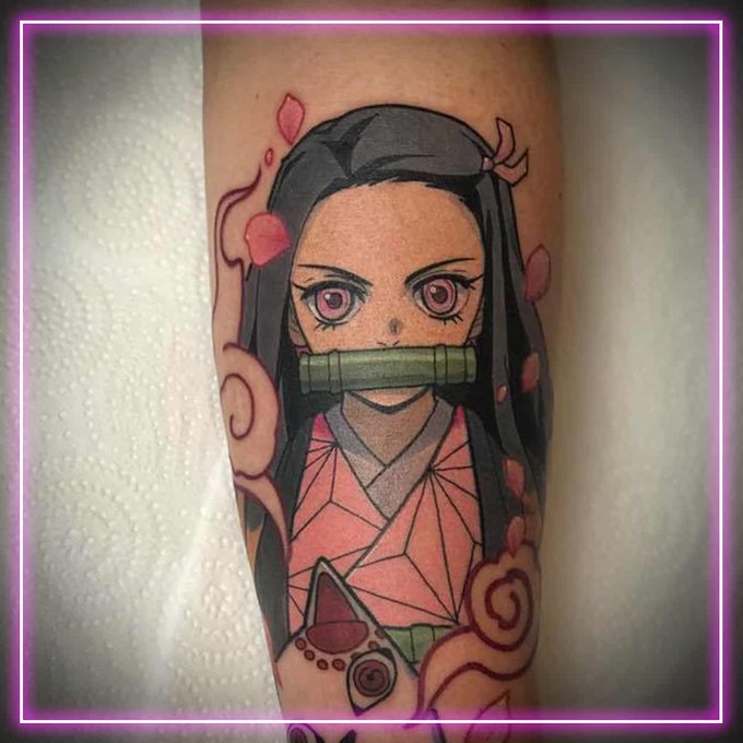
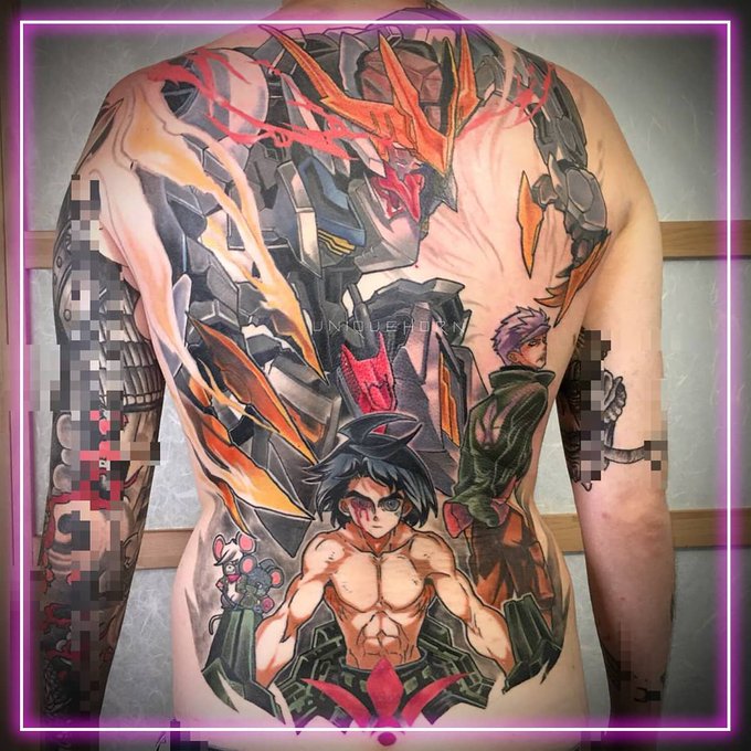

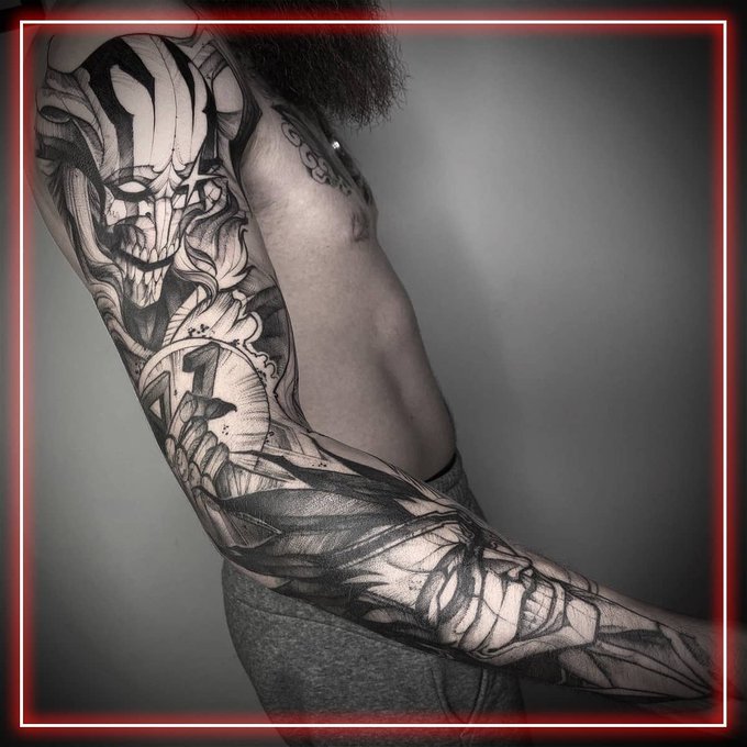
Cette équipe de tatoueurs font des dessins uniques au monde, et avec talent ! Chacun d’entre eux ont leur style propre, une vision artistique qui réussit à sublimer nos séries préférées, faisant de leurs tatouages une représentation de ce qui nous tient le plus à cœur. ❤️


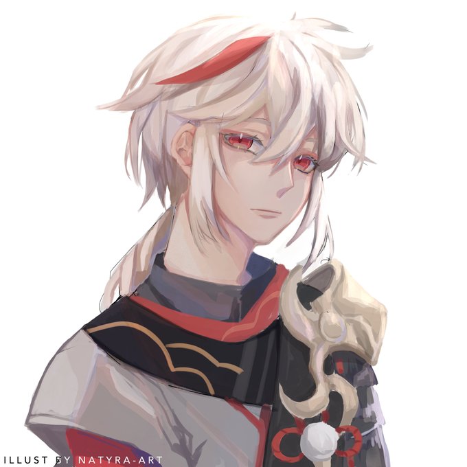

Kazuha looks like Aether (Traveler) but in a different font 😌❤️ oh I also tried the one layer style and I had so much fun! I'm definitely gonna use it again from time to time!
#kazuhagenshinimpact #GenshinImpact