ComparisonのTwitterイラスト検索結果。 22,246 件中 158ページ目


Here's a few panel comparisons from my webcomic Earthshine! Early 2021 vs. now 🥰 https://t.co/6EmltNvzuo


@DailyJunzumi Yeah they have, if you wanna see all the sprites I can send them if you'd like! but for comparison, this is what Blitzmon's equivalent sprite looks. (I actually really like this one! KoKabuterimon and Tinkermon don't have equivalent sprites to either of these)


i get this comparison has been made countless of times but club penguin-looking ass 💀


@NoHornyOnMain6 Even in Dreamland 3 and 64 he didn't look this weird. His head is just way too small and pointy, and his coat getting larger only makes his head look smaller in comparison.


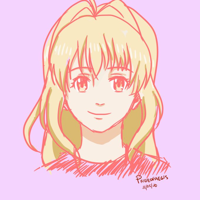
@nikoruisu December 2020 - December 2021
I have drawn a couple since but it's been a dry/busy year for me and this is the best and most direct comparison I have.


seulgi art comparison..
that was ths first time i made kpop art too I think


A comparison of (SR) Faintly Shimmering Tears of Innocence [Left] and (SR) Mysterious World of Alice's Tears [Right]
#ハロースイートデイズ #hellosweetdays #hsd #ハロスイ #sanrio #サンリオ


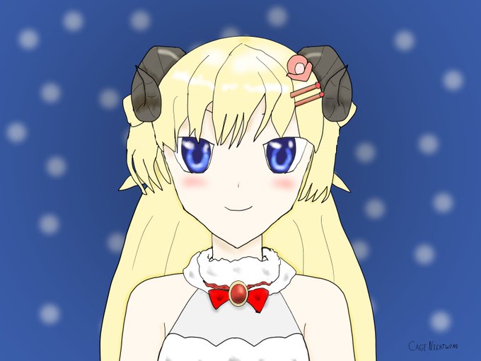
2017 vs 2022
okay, a better comparison, but five years apart XD


comparison
.
.
.
.
.
.
.
.
.
#bsd #bsdfanart #bsdtwt #bungostraydogs #bungostraydogsfanart #dazaiosamu #osamudazai #dazaiosamufanart #bsddazai https://t.co/SA4T90yV46


That's speculation of course. But the scale and comparisons is one that lives in my head rent free.
There is also the fact that Turner's work is beautiful. He paints water like glass. His ability to capture waves in a single moment is probably my favourite thing about his work.


This is a revival of an old oc, here’s a comparison of this art with the oldest version of her that I could find on my IPad!