comparison.のTwitterイラスト検索結果。 2,234 件中 17ページ目
A drawing I did at 17 VS a drawing I did at 35.
I saw that "if you aren't a pro artist by 16-17, you should give up" tweet and it made me do this comparison.
[FanArt/W.I.P] Working on a Bean Thresh. It’s gonna be a redraw of one of my old fan arts of him. Here’s how its looking so far. When I’m finished Imma post an old vs new comparison.
#ArtofLegends #workinprogress #thresh #LeagueOfLegendsFanArt
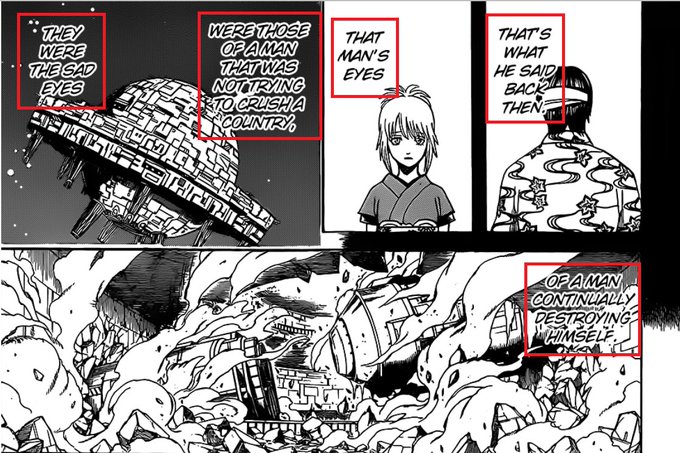
05:14-05:20 Anime/Manga Comparison. Decapitation is censored (Lesson 633)
07:29-07:36 Dialogue from Matako and Takasugi cut (Lesson 632)
08:06 Dialogue from Matako cut. This was really good dialogue fleshing out Takasugi and parallel him to Enshou. Upsetting to me
I Like to Wear Soft Clothing: Actually, the full title of musician Bill Wurtz’s latest tune is “i like to wear soft clothing (cause it makes me feel like i’m rough in comparison.)” The lyrics tell the tale of a man who finds comfort in his clothes,… https://t.co/hnk1BM1lQu
Fawful and Jolligig side by side for an updated comparison. They are roughly the same height unless you count Jolli’s hair!
It's also interesting to see a similar approach to the artwork i.e. additional depth and detail.
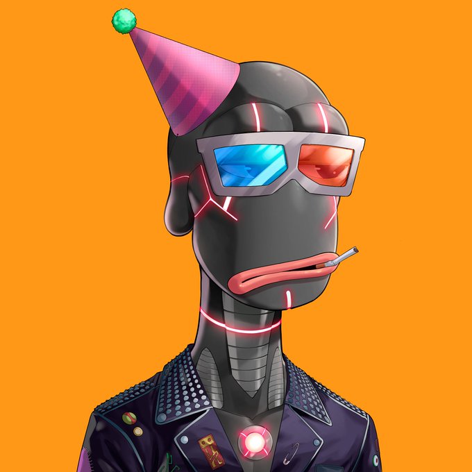
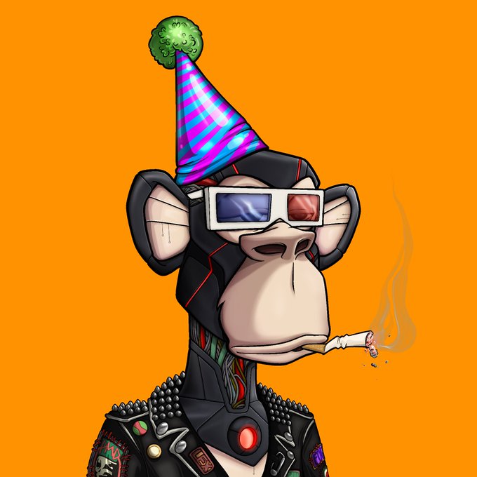
Here's #BAYC 4707 next to #RAYC 9613 and the equivalent #Rxnegade #RXAPE for comparison.
...
I wonder if minters get royalties on secondary with @RareApepeYC as with @ProjectRxnegade
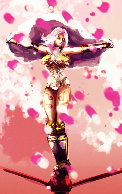
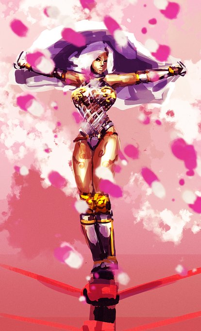
side by side comparison. Left to Right: New v. Old.
a couple of problems with the old design:
-Tits were balloons.
-visible waistline.
-no knee fat/thighs weren't big enough.
-slim neck despite being large.
-skinny arms.
but it's been corrected slightly. might change more.
Since I haven't posted my bread dog used in the MV yet, might as well do it now.
Here's my bread dog design used for the Astrogirl Sanallite cover! And of course, the original drawing I did for comparison.
It's me in a little rugby headgear :3 https://t.co/gRtU0lgGpF
Today marks the day I have been drawing a a little for about a month.
Pretty impressed how much I have progressed in this month!
Here are 2 of my first and 2 of my last drawings for comparison.
btw here's the comparison. Some people might remember my teaser image last year. Truth is I never finished it because the pose was weird and I hated the simple clothing design.
never give up your dreams to redesign characters for internet points
@Variety Exciting, but are they better than the 'single ladies' look? Here's a really good picture for comparison...
@serenedreaming YEAH that's a good comparison. To me it's Gen 3 that gives this vibe the most, with how a lot of Pokémon have this very subtle texturing to them that I almost never see in any other gen
OK, last comparison. Street Fighter Zero character selection screen. First is the PS2 port from Fighters' Generation/Alpha Anthology. Any mode outside of arcade mode makes it easy to pick Gouki/Vega/Dan. Second is CPS2, finally CPS Changer. #streetfighter #ストリートファイター
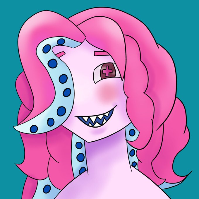
Also, here's my new pfp, both lined and lineless! The old one is also included for comparison. I'm really proud of them both tbh
Rework of Yasha from last week for patreon, old version shown for comparison. #rumbleroses
One of my first pieces of transformers art vs one of my most recent pieces.
It’s hard to realize how far you’ve come sometimes, unless you do a side by side comparison. I’m guilty of doing this more than a few times and I’ll never not be floored by my progress ♥️
#Maccadam
Bet. Here’s Emo Moonbeam
I’m getting of flashbacks of how I actually dressed in 2005 and idk how I feel about it 😂
I gave them the striped scene hair that was so cool back then because I never did it to my hair irl 😭
Normal Moonbeam for comparison. https://t.co/QvYg4HnctA


