desaturatedのTwitterイラスト検索結果。 17ページ目


someone suggested i make a version where butters parents are desaturated whereas butters himself is vibrant! i think it looks really coolio


@artistsbase Bisa juga bikin warnanya kontras kek gini. Di sini warna chara hitam putih (monokrom/desaturated) terus disiram dengan BG merah yang saturated banget.
Metode ini bikin charanya stand out dan menarik perhatian juga


lol what hte fuck happened to the colors in my art why are they so desaturated now
ive been using the same palette for a while

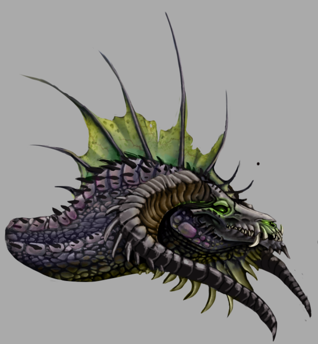
I always feel like my stuff is incredibly desaturated and lacking colors, so i threw some color in and I like it a ton better!


I drew them by memory and it didnt look this desaturated on my tablet so uh yeah
#fnaf #fnafsecuritybreach #fnaf4 #fnaffanart #gregory #evanafton


@SeraRavi desaturated greenish-yellows were EXACTLY what I was thinking of
Even That One

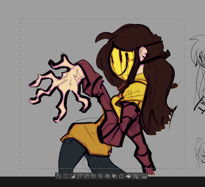


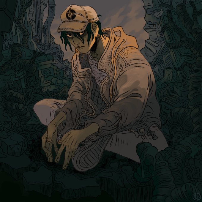
let's dig through some relics! i used to like all yellows and either clashing or overly-complimentary colour combos and desaturated palettes, i miss this sm https://t.co/DjoB5uuivy


@FastFoodKillers That's pretty close, only a few shades more vibrant.
Though I actually love the cooler, desaturated look. Makes him seem a bit more relaxed than he usually is. And that's on color theory.


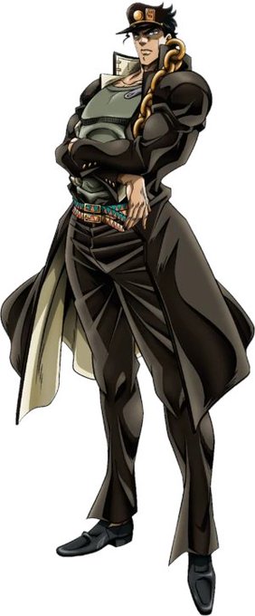
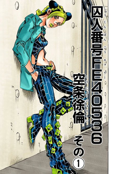

Just realized they probably desaturated jolynes palette bc they did the same for jotaro


@TheMrPasquale i actually prefer the quill proportions of the forces model, my only gripe is how desaturated sonic looks
if the frontiers model makes sonic more of a darker, saturated blue like generations or unleashed i think itd be perfect

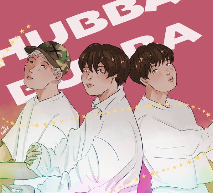


Feel like mine are more desaturated pastels but love pink and purple 🤗 https://t.co/RgqgmAcflq


if you crank the saturation up the skin looks great, the artist just works in really desaturated colours.

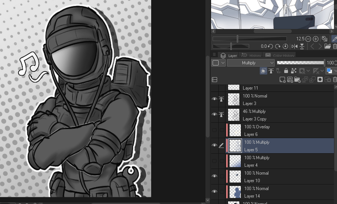

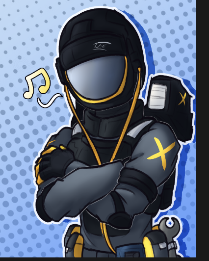
@P_Protocoll 4- using an desaturated blue, on a multiply layer i do the shading of the shadows and depth of clothes at best
4.5- and another one for the highlgihts as a overlay layer
5- from there i just delete the solid color layer and disable the greyscale gradient
and bam!

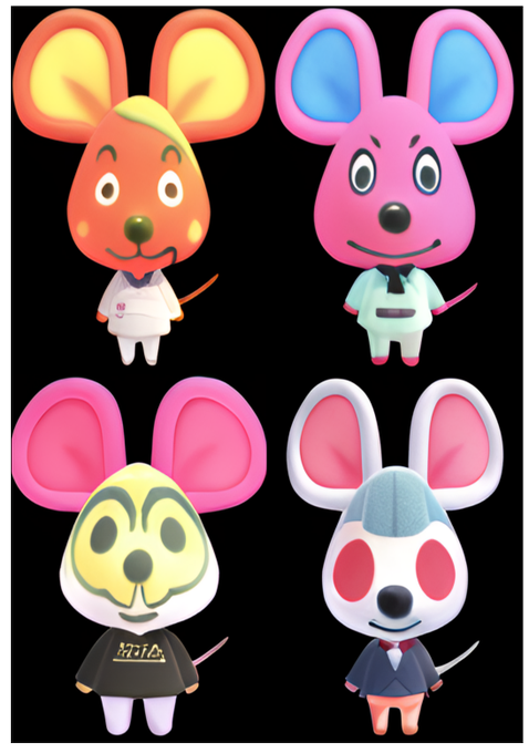
I'm aware the first one is just desaturated Bettina, but the other ones are pretty cool.
#LookingGlassAI


4. Stay Back
A commission for @ItsmeNightwind, this one really stands out to me because of the general atmosphere. Eventhough you can't see whatever Maku's gesturing towards it looks forboding and it was nice for me to work with desaturated colours.