saturatedのTwitterイラスト検索結果。 17ページ目


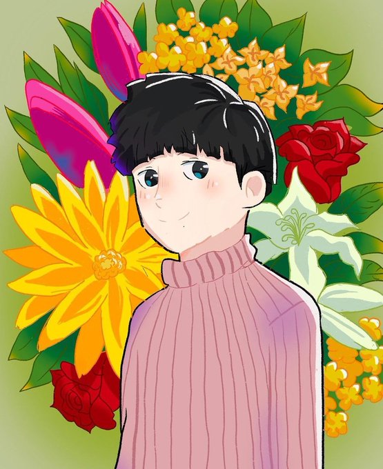
Mollymauk!
Used more muted colors for this, because my previous drawings looked so saturated in my brother's phone while they looks fine on my monitor. Hope this is better😅
#mollymauktealeaf #criticalrolefanart #CriticalRole #CriticalRoleArt



Hi #PortfolioDay im emirrin and im fairly new to digital art! Im experimenting with lighting and new techniques.
I also love saturated colors!

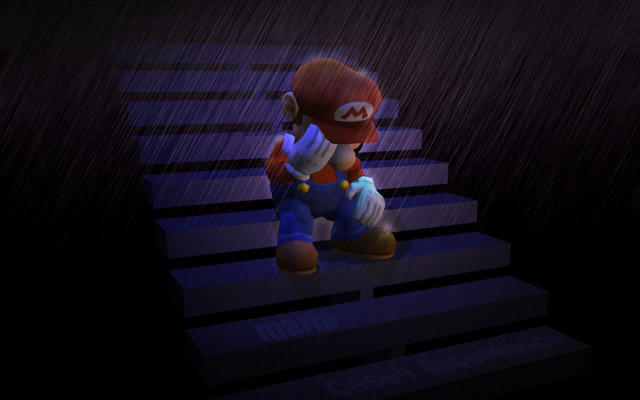

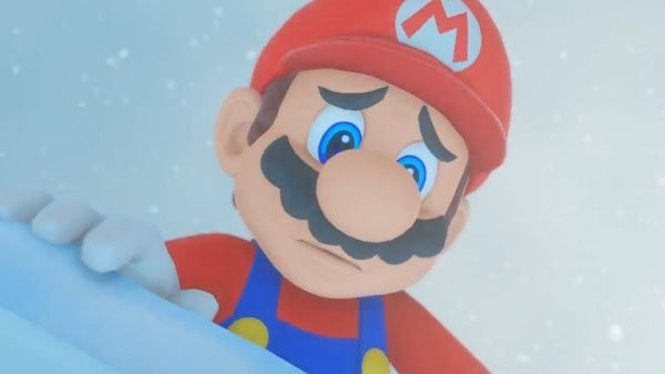

These images are so oversaturated on the internet, I just laugh my ass off whenever I see them used unironically


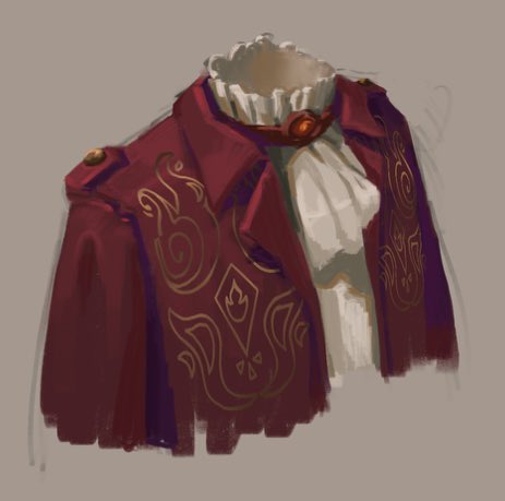
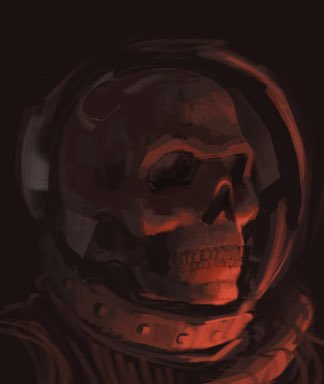
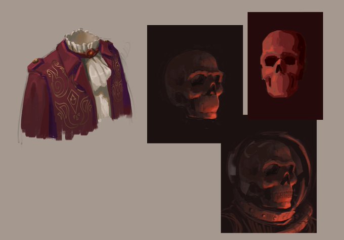
Sketchdump
I really found that more saturated shadows in a slightly colder color made the illustration pop much more! Love how these clothes turned out
#sketches #digitalsketch #procreate #skullart


Salutations! I’m Acinom and I love drawing colorful and saturated fanart! #PortfolioDay


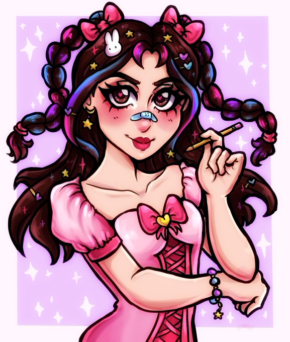


Hello! My name is Kelly and I am an animator/illustrator who loves saturated colors and sparkles! #portfolioday 🐰💖✨


So many projects with low-effort art keep flooding this already over-saturated NFT market.
Each one of them make me value & appreciate the art, depth & diversity of collections like @RENGA_inc, @0n1Force & @savagenationnft, even more.

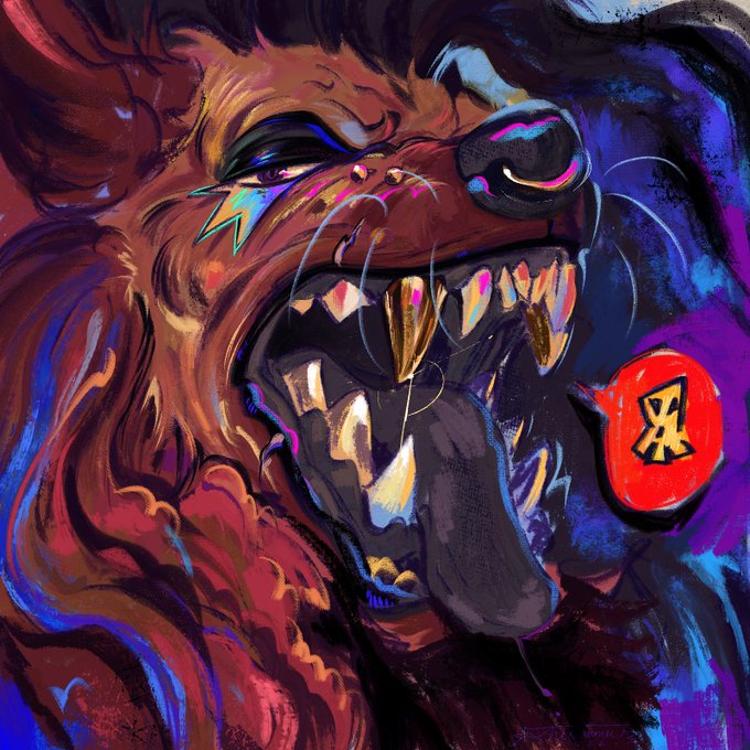


#PortfolioDay
Hi! I’m Dawner and I specialize in gnarly, saturated portraits!


Happy #PortfolioDay 🌟 #artistsontwitter
I’m Citrina, a designer and illustrator! I like bright, saturated colors with stark contrast, and I love using lots of texture in my pieces!
🎨 https://t.co/0HZS1fJro8


Heres the still! Its a lot more saturated as well because compression is silly


It's #PortfolioDay ! I'm Silver (they/them), an illustrator with a love of bright, saturated colors. I do take commissions and my current fixation is Destiny 2: I also make DnD art and original OC designs!
🌟Kofi: https://t.co/TykWcXqaZa
🌟Social Media: https://t.co/p4bVgPCPSo


Hello #PortfolioDay ☀️
I am a digital artist and illustrator, love fantasy and saturated colors
(links in comments)


@dvmbleach i used a custom gradient map on the grayscale layer and added a layer above it with saturated yellows/reds/blues according to facial color zones (see image) and messed with the blending mode/opacity!!

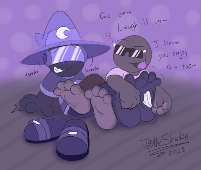
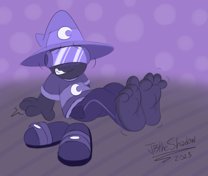
JB looked back at the art and wasn't content with how gray the clothing came out
So he did some tinkering with the colors. keeping more or less the same blue hue, just more saturated. This is the result!
Doesn't it look so much nicer~? Also bonus shot with just Guy :P https://t.co/6aGxC7B9j3


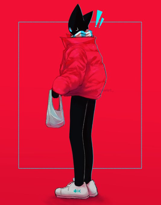
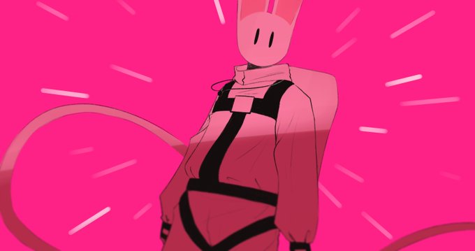


Pls i dont know how her hat works and I used more saturated colors for her hair https://t.co/YBeA1boO7y