ContrasのTwitterイラスト検索結果。 162ページ目


@Fernando362880 Mis Digimon favoritos son Greymon y Bulkmon
y en pokemon Charizard y Feraligatr
Greymon y charizard se relacionan en sus elementos de fuego y que parecen dinosaurios dragonicos
y los otros por el cuerpo quizas porque de elementos contrastan demasiado

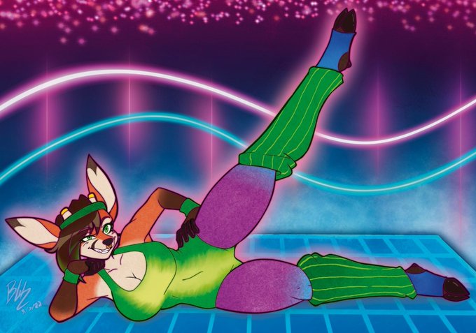

I really like how these two contrast each other via their poses X3
Both are commissions <3
Via @ItsNoogs and @MammothMcMuff <3


Also the unedited version bc I think it's kind of an interesting contrast...


#6140. 14Ξ
- Strong contrast between bg and subject makes it pop
- Simple use of colors
- Evokes a contemplative vibe


@SugoiTheBoi For me it has to do with the character's core. What traits do I want to be more pronounced?
For Rada I went from a design I thought was cool, to one that emphasised a more intimidating build, more pronounced scars to show her carelessness, and a friendly face to contrast.


Edited version, with more contrast


drawing practice ~ I used @r_ani_art 's male mc Nate and his pair Satan.😅 I avoided it for so long and now I've finished. Twas fun, learning to contrast highlight 😁 #obeymefanart #ObeyMeSatan #obeymeMC
[base was used! by @ _banun]


Zhak the albino crow's ref sheet pt.1 is here, and he's about as done with it, as i am most days.
In contrast to Lucia's Extravagant Ref sheet, He just wanted to be drawn again, its been a while
Lucia also bothering the crow, again
#furry #furryartwork #Furryartist #furryfandom

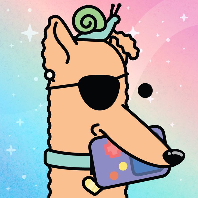
Only about 30 min to own Doodle Doge # 317, with game, eyepatch, snail buddy & perfect color contrast, for the floor price of 0.0009 $ETH!
#NFTs #NFTCollection #NFTProject #NFT #NFTDoges #Early #NFTshilling #NFTShill #ColorfulNFT
https://t.co/UEt2kaawMo


The Chanting Winged Dames are my favorite enemy in Elden Ring so far. I love that they lure you in with a beautiful, melancholic voice, and how it's contrasted by their grotesque, withering appearance. A dichotomy that encapsulate the entire game. Peak FromSoft design.


This is 2/5 of my @MultversofWomen mints. Very mystic background and very contrasting 'i don't give a shit' look. This is how superheroes are on Sundays. See ya next week.


@LBSamuelsson Here’s some of my earliest digital art, in contrast with some of my most recent! They probably took a similar amount of time (honestly the old work might have taken longer)

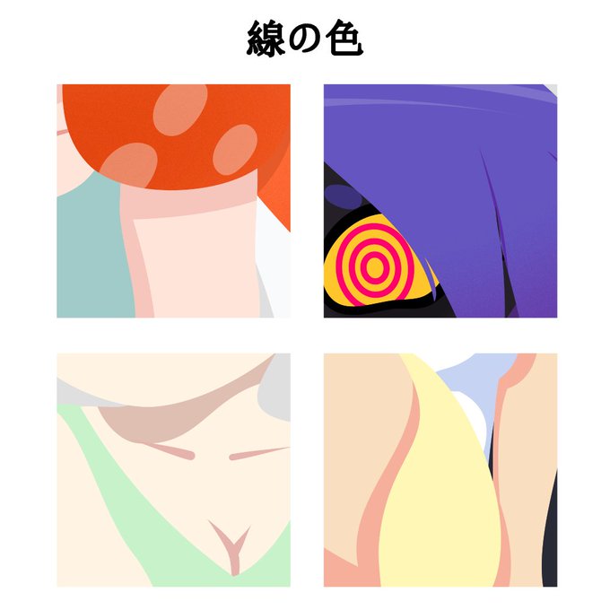

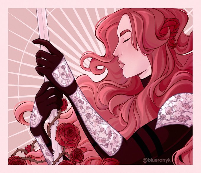
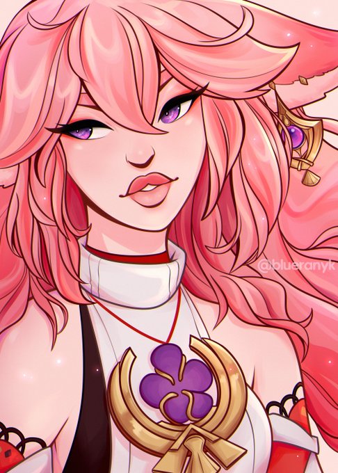

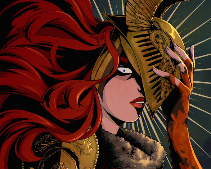
@prinkidoodles hi hello there! :D my name is blue and i enjoy making art with vibrant colors and strong contrast! 🫐


LIKE #17: Robert Valley. From his work on "TRON Uprising" to the two shorts he directed for "Love, Death + Robots" ("Zima Blue" and "Ice"), there's a distinct sharpness and striking contrast to his style and his take on design that I find captivating, full stop~ ✨


I don't normally do painted backgrounds so this part took a sec. I wanted to handle the city/contrast/shapes a bit like old batman/Gargoyles cartoons. For a coupe of them I made two painted versions- one before and one after lightning strike.


decided to go with the yellower tone because the contrast with the purple makes her look dull and Less Alive


7. Mako vice
I like the contrast, limited color and line quality of their work.