ContrasのTwitterイラスト検索結果。 10,816 件中 164ページ目


@SugoiTheBoi For me it has to do with the character's core. What traits do I want to be more pronounced?
For Rada I went from a design I thought was cool, to one that emphasised a more intimidating build, more pronounced scars to show her carelessness, and a friendly face to contrast.


Edited version, with more contrast


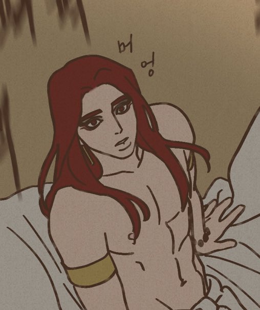
drawing practice ~ I used @r_ani_art 's male mc Nate and his pair Satan.😅 I avoided it for so long and now I've finished. Twas fun, learning to contrast highlight 😁 #obeymefanart #ObeyMeSatan #obeymeMC
[base was used! by @ _banun]


Zhak the albino crow's ref sheet pt.1 is here, and he's about as done with it, as i am most days.
In contrast to Lucia's Extravagant Ref sheet, He just wanted to be drawn again, its been a while
Lucia also bothering the crow, again
#furry #furryartwork #Furryartist #furryfandom

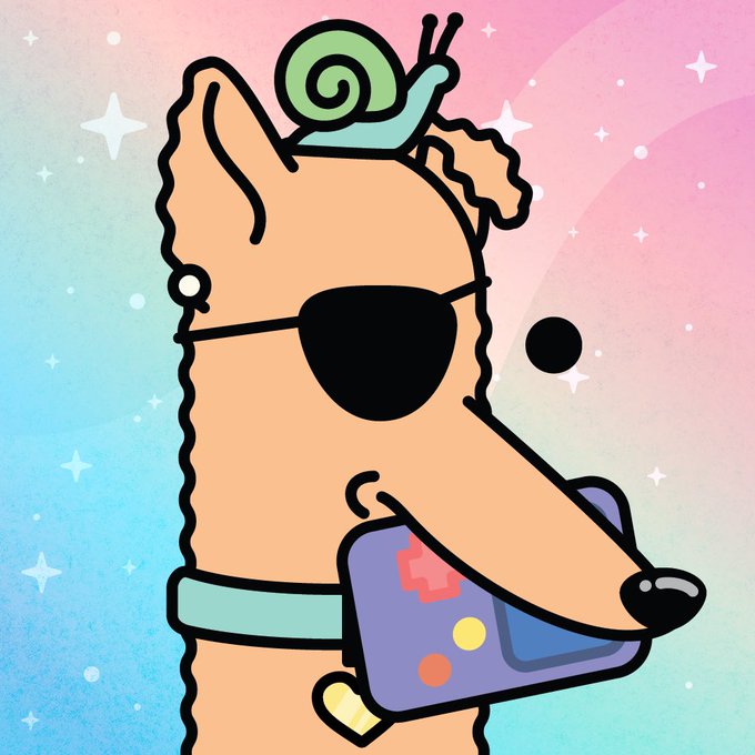
Only about 30 min to own Doodle Doge # 317, with game, eyepatch, snail buddy & perfect color contrast, for the floor price of 0.0009 $ETH!
#NFTs #NFTCollection #NFTProject #NFT #NFTDoges #Early #NFTshilling #NFTShill #ColorfulNFT
https://t.co/UEt2kaawMo


The Chanting Winged Dames are my favorite enemy in Elden Ring so far. I love that they lure you in with a beautiful, melancholic voice, and how it's contrasted by their grotesque, withering appearance. A dichotomy that encapsulate the entire game. Peak FromSoft design.


This is 2/5 of my @MultversofWomen mints. Very mystic background and very contrasting 'i don't give a shit' look. This is how superheroes are on Sundays. See ya next week.


@LBSamuelsson Here’s some of my earliest digital art, in contrast with some of my most recent! They probably took a similar amount of time (honestly the old work might have taken longer)


@prinkidoodles hi hello there! :D my name is blue and i enjoy making art with vibrant colors and strong contrast! 🫐


LIKE #17: Robert Valley. From his work on "TRON Uprising" to the two shorts he directed for "Love, Death + Robots" ("Zima Blue" and "Ice"), there's a distinct sharpness and striking contrast to his style and his take on design that I find captivating, full stop~ ✨


I don't normally do painted backgrounds so this part took a sec. I wanted to handle the city/contrast/shapes a bit like old batman/Gargoyles cartoons. For a coupe of them I made two painted versions- one before and one after lightning strike.


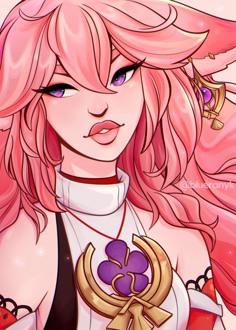
decided to go with the yellower tone because the contrast with the purple makes her look dull and Less Alive


7. Mako vice
I like the contrast, limited color and line quality of their work.


This one took quite a while, but I enjoyed drawing @kara_valliere (instagram) in her different roles!! I absolutely love that your roles have such a strong contrast to each other, and it was really fun to include them in one drawing! :)))
#universalmardigras2022 #universal


Get on your knees for our king🙌
I gave Alastor a slightly different outfit that - in my opinion - works a little better for him than the plain suit.
I‘m a fan of the vest and the red makes a nice contrast to Aamons blue jacket👍
#digitalart #Procreate #originalcharacter #comic


Finally managed to collect pieces by @JuhaniHalkomaki and @StudioYorktown.🎉
The colours match, while the round organic shapes of "f.c.p.p.p.c." contrast beautifully with the blocky lines of "Myr".♥️ Love the stitch detail, too!🪡
https://t.co/Sqwtm6BJzu
https://t.co/rf1hROuOBT

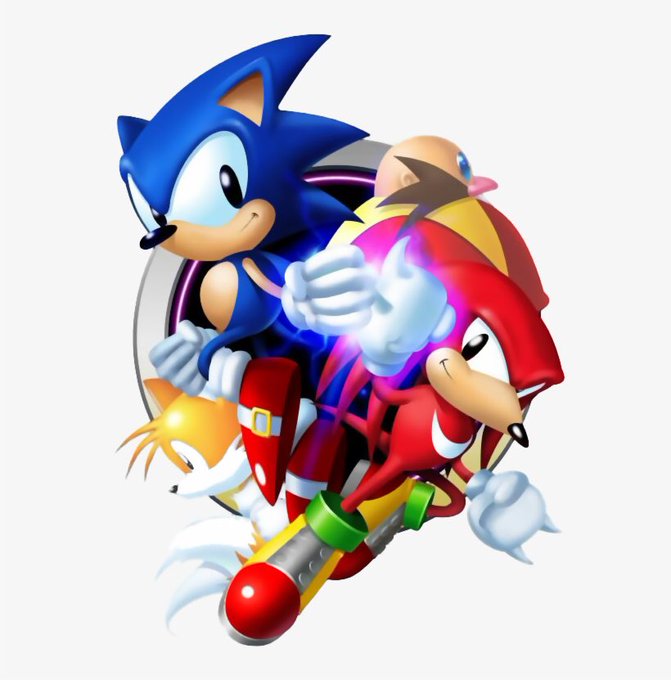
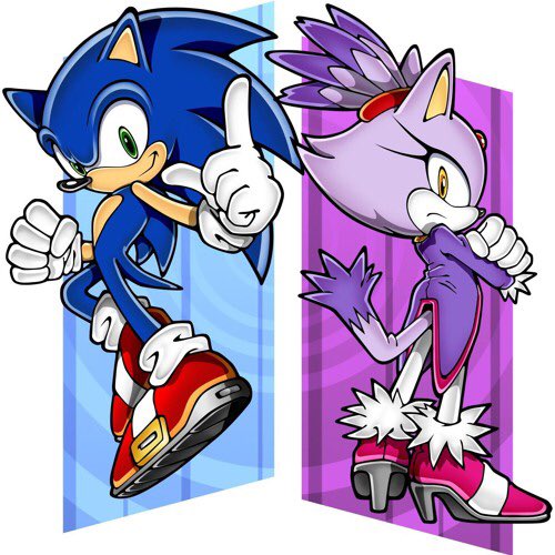
@TheButtsMcgee Look at these images. You can see how Knuckles and Blaze will contrast with Sonic based on their designs. But the don’t literally have to be Sonic but black. Shadow’s design is more or less black Sonic and cooler shoes Ig. Ratio me all you want but I’m dying on this hill.