CONTRASTのTwitterイラスト検索結果。 165ページ目


@1x2_lucifer I LOVE THE CONTRASTING AESTHETICSSSSSS IT LOOKS AMAZING LUCI 😭


Me sigue gustando un montón Mancini como villano!
En TRACKERS tenía un interés por crear unas estructuras físicas exageradas, lánguidas y angulosas, en contraste con ambientes pictóricos.
(Sigo)


🔳▫️ Computer Feeling Collection
https://t.co/UHSYaS7q5e
Abstract Pixels having fun, contrasting colors and exotic square based shapes.
#NFT #NFTArt #NftArtCollection #NFTCommunity #opensea
#NFTs #Art #digitalart #abstractnft


I hate texturing skin because I typically end up making the colors contrast too much without realizing it. I think I finally struck the balance I've been looking for where it truly looks naturalistic
#lowpoly #Blockbench #texture #textureartist #pixelart #pixelartist #gamedev


@Tikatika1810 Dats true tho its still d same suitang were just loving them differently 😁
But d contrast of d way u see Suitang vs. d way i see them 😂😂😆😆
What u c: what i c:


the Forth Rail bridge was built in 1889 and soon after that the phrase ‘Painting the Forth Bridge’ was coined as a colloquial expression for a never ending task… by contrast I have only been painting for nigh on 15 years
Forth RailBridge (continued)
oil on panel ca.2008-22

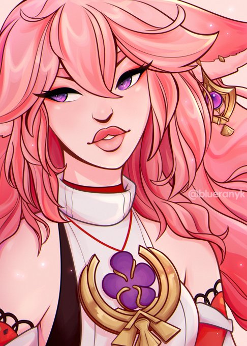
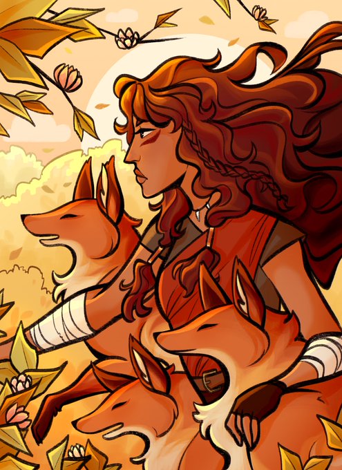
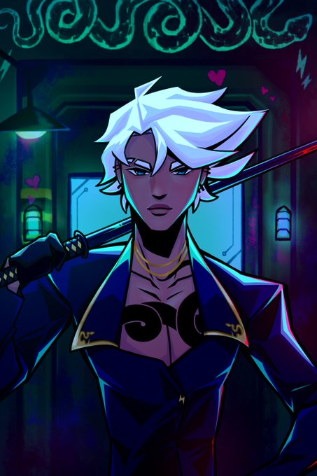
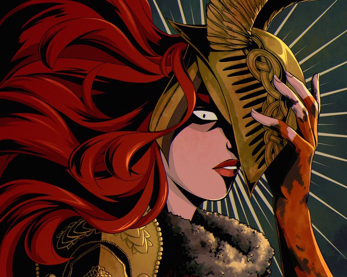
@hindasavra hi hi! i’m blue and i love working with vibrant colors and strong contrast! 🫐


Third colored Velosian Draconoid for @brizzie_art to be given for a friend :)
A pastel themed one to contrast her dark themed partner.

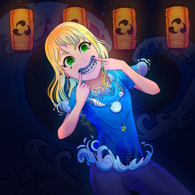
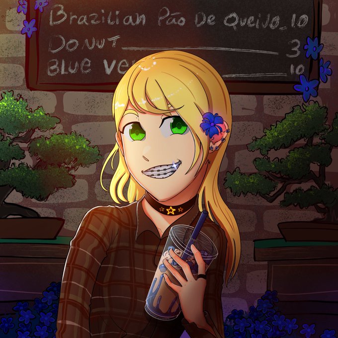
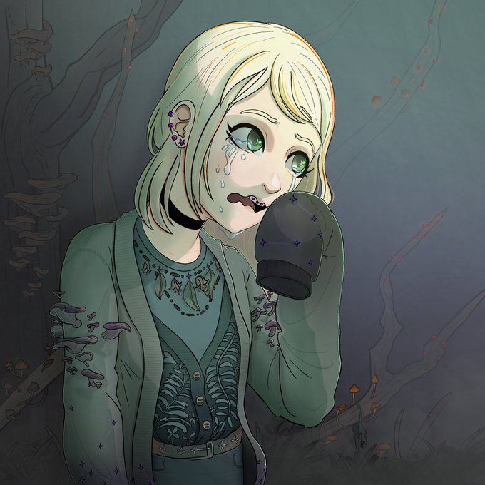
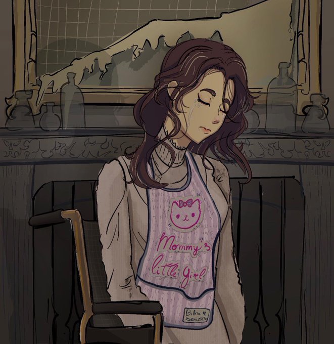

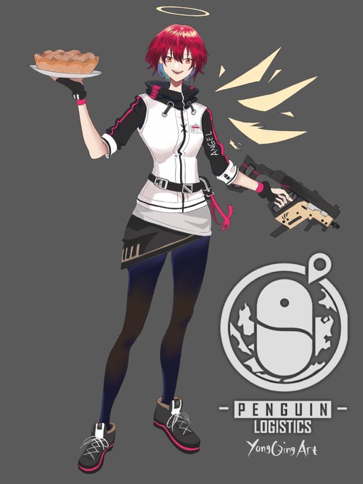
Exusiai, her hair and design really contrast with mostima.
I like em
#アークナイツ #Arknights


10: I absolutely love the contrast I have here lmaooo, attract them with cute characters only to destroy it all


@ViiMorteArt Thanks for hosting Vii 💛😊
I'm Melissa and I mostly paint portraits! Contrast and colours are something I like emphasizing. I love feedback so plz lmk what you think!
♥︎ https://t.co/WWMKqyo2Jy


Finishing up @TheShelbdiggity ‘s character from our campaign and just admiring the contrast between the flats and some detail work


Nah but the contrast between Nayuta's stage presence and This


I dunno if anyone else does this but I usually paint a pretty saturated layer as my first pass and then add an overall tinted grey. I would then start building contrast and add spotlights of saturation to finish the piece. This one is on its way to the final stage


It’s all about contrasts
We’re possible to feel only thanks to contrasts. Our lives are alive and can breathe because of contrasts. And the grey wouldn’t be grey if there was no black and white
Fabulous artworks by:@Elizabedsh1 @voplividchau @DisartoArt @neon_based @damnthedesign


literally why aren’t these two a popular pairing? they’re both 17 year old vsingers and their voices contrast nicely too 😭

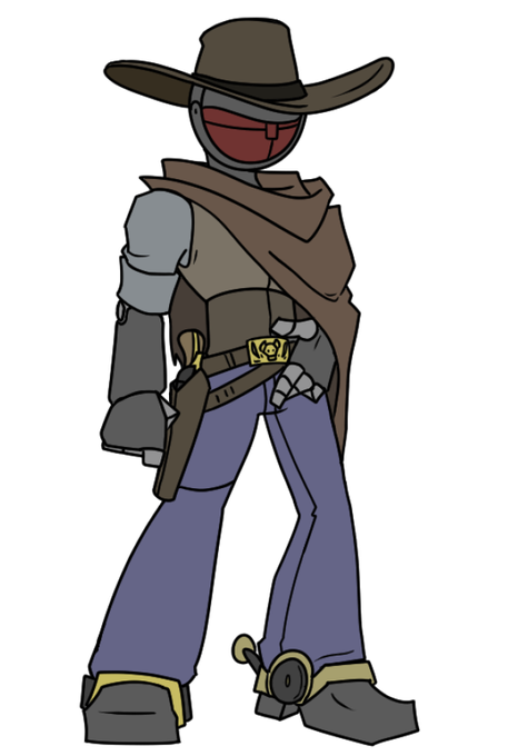

god im so fucking proud of this design of D5
such a contrast from his previous iterations

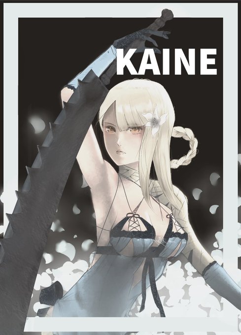
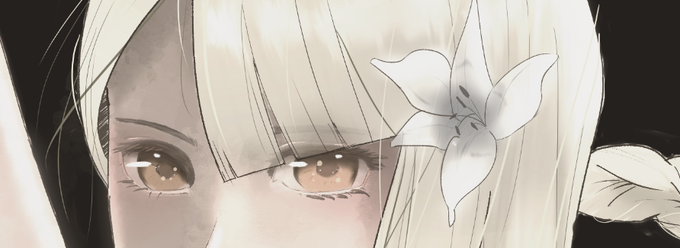
after many hours of being fickle w/ contrasts + colors, here's a thing i made of Kaine from #NieRReplicant . I hope I make Yoko Taro proud


@NakaruR My favorites are Jean and Childe, a great contrast 💖✨