ContrastのTwitterイラスト検索結果。 10,510 件中 165ページ目


4. Scenes/Illustrations or whatever you’d catagory these
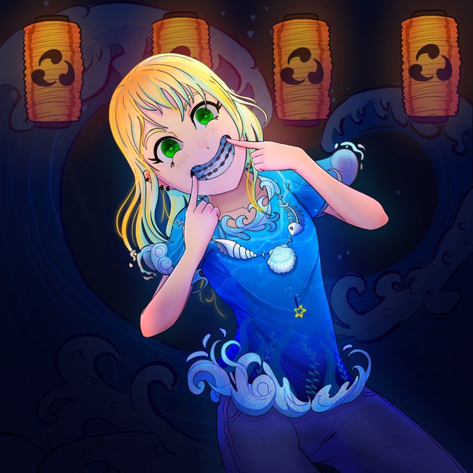
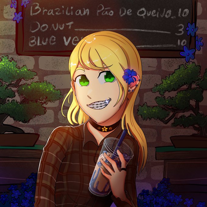
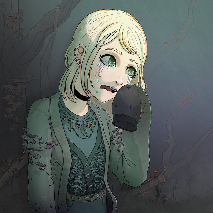
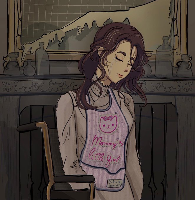
I love drawing characters, creatures and environments in poses, fighting and interacting. Most of these leaning toward “edgy” anime style. I like dark but also like the contrast of certain lights at night like neon lights


@SaxClips Green and orange is for the Australian outback! Orange sand and green foliage makes a nice contrast! Plus the orange is stylised in a pattern that resemble fire because there's unfortunately a lot of bushfires in the outback.


the contrast between delilah and an actual flatwoods monster is pretty funny lol https://t.co/ZZfPFHMfh1


#Commission work for @MatticRage of his cute #oc #originalcharacter #femboy 🐱🐱🐱 Cropped version! I loveeeeeeeee coloring his hair sooo much I can't stressed out how beautiful the blue in contrast with his light gray 💙💙 Thanks for commissioning me!
#digitalart #animeart


My artwork for this month! I'm slowly improving and I think I'm getting a better grasp of contrast! Anyway, I would love to know what you think! (I'm also more than happy to talk about commissions if anyone is interested!)
#digitalart #dungeonsanddragons #5e #originalcharacters


@1x2_lucifer I LOVE THE CONTRASTING AESTHETICSSSSSS IT LOOKS AMAZING LUCI 😭


Me sigue gustando un montón Mancini como villano!
En TRACKERS tenía un interés por crear unas estructuras físicas exageradas, lánguidas y angulosas, en contraste con ambientes pictóricos.
(Sigo)


🔳▫️ Computer Feeling Collection
https://t.co/UHSYaS7q5e
Abstract Pixels having fun, contrasting colors and exotic square based shapes.
#NFT #NFTArt #NftArtCollection #NFTCommunity #opensea
#NFTs #Art #digitalart #abstractnft


I hate texturing skin because I typically end up making the colors contrast too much without realizing it. I think I finally struck the balance I've been looking for where it truly looks naturalistic
#lowpoly #Blockbench #texture #textureartist #pixelart #pixelartist #gamedev


@Tikatika1810 Dats true tho its still d same suitang were just loving them differently 😁
But d contrast of d way u see Suitang vs. d way i see them 😂😂😆😆
What u c: what i c:


the Forth Rail bridge was built in 1889 and soon after that the phrase ‘Painting the Forth Bridge’ was coined as a colloquial expression for a never ending task… by contrast I have only been painting for nigh on 15 years
Forth RailBridge (continued)
oil on panel ca.2008-22

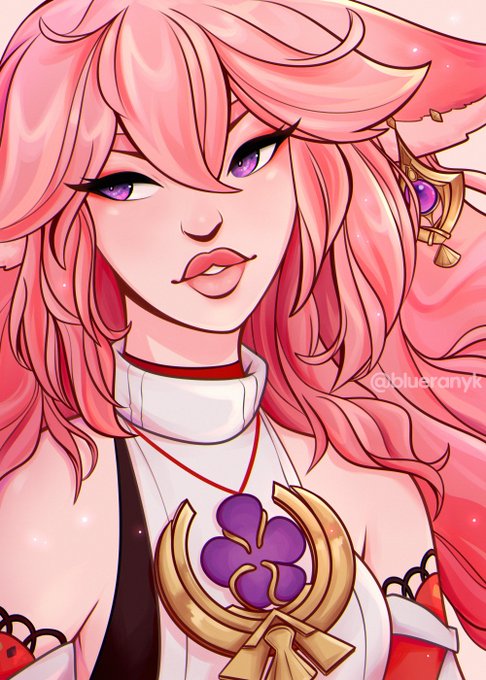
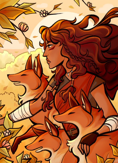
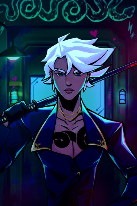
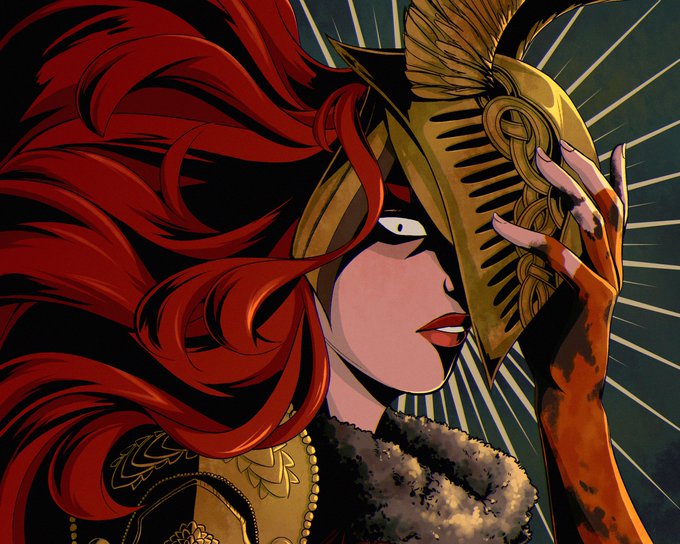
@hindasavra hi hi! i’m blue and i love working with vibrant colors and strong contrast! 🫐


Third colored Velosian Draconoid for @brizzie_art to be given for a friend :)
A pastel themed one to contrast her dark themed partner.


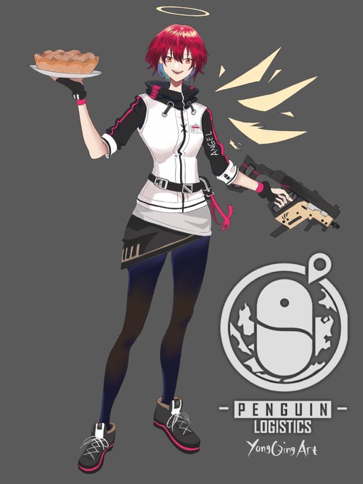
Exusiai, her hair and design really contrast with mostima.
I like em
#アークナイツ #Arknights


10: I absolutely love the contrast I have here lmaooo, attract them with cute characters only to destroy it all


@ViiMorteArt Thanks for hosting Vii 💛😊
I'm Melissa and I mostly paint portraits! Contrast and colours are something I like emphasizing. I love feedback so plz lmk what you think!
♥︎ https://t.co/WWMKqyo2Jy


Finishing up @TheShelbdiggity ‘s character from our campaign and just admiring the contrast between the flats and some detail work


Nah but the contrast between Nayuta's stage presence and This


I dunno if anyone else does this but I usually paint a pretty saturated layer as my first pass and then add an overall tinted grey. I would then start building contrast and add spotlights of saturation to finish the piece. This one is on its way to the final stage