compareのTwitterイラスト検索結果。 165ページ目


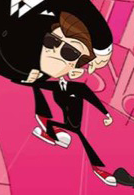
@UVSophieBell I know we joke on dissing Brunette Jack a lot but.... he DOES kinda look like Opal's long lost secret brother when compared to each other 😳
(they even have the EXACT shade of Brunette 👀👀👀)

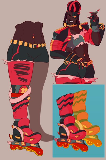


[Miscellaneous character]
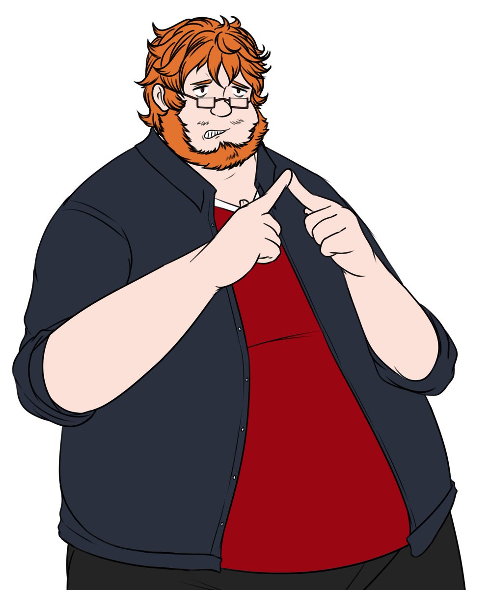
This character's name is Charlie Barton, I have some ideas for him but mostly for my upcoming Halloween extravaganza if it comes to fruition he's just a normal human compared to all my other characters who have some paranormal in them... or is he normal?


Wanted to compare my OLD Twisted Distortions cover to my NEW one.
Honestly, the difference is astounding to me xhkciycku


oh also!! i think ive improved quite a bit at live2D since my first model (made in june) so here they are compared to my most recent model that i finished today! #Live2D #vtubercommissions #VtubersUprising


It's probably because i'm in a WAY different headspace than I was a freshman in high school, and the edits are really not great compared to the theatric version, but damn I long to remember it the way I did :'D

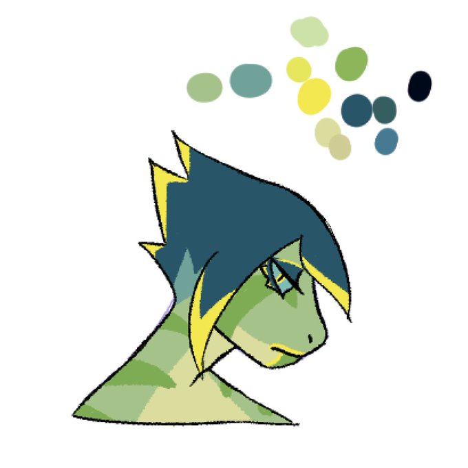
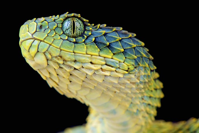
another one, colorpicked directly from this image, to give a more "realistic/actually trying to make it look like That Snake" version to compare to...


I am very disappointed that I am getting more likes on steven minecraf, on an abandoned twitter account compared to actually finished drawings I have posted before when I was a smidge more active.
alexander minecrat


I finally have a new drawing coming up, it's gonna be a pretty big one compared to my usual stuff 👀


Having perfectionism issue. I realize that compared to everyone else in the field Im a complete amateur and im forcing myself to make something way beyond my skill level.
Posting to just kinda move on from this piece for a bit. #Zetacrylic

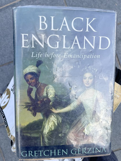
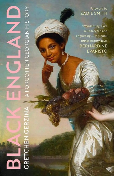
Reading @ZadieSmith @guardian review of the 2022 edition of #GretchenGerzina’s brilliant’Black England’ minded to compare my 1995 edition cover with 2022 cover - it’s a model of how #Black doesn’t need a white reference point to validate it #WeHaveMovedOn #ThatWasThenThisIsNow


@Ruruyu_FFXIV @liddle_lefty @ARareGeno @SaberNoctisV @FemboyArchive What's funny is that Vastedge XT (the pachinko machine) was Bridget's last canon appearance pre-Strive and there's subtle design differences compared to her outfit in GGXX, notably the lack of a male symbol on her habit and a more form-hiding secondary layer to her dress.

Gente, obrigadão por essa live na madrugada, foi curta mas foi super divertido <3
Desde ja agradeço os novos seguidores, o comparecimento de quem ja acompanha, a presença de vocês deixam meu coração quentinho!!


@ShaewalS @puhrpcake @seorangnanie @OkiyYiko Haaa sudahh haha tapi compare dengan both.. these two animators levels over 9000 🔥🔥🔥

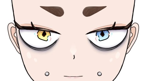
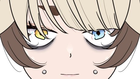
not sure why but every time i try to draw eyes for my l2d i feel like they don't fit well enough even tho i kept re-drawing them many times. in compare in my vroid they fit 💯👌 it makes me reconsider if i even want scuffed 2D version lol


So some things I kept from prototype Rio.
The claws, the ear markings, the white chest/tummy, the eyelashes, and height compared to the Clones.
Hard to believe she's not even a year old yet.

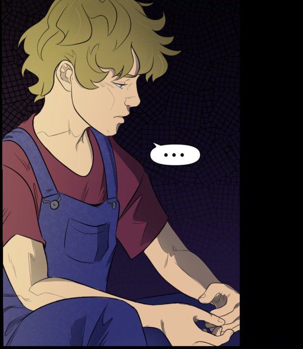

@EwylanaR The difference between my art at the beginning of my comic compared to where I’m at now is so surreal to me.


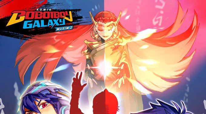
Compare this. I seriously have no idea who is the girl on the cover. Is she satriantar or princess kira'na? Wdyt?


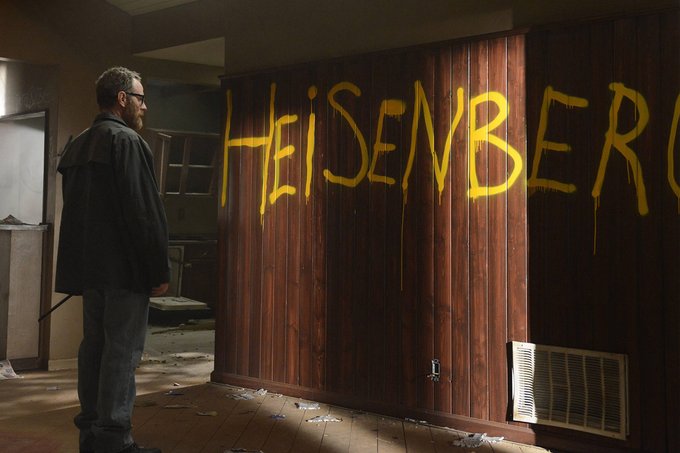

Gilligan still uses color to signify certain feelings but the palettes feel slightly different very similarly to how Cowboy Bebop TV has a comparatively garish palette when compared to the subdued hues in Knockin' On Heaven's Door.


@octolinghacker my splatoon 3 art has that energy, it looks horrible compared to my normal art