ContrasのTwitterイラスト検索結果。 10,816 件中 169ページ目


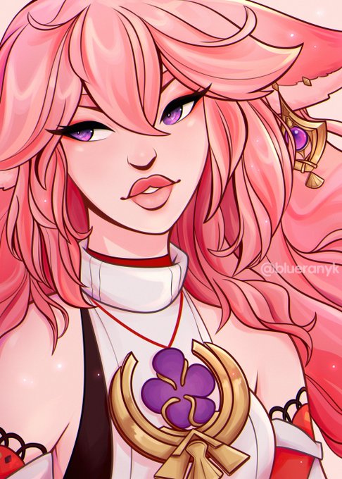
Saito's commentary in magazines and interviews often includes surprise at how 'adult' Shinya Hasegawa's adaptations of her designs are for the series. There is, let's say... A contrast, even in super early series art.


it still makes me insanely happy how they designed trunks and goten in the upcoming dragon ball film
aside from the obvious change, them keeping the contrast between goten and trunks’s outfits to indicate their parents’ backgrounds is still so cool


(this art needs an update but) compare and contrast with my pla oc who looks like a Cool Lone Wolf girl but is actually very nice and friendly just bad at talking to people. also a lesbian i dont have names for either of th


4. Scenes/Illustrations or whatever you’d catagory these
I love drawing characters, creatures and environments in poses, fighting and interacting. Most of these leaning toward “edgy” anime style. I like dark but also like the contrast of certain lights at night like neon lights


The red really contrasts with the blue of the Rise logo, and I love how its basically Malzeno when Rise was Ibushi and Narwa


@SaxClips Green and orange is for the Australian outback! Orange sand and green foliage makes a nice contrast! Plus the orange is stylised in a pattern that resemble fire because there's unfortunately a lot of bushfires in the outback.


the contrast between delilah and an actual flatwoods monster is pretty funny lol https://t.co/ZZfPFHMfh1


#Commission work for @MatticRage of his cute #oc #originalcharacter #femboy 🐱🐱🐱 Cropped version! I loveeeeeeeee coloring his hair sooo much I can't stressed out how beautiful the blue in contrast with his light gray 💙💙 Thanks for commissioning me!
#digitalart #animeart


My artwork for this month! I'm slowly improving and I think I'm getting a better grasp of contrast! Anyway, I would love to know what you think! (I'm also more than happy to talk about commissions if anyone is interested!)
#digitalart #dungeonsanddragons #5e #originalcharacters


@1x2_lucifer I LOVE THE CONTRASTING AESTHETICSSSSSS IT LOOKS AMAZING LUCI 😭


Me sigue gustando un montón Mancini como villano!
En TRACKERS tenía un interés por crear unas estructuras físicas exageradas, lánguidas y angulosas, en contraste con ambientes pictóricos.
(Sigo)


🔳▫️ Computer Feeling Collection
https://t.co/UHSYaS7q5e
Abstract Pixels having fun, contrasting colors and exotic square based shapes.
#NFT #NFTArt #NftArtCollection #NFTCommunity #opensea
#NFTs #Art #digitalart #abstractnft


I hate texturing skin because I typically end up making the colors contrast too much without realizing it. I think I finally struck the balance I've been looking for where it truly looks naturalistic
#lowpoly #Blockbench #texture #textureartist #pixelart #pixelartist #gamedev


@Tikatika1810 Dats true tho its still d same suitang were just loving them differently 😁
But d contrast of d way u see Suitang vs. d way i see them 😂😂😆😆
What u c: what i c:


the Forth Rail bridge was built in 1889 and soon after that the phrase ‘Painting the Forth Bridge’ was coined as a colloquial expression for a never ending task… by contrast I have only been painting for nigh on 15 years
Forth RailBridge (continued)
oil on panel ca.2008-22


@hindasavra hi hi! i’m blue and i love working with vibrant colors and strong contrast! 🫐


Third colored Velosian Draconoid for @brizzie_art to be given for a friend :)
A pastel themed one to contrast her dark themed partner.


Exusiai, her hair and design really contrast with mostima.
I like em
#アークナイツ #Arknights


10: I absolutely love the contrast I have here lmaooo, attract them with cute characters only to destroy it all