ContrastのTwitterイラスト検索結果。 10,510 件中 169ページ目


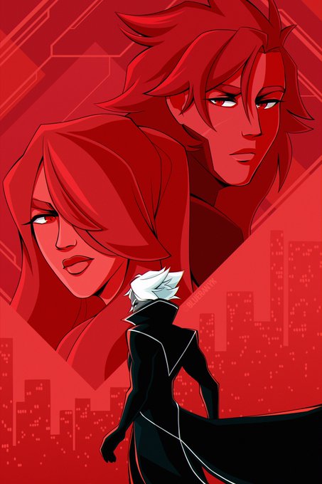
Tenía este dibujo pendiente y me encanta como quedó 😈💖
@contriteorb4 Espero te guste uwu hay que intentar revivir algunas transformación UWU
Se agradece un ❤y tu rt :3
(Notad que mk marca de agua le cambie a rojo para que no hubiera contraste en el dibujo uwu)


Fashion side of Twitter, I need help:
What's the difference between gyaru and scene and how do they compare/contrast?
Additionally, I do think this is a good subject matter for an anthropological paper.

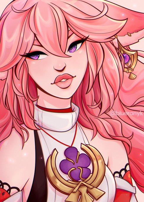

@eldritch48 hi! my name is blue and i love creating art with vibrant colors and high contrast! 🫐


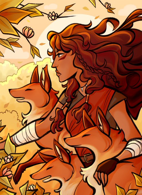
@ChomperVT I’m Frey and currently going thru a redesign! I love mostly the contrasting fall colors with my ears and hair and how well it works with the glowing green! I’m hoping to include for bone and ghosts with my outfit but I’m really happy with finally making a curly wolf mane


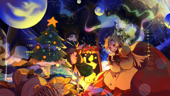

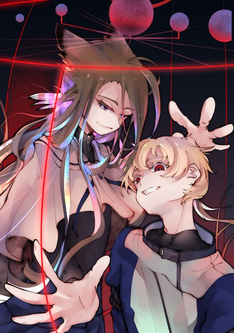
#เก๊งเก๊งกับแก๊งงอกออริ
สวัสดีค่ะ ชื่ออุ้ม/หลายๆ คนเรียกอุชี่-อรุชี่ ค่ะ/////
เป็นสายวาดออริแนวแฟนตาซี-ไซไฟเบาๆ ในองค์ประกอบ และตัวละครจะเป็นดีไซน์แบบหนุ่มน้อยสาวน้อยน่ารักหน้าหวาน in contrast ค่ะ !
ฝากตัวฝากใจ ถ้าชอบแนววิทย์เนียนเวท หนุ่มสาวหัวขาว สามารถมาคุยกันได้นะคะ!


No os perdáis el drop de @pacogillette.
Una colección llena de color en formato gif que contrasta con los grises y claroscuros del ser humano.
📆10-02-22 a las 19:00h. (UTC+1)
🇲🇽 12:00 P.M
👉https://t.co/ydbKHvjBZq

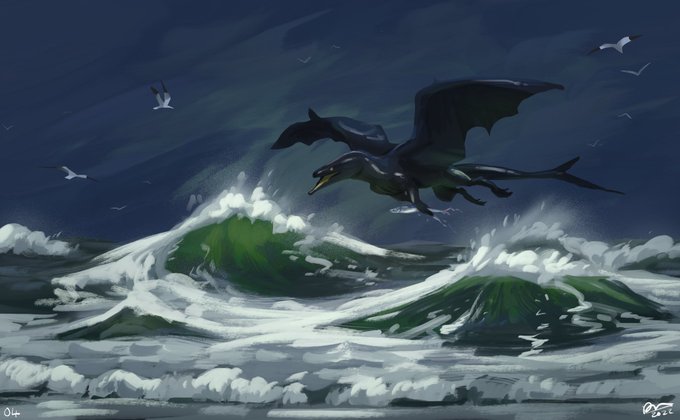

04 - fishing - struggled a bit more painting this one from memory as I couldn’t remember the contrast between the sky and sea that well. Got close enough in the end after a few restarts 🌊


Two human Minimi… the utter contrast. >:^/ vs <:]
#minimusambus <3


The fascinating color contrast of cold and warm. Btw, kind of strange that it’s only a second tiger in our feed this year.
The author’s description:
“Blue girl with tiger spirit”
Artist - @garisedelweiss
Collector - @MattDionis


love this contrast between the sketch and the almost finished work🤗💖 step by step🐾


The contrast is killing me hahaHAhAHA
I sincerely recommend watching them climbing together (#


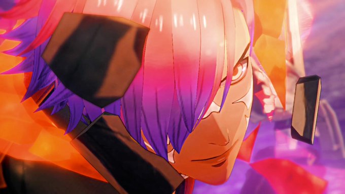
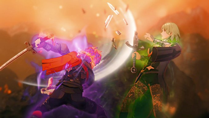

Reason why I say they are fused in that scene is purple boy doesn’t normally have these markings but has the markings in the scene where he breaks Byleth’s sword. He also has purple aura to contrast Byleth’s green.


Crona is body type goals. I too want a skinny frame contrasted by massive shapely hips


@SongOfTheEast The uncomfortability is the point
The scene that immediately follows talks about how different Themyscira is from man’s world, it’s contrasting the themes that were very vocal and present in golden age Wonder Woman with modern sensibilities and just the history of our world


I'm messing with designs, would anybody want one of these two contrasting bros? And I'm having alot of fun doing these so I'm tempted to dip my foot into the world of adopts, any advice and pricing and such? Obviously they would be more detailed.
.
.
#art #ArtistOnTwitter #Adopt


Another two that are complementary yet contrasting are Cor / Mark, who are meant to be Snide Mage and Cowardly Fighter


Contrasting Designs:
Kent / Uzu are meant to be a Cain / Abel-esque archetype
Ferrum / Blaise are meant to be Noble Warrior / Bastard Manipulator duo of brothers


I felt like it could still benefit from adjustments especially contrast. Also tweaked some materials that were bothering me. Here's the updated version, and a close-up too
#Ganyu #GenshinImpact #甘雨 #原神