CONTRASTのTwitterイラスト検索結果。 170ページ目


@wooyoungandwild I think a personal favorite for me is how i like playing with more dramatic lighting? Like just being able to make the contrast of highlights and shadows pop more is always a fun process


I re-did some aspects from @FloofyRainer 's ref, and the contrast looks interesting!


Mitsu and Vespa here are humanoid bug OCs, but Vespa contrasts from Mitsu by having more bug-esque features. https://t.co/1RiqNws7W4


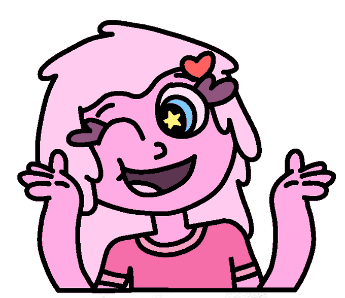

Couldn't think of a title for this part:
Slimy and Squishy
[I mainly made Squishy to just be Slimy's nervous and nerdy little sister, contrasting with Slimy with how Slimy's tall & slim with long hair, while Squishy's short & chubby with short hair]
https://t.co/RtgoTwQdms


I generally think I design my OCs around each other, best example Max n Happy. Try having Bonnie contrast Happy and with other villains usually theme them around purple to contrast with buns yellow. https://t.co/CBHNow8nLP

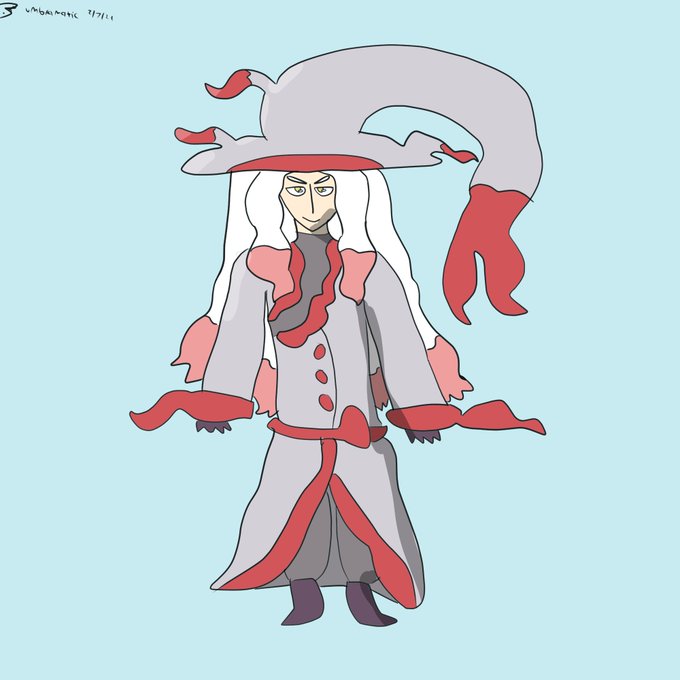

And the final Umbra Plays #PokemonLegendsArceus gijinkas, Luciana the Hisuian Zoroark and Hazel the Lucario! These two seem to particularly contrast each other - fitting.


@WlEGRAF Fig 3: Rando McGoogleimagesearch
now were really getting into interesting negative space and strong contrasts. v strong triangular movement—~15-16 in the body, not gonna bother counting the steep trapezoids on the ribbon or the lacing.


Romance cover-type silliness on Monte Marte 100% cotton paper. The high contrast value areas work surprisingly well (for me) despite everything else being mushy. I can't recommend this paper, it sucks up paint like mad. I guess not all cotton papers are equal. Or it's just me.

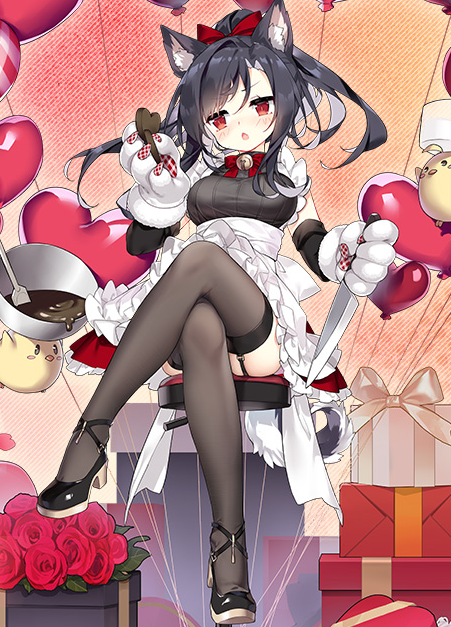
@AzurLane_EN The contrast of Shigure's black and the red of the valentine ornaments! She looks especially cute with those paw gloves, but that imposing cross-leg pose giving us a peek at her garter belt makes her look a bit hotter.
An alluring yet adorable skin! Fit for someone like Shigure!

@WlEGRAF Fig. 1: Judith
shes a real good ex. of balanced design. her body has a lot of complex shapes (antennae, strong curves contrasted w/sharp angles), so the suit is simple. the color is in the same family as the rest of her palette & stands out against her skin, acting as neg space


@hikimango Soo really quick tldr but basically follow this rule of having a really big curve in one side while on the other it kinda flattens (doesn't mean you make a straight line but simply that you don't thiccen those parts as much)
And that creates the contrast and accentuates the thicc


@ndasfw Like in this one, there's not much of the trapezius on either side. It could soften out the angle contrast from neck to shoulders.



@BudSnob @worldofwomennft Absolutely love the contrast with the background. And the spike collar makes her extremely fierce! Enjoy! 💚

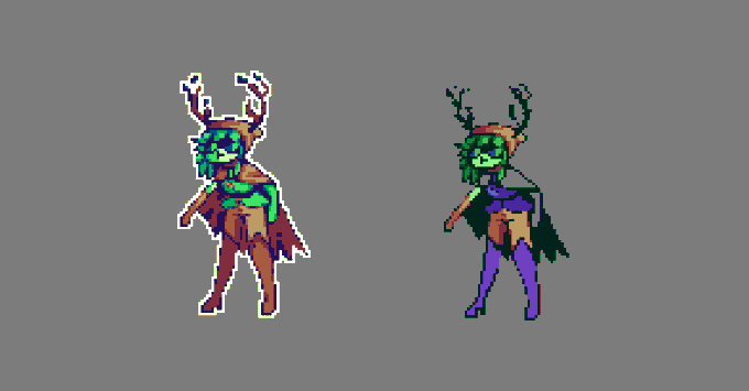
i used the green shirt palette cos i couldn't get my colors to work! i'm finding greens hard to work with. noticed that on my leaf man.
mfw there's no contrast, outline's not dark enough, shading looks too soft, it looks like shit-- i
me just ranting about my skill issue lol 🥲

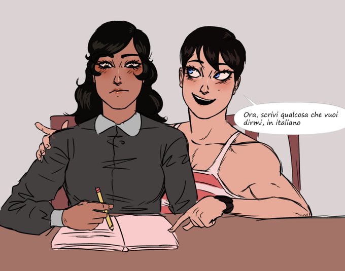
tengo un poco de ganas de hacer algo medio triste entre ellas para contrastar con tanta wea wholesome y no saturar XDD
@estufathenun666


Today's aesthetic is Frutiger Aero !
This aesthetic involves glossy materials, glass, vibrant colors contrasting monochrome looks, skeuomorphism, nature visuals and humanism themes !!


@lissafest But when it comes to Izuku and Ochako, they're openly and clearly YIN-type characters in both personality and design. In contrast to other major relationships such as MiriTama and Bkdk, or other canon couples in the series. I think its a detail to take into account

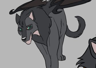
So good so far... To be honest, I am struggling with the colour contrast.