ContrastのTwitterイラスト検索結果。 10,510 件中 170ページ目


My friend said that my art looks like nfs Most Wanted (2005) graphic.
I know right 😄, it's gloomy but also high contrast.
I actually still doesn't know how to add complementary or ambient colors, so I always rely on grayscale for coloring


『 Pretty. 』
—; Each day, I were to observe different people of the outside world with the help of the void's vision. Today, I got to observe a pretty woman. Her teal-colored eyes caught my attention in contrast to the void's color. I fell quick in love with a woman.


Watercolor #painting of the dramatic #storm sky, titled "Sky No. 6'" (30 x 40,8 cm, 2017). I just love those contrasting colors!
You can find the original watercolor and signed art prints of it here:
https://t.co/BO4WBzUoE0
https://t.co/cSVqObweKm


@CanalBrushRush Me ilumine com a sua sabedoria Guilherme Bruxo Rústico
Tinha feito essa arte pra treinar uma iluminação mais recortada, mas acho que podia ter mais contraste, nao sei


@wooyoungandwild I think a personal favorite for me is how i like playing with more dramatic lighting? Like just being able to make the contrast of highlights and shadows pop more is always a fun process


I re-did some aspects from @FloofyRainer 's ref, and the contrast looks interesting!


Mitsu and Vespa here are humanoid bug OCs, but Vespa contrasts from Mitsu by having more bug-esque features. https://t.co/1RiqNws7W4


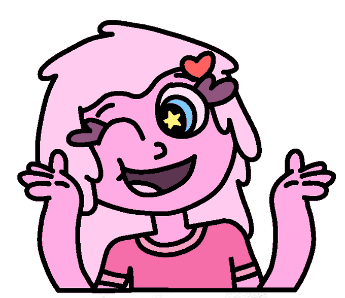

Couldn't think of a title for this part:
Slimy and Squishy
[I mainly made Squishy to just be Slimy's nervous and nerdy little sister, contrasting with Slimy with how Slimy's tall & slim with long hair, while Squishy's short & chubby with short hair]
https://t.co/RtgoTwQdms


I generally think I design my OCs around each other, best example Max n Happy. Try having Bonnie contrast Happy and with other villains usually theme them around purple to contrast with buns yellow. https://t.co/CBHNow8nLP

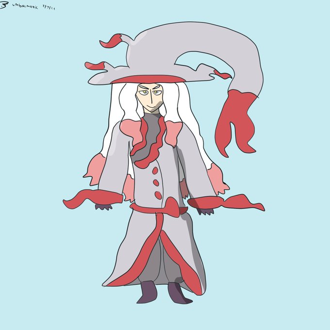

And the final Umbra Plays #PokemonLegendsArceus gijinkas, Luciana the Hisuian Zoroark and Hazel the Lucario! These two seem to particularly contrast each other - fitting.


@WlEGRAF Fig 3: Rando McGoogleimagesearch
now were really getting into interesting negative space and strong contrasts. v strong triangular movement—~15-16 in the body, not gonna bother counting the steep trapezoids on the ribbon or the lacing.


Romance cover-type silliness on Monte Marte 100% cotton paper. The high contrast value areas work surprisingly well (for me) despite everything else being mushy. I can't recommend this paper, it sucks up paint like mad. I guess not all cotton papers are equal. Or it's just me.

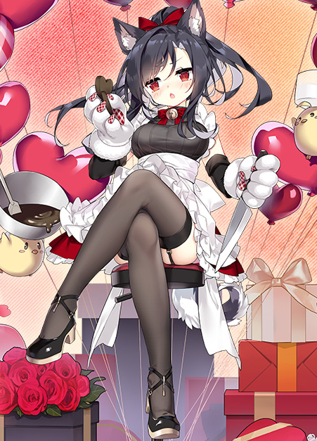
@AzurLane_EN The contrast of Shigure's black and the red of the valentine ornaments! She looks especially cute with those paw gloves, but that imposing cross-leg pose giving us a peek at her garter belt makes her look a bit hotter.
An alluring yet adorable skin! Fit for someone like Shigure!

@WlEGRAF Fig. 1: Judith
shes a real good ex. of balanced design. her body has a lot of complex shapes (antennae, strong curves contrasted w/sharp angles), so the suit is simple. the color is in the same family as the rest of her palette & stands out against her skin, acting as neg space


@hikimango Soo really quick tldr but basically follow this rule of having a really big curve in one side while on the other it kinda flattens (doesn't mean you make a straight line but simply that you don't thiccen those parts as much)
And that creates the contrast and accentuates the thicc


@ndasfw Like in this one, there's not much of the trapezius on either side. It could soften out the angle contrast from neck to shoulders.



@BudSnob @worldofwomennft Absolutely love the contrast with the background. And the spike collar makes her extremely fierce! Enjoy! 💚