readableのTwitterイラスト検索結果。 18ページ目


Some plant friends :)
Trying to figure out how much detail I can remove from a plant pot and still have it be readable. Pretty sure I could go even smaller, but I like this level of detail quite a bit
#pixelart | #plants | #gameart | #indiegames | #indiedev


Were you published on Paragraph Planet during 2021? All of the stories are readable in the archive. Even December, look at me so bloody organised). https://t.co/I9uagkW4c1 #WritingCommunity #flashfiction #amwriting


Updated my commissions as well as added a TOS. So hopefully its more readable. #ocs #dnd #artist #commissionsopen #characterdesign #conceptart


The bosses are all neat too! I love their how over the top their color palettes are while still being readable!


i have no idea what twitter is gonna do to the image quality or how readable these are gonna be, so uh. probably-more-readable crosspost on tumblr:
https://t.co/OZulNt7Fbr
god i love larry. i sure hope nothing happens to him in season 3! :,)


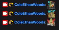
Decided to update my most recent Twitch emotes to be a bit more readable. Definitely feels better now!


The version of the Raid Emote i wish we could have used 😩, alas it just wasn't readable
#twitchemotes #TwitchEmoteArtist #drdoom #Marvel #marvelcomics


Twitter, am I right? LMFAO
Here’s the (readable) gift to my friends in GaMetal, still sorry I couldn’t fit everyone in! https://t.co/382TGovj4m


The story of horror!sans replacing an eye.
I use a translator. Sorry if some parts are unreadable. https://t.co/ZtkSqV8PgH


Going live! The tattoos are getting more complicated than they should. I need to find a balance where they are nice and somewhat detailed but not to the point that is noisy and unreadable🤔
https://t.co/PSQjoLUnQ4
#Vtuber #VTuberUprising #vtubermodel #digitalart #characterdesign


Oliver's 10th anniversary!! I made a comic!! It's kinda cringe but!! I finished it finally!!
It's all headcanons but I tried to make it vague enough to be readable without knowing it (1/4)


it's here - 🍯🌸🥠🐱🍳
my audition for @ChopToTheTopOCT || #chop2thetopoct !
also readable on tapas: https://t.co/ZMtPNXvZyl
enjoy 💗
(1/5 💮)


I started off with a more hex-ish and less square-ish approach. But it got a bit messy. Squares actually create nice flowing lines that make the grid more readable and distances more countable. So now I'm trying to keep the open areas quite square

Some rocky islands. Trying to make the grid natural and readable, yet funky. Square, yet hex.


Trochar! it’s quiet, curious, and unpredictable. has a fascination with anatomy and a cold, unreadable demeanor. https://t.co/cxYA5al3Zz


working on the more human-readable file format. map load is getting there, but not complete yet.