CONTRASTのTwitterイラスト検索結果。 171ページ目


@yulikitten There are are characters with robotic antenna ears in the game for contrast.


The finished designs for Glamtrap and Ilusion Afton for my copycat AU! I love the contrast between them haha.
#characterdesign #fnaffanart #fnafsecuritybreach #fnafart #fnafsbfanart


tried a black mask this time
i like the contrast a bit more


The contrast between this cg and the one they first showed for this scene really hits. #FGO


The above outputs were from training "100 Epochs" and Low Confidence. Meaning that the AI trained a LOT and deferred to its training data for making decisions. It didn't experiment much.
Contrast with these, where it trained for 1 Epoch and had High Confidence.

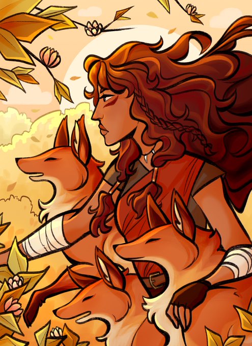


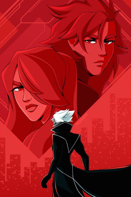
@Kiradraws1 hello there! :) my name is blue and i make a lot of art with vibrant colors and strong contrast! 🫐

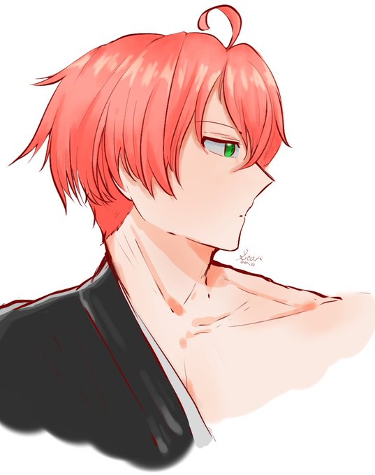


Beautiful art by @Lusan_666 ! I gotten the one on the left as I loved the contrast between full/crescent moon. Soon after, @Lusan_666 created a gift of full moon girl (right). Really nice piece and check out the rest of the illustration at https://t.co/1kMgV6QQuE
Thank you!!


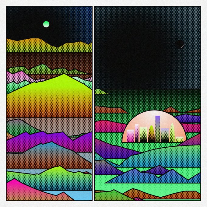
#438 is currently the 2nd most rare, beat only by the amazing #368 with rainbow colors, dark sun, and 2 big panels. ⚫️🌈 I love the contrast of the ominous dark sun and bright colors, a rare combo I wouldn't have imagined.
https://t.co/pQCa36KFFy


Johan my beloved slut man. His talking voice is quite deep in tone in contrast to his very operatic high singing voice. This is also something he would have been trained in since a very young age
https://t.co/AP2X92WGXP


♠︎ Olhos brilhantes ♠︎
╰►Tempo:4h e 20min
Um desenho que eu fiz para alguém que admiro o trabalho @beeddos nesse desenho eu consegui fazer uma boa iluminação e estou feliz por isso! (O fundo é simples pois eu só queria uma cor de tivesse um contraste)


@racchan_ch Thank you so much for this opportunity 🤗 I guess what I like about my model is the overall cozy vibes it gives. Also I like the contrast between my hair to my outfits but they still compliment each other 🍓🐰


in my free time I like to think of the different ways I can show the contrast between Earth's and Mars' sunsets. I'm going to have the gang go to Busan for a vacation for sure. maybe another episode can be a AR/VR student collab project between an Earth and Hellas uni students 🤔


Actually it is, I just use a hard contrast light cuz the little fire is in front of her n.n https://t.co/X4ZbfocZf6


I actually love drawing purple bruises and bite marks on Near. It contrasts so perfectly with his pale skin. They really stand out. Mello would definitely be the type of person to cover Near in them 🤤

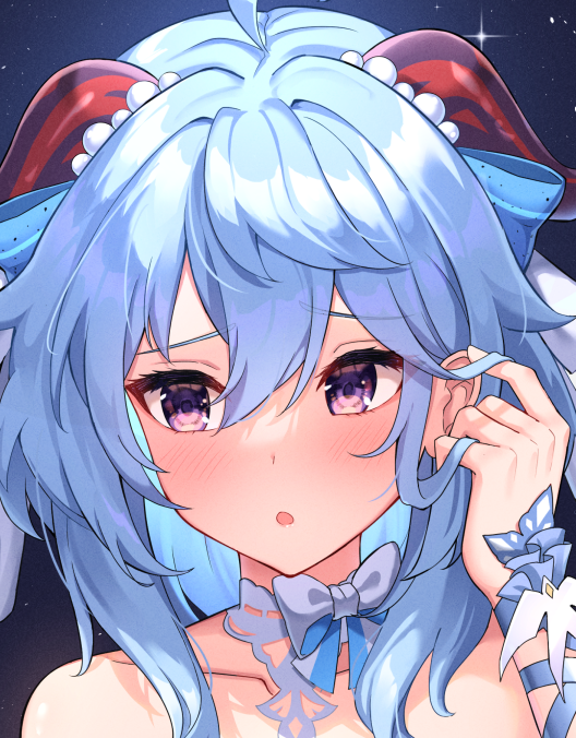
I made Ganyu wear a white/ blue outfit rather than Keqing's black/ purple to show the contrast of their characters

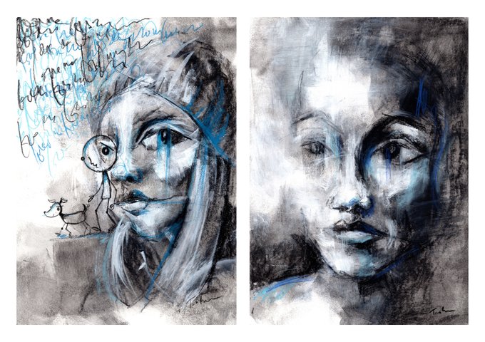
These 2 are looking for new homes from my Total Contrast Collection.
Available on @opensea
https://t.co/7zogKzglal
#NFTartist #NFTpainters #womeninNFT #NFTartist #NFTartists #NFTcommunity