ContrastのTwitterイラスト検索結果。 10,510 件中 171ページ目

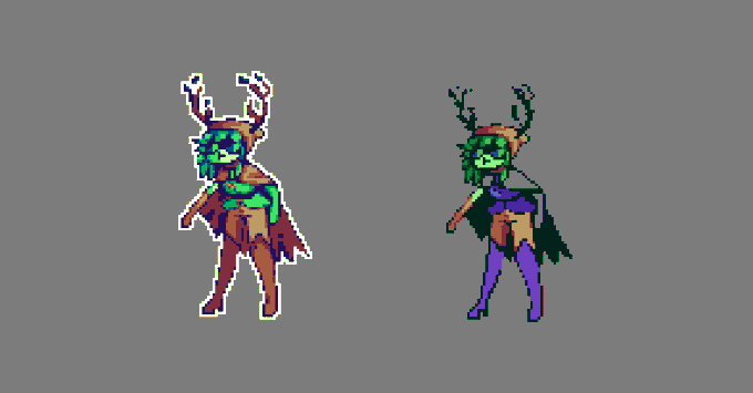
i used the green shirt palette cos i couldn't get my colors to work! i'm finding greens hard to work with. noticed that on my leaf man.
mfw there's no contrast, outline's not dark enough, shading looks too soft, it looks like shit-- i
me just ranting about my skill issue lol 🥲

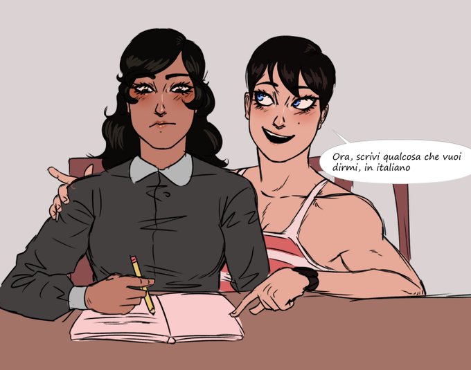
tengo un poco de ganas de hacer algo medio triste entre ellas para contrastar con tanta wea wholesome y no saturar XDD
@estufathenun666


Today's aesthetic is Frutiger Aero !
This aesthetic involves glossy materials, glass, vibrant colors contrasting monochrome looks, skeuomorphism, nature visuals and humanism themes !!


@lissafest But when it comes to Izuku and Ochako, they're openly and clearly YIN-type characters in both personality and design. In contrast to other major relationships such as MiriTama and Bkdk, or other canon couples in the series. I think its a detail to take into account

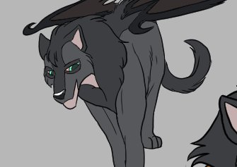
So good so far... To be honest, I am struggling with the colour contrast.


@yulikitten There are are characters with robotic antenna ears in the game for contrast.


The finished designs for Glamtrap and Ilusion Afton for my copycat AU! I love the contrast between them haha.
#characterdesign #fnaffanart #fnafsecuritybreach #fnafart #fnafsbfanart


tried a black mask this time
i like the contrast a bit more


The contrast between this cg and the one they first showed for this scene really hits. #FGO


The above outputs were from training "100 Epochs" and Low Confidence. Meaning that the AI trained a LOT and deferred to its training data for making decisions. It didn't experiment much.
Contrast with these, where it trained for 1 Epoch and had High Confidence.

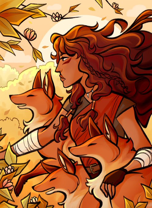


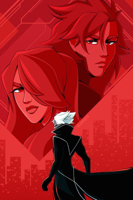
@Kiradraws1 hello there! :) my name is blue and i make a lot of art with vibrant colors and strong contrast! 🫐

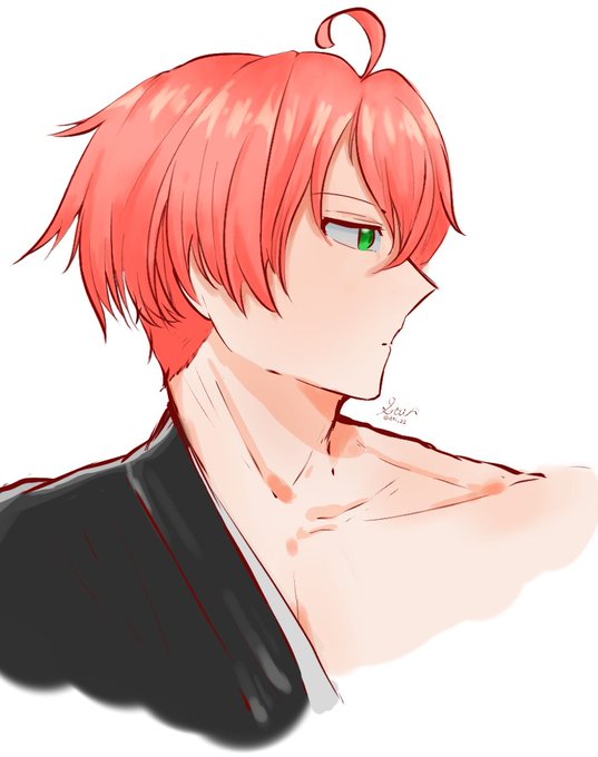


Beautiful art by @Lusan_666 ! I gotten the one on the left as I loved the contrast between full/crescent moon. Soon after, @Lusan_666 created a gift of full moon girl (right). Really nice piece and check out the rest of the illustration at https://t.co/1kMgV6QQuE
Thank you!!


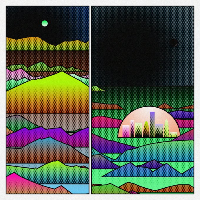
#438 is currently the 2nd most rare, beat only by the amazing #368 with rainbow colors, dark sun, and 2 big panels. ⚫️🌈 I love the contrast of the ominous dark sun and bright colors, a rare combo I wouldn't have imagined.
https://t.co/pQCa36KFFy


Johan my beloved slut man. His talking voice is quite deep in tone in contrast to his very operatic high singing voice. This is also something he would have been trained in since a very young age
https://t.co/AP2X92WGXP


♠︎ Olhos brilhantes ♠︎
╰►Tempo:4h e 20min
Um desenho que eu fiz para alguém que admiro o trabalho @beeddos nesse desenho eu consegui fazer uma boa iluminação e estou feliz por isso! (O fundo é simples pois eu só queria uma cor de tivesse um contraste)


@racchan_ch Thank you so much for this opportunity 🤗 I guess what I like about my model is the overall cozy vibes it gives. Also I like the contrast between my hair to my outfits but they still compliment each other 🍓🐰


