contrasのTwitterイラスト検索結果。 10,765 件中 171ページ目

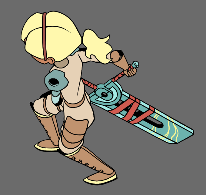

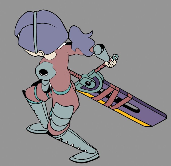

Here's the first local colors pass I did as well as some options that Hazel threw out! The mostly-white one she made really appealed to me for its high contrast and I ended up combining that with my original idea for the final colors (see below 👀)


Spotted the rowdiest ninja catboy aka Viln'ir Jrm'ngandr 🥷💚loved the green & red contrast
#LittleHeartsArtParty #PrimalArtParty


Much 🤍 to FFF🙃 I got lucky. Something magical & remarkable going on here. In stark contrast with the usual apathetic & obnoxious nft scene- the community is genuine, upbeat, silly, and encouraging. The artist is a next level talent- executing hand drawn pieces daily! Im all in


... (or at least what I think is a hairpin) should be. I decided with brown and yellow because those were the only colors that contrasted well when I accidentally drew them off of his hair. You know, when you think about it, this is kinda like En-eff-tees.


@AVNFeatherfault Yeah there's something about 1) the fact that armor in general is pretty awesome, and 2) the contrast between the silver armor and the black feathers just always seemed like a winner to me! Lol! But then again, considering what I'm into....


A PEACEFUL MOMENT
Este es el último dibujo que hice antes de regresar a clases en la uni, y también del que más orgullo siento.
Mi parte favorita es la atmósfera tan tranquila que transmite, con contraste con su personalidad.
#art #myartwork #originalcharacter #CLIPSTUDIOPAINT


Both sides who say XC3 designs are ''censored'' in a positive and negative way in contrast to XC2 are completely dumb and never played XC2.
Because look! XC2 is also censored! How dare they!


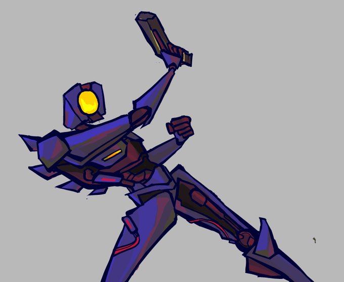

and i tried so hard on giving their individual palettes contrast but ended up colour editing it to hell anyway LOL


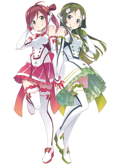
【VOCALOID4】The vocal synth of the hour is Masaoka Azuki.
Azuki is a cheerful girl who tends to act first and think later, in contrast to her best friend Kobayashi Matcha.
Originally released for VOCALOID2, her voicebank wasn’t public until her V4 release.

btw no I haven't forgotten! Just waiting for a quote.
Also yes I did decide to give the cloth some colour for contrast.

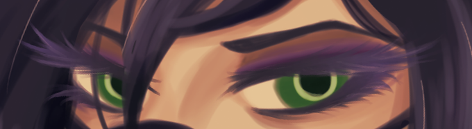
contrast to my suffering, look at her eyesssss ii put a lot of detail becos the mask covers most of her face


Light and dark fantasy AUs complete 👍
What contrasting concept should I do next? https://t.co/Vy2MxCGD0R

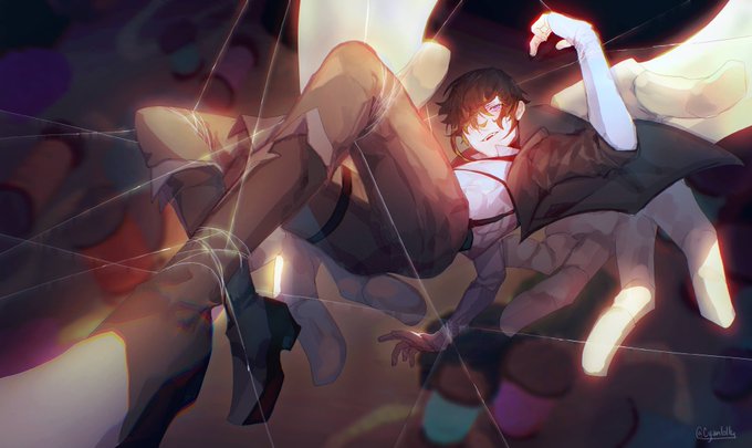

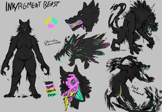


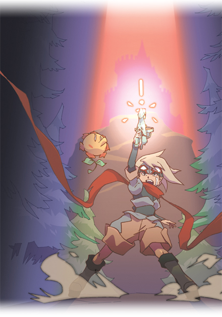


@Riendonut I'm a big fan of the art for Boktai. I love how hard the key art goes, and then you have the little scrimbly characters, such a funny contrast.

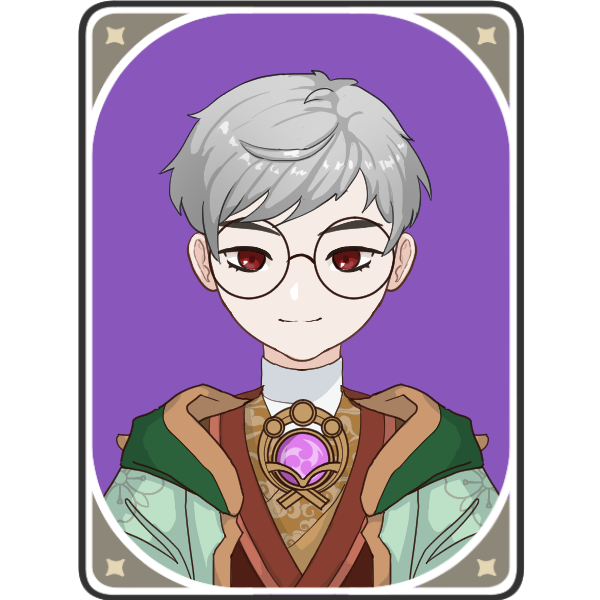
I tried making my own, I always wanted to be an Electro chara hahaha.. I used my fave colors as contrast to the element's color (similar to Kazuha) ... even in genshin, I still have bad eyesight >//<


You need higher contrast.
I can see you focused on light and reflections, but you didn’t put the same care into shadows.
I also made the face lighter to catch the viewer’s eye.
Also, objects can still vary in hue even if lit by the same colored light, like the mirror frame. https://t.co/Evi5JCu2Kd

@peachthyme You need higher contrast.
I can see you focused on light and reflections, but you didn’t put the same care into shadows.
I also made the face lighter to catch the viewer’s eye.
Also, objects can still vary in hue even if lit by the same colored light, like the mirror frame.