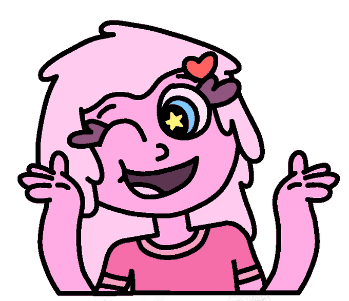
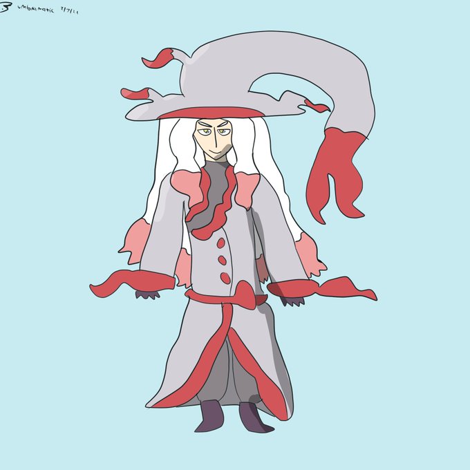
ContrasのTwitterイラスト検索結果。 10,816 件中 174ページ目


I'm messing with designs, would anybody want one of these two contrasting bros? And I'm having alot of fun doing these so I'm tempted to dip my foot into the world of adopts, any advice and pricing and such? Obviously they would be more detailed.
.
.
#art #ArtistOnTwitter #Adopt


Another two that are complementary yet contrasting are Cor / Mark, who are meant to be Snide Mage and Cowardly Fighter


Contrasting Designs:
Kent / Uzu are meant to be a Cain / Abel-esque archetype
Ferrum / Blaise are meant to be Noble Warrior / Bastard Manipulator duo of brothers


I felt like it could still benefit from adjustments especially contrast. Also tweaked some materials that were bothering me. Here's the updated version, and a close-up too
#Ganyu #GenshinImpact #甘雨 #原神


My friend said that my art looks like nfs Most Wanted (2005) graphic.
I know right 😄, it's gloomy but also high contrast.
I actually still doesn't know how to add complementary or ambient colors, so I always rely on grayscale for coloring


『 Pretty. 』
—; Each day, I were to observe different people of the outside world with the help of the void's vision. Today, I got to observe a pretty woman. Her teal-colored eyes caught my attention in contrast to the void's color. I fell quick in love with a woman.


Watercolor #painting of the dramatic #storm sky, titled "Sky No. 6'" (30 x 40,8 cm, 2017). I just love those contrasting colors!
You can find the original watercolor and signed art prints of it here:
https://t.co/BO4WBzUoE0
https://t.co/cSVqObweKm


@CanalBrushRush Me ilumine com a sua sabedoria Guilherme Bruxo Rústico
Tinha feito essa arte pra treinar uma iluminação mais recortada, mas acho que podia ter mais contraste, nao sei


@wooyoungandwild I think a personal favorite for me is how i like playing with more dramatic lighting? Like just being able to make the contrast of highlights and shadows pop more is always a fun process


I re-did some aspects from @FloofyRainer 's ref, and the contrast looks interesting!


Mitsu and Vespa here are humanoid bug OCs, but Vespa contrasts from Mitsu by having more bug-esque features. https://t.co/1RiqNws7W4


Couldn't think of a title for this part:
Slimy and Squishy
[I mainly made Squishy to just be Slimy's nervous and nerdy little sister, contrasting with Slimy with how Slimy's tall & slim with long hair, while Squishy's short & chubby with short hair]
https://t.co/RtgoTwQdms


I generally think I design my OCs around each other, best example Max n Happy. Try having Bonnie contrast Happy and with other villains usually theme them around purple to contrast with buns yellow. https://t.co/CBHNow8nLP


And the final Umbra Plays #PokemonLegendsArceus gijinkas, Luciana the Hisuian Zoroark and Hazel the Lucario! These two seem to particularly contrast each other - fitting.


@WlEGRAF Fig 3: Rando McGoogleimagesearch
now were really getting into interesting negative space and strong contrasts. v strong triangular movement—~15-16 in the body, not gonna bother counting the steep trapezoids on the ribbon or the lacing.


Romance cover-type silliness on Monte Marte 100% cotton paper. The high contrast value areas work surprisingly well (for me) despite everything else being mushy. I can't recommend this paper, it sucks up paint like mad. I guess not all cotton papers are equal. Or it's just me.