ContrastのTwitterイラスト検索結果。 10,510 件中 174ページ目


i messed with the sword colors a bit for contrast :) #art #beidou #genshintwt #artist #genshinfanart


When it comes to your two favorite YouTubers, do they have similar vibes, or is the contrast beyond absurd?


Ballet dancer jump and a waterfall, particularly striking color contrast, and a beautiful feel. Imagine it on your wall! Available in my online gallery.
.
#art #artist #ballet #ballerina #dance #dancer #dancing #waterfall #naturr


How about a look at some @thesevens_7 Season 2 traits and attention to detail:
- multitude of hair styles
- mask variety
- colour contrasts
- art design brings strong post apocalyptic anime vibes
Lets not forget these are just the tip of a 7K collection iceberg! #thesevens LFG!


What makes a composition really soar? It's more than the color, light, or even the subject. It's Contrast!
FREE for Schoolism Subscribers! "The Magic of Contrast: Designing Compositions" webinar with Sam Nielson -This Friday 10 AM PT- Subscribe by 11:59PM PT Wed to join in ✨


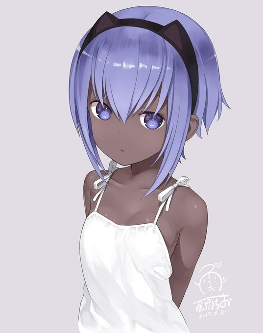
Daily Dose of Waifu nyaa~ ( `3`)
Cute Contrast [Fate]
Sauce via: awwnime - https://t.co/ODKStUc8NO
HD Picture: https://t.co/Ew088XSccJ
Join our Discord server desu!
https://t.co/kbj72mnORh
#Melon_chan ♡ #DailyDoseofWaifu #DevilishMoe
#Anime #AnimeGirl #AnimePicture #AnimeM…

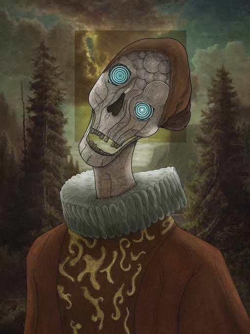
Encantados con @Rodolfodelaluz2!!!
Un #NFTWITCH lleno de contrastes, talento y pasión…
Samsara un genio en toda regla!!!!
Gracias a toda la comunidad que acompañó la transmisión!!!!


Thank you @GebsArt for taking on my commission! 😍 i love the style and the lighting contrast so much!! It shows both the light and dark side of the clouds 🤩


Battler is a scary mid range menace with a lot of + frames and an ability that restores him health, but lacks damage and mixup. This is contrasted with his VN part where he would very good at negating theories (Great neutral and passive regen) but his own theories are weak. (4/?)


Another person with stickers <3 I love the contrast on this one
#digitalart


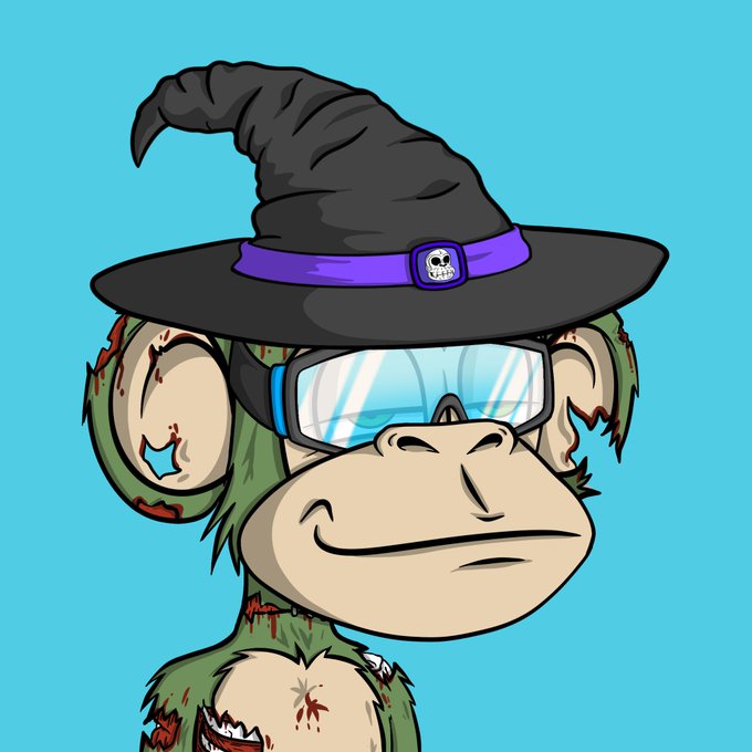
My two JBAC's revealed!
Blue theme, contrasting my PFP's red! 🔥
@JungleBayAC @junglebayio #ApeFollowApe #JBAC


Hi, gege! *no contrast/color correction #tgcf #tianguancifu #xielian #huacheng #hualian #HeavenOfficialsBlessing


@sofyanboudouni Merci Sofyan pour ce tweet 🙏 Les dernières illu que je préfère, passion lumière et contraste de couleurs 😁


wosemi-sama's opening is such a contrast to the other 3 I've got up for this collab lmao


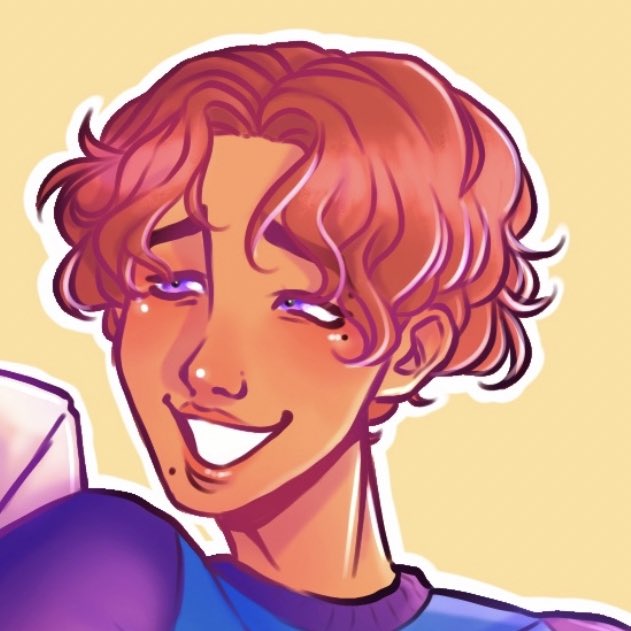

so thr prince had a fairly different (more.. youthful) design before i finally landed on this one
with the stark contrast with their personalities i wanted to draw them both <3
#ArtistOnTwitter #art #oc #Doodles #character #digitalart


proud of this :) they payed me to draw their OC and also design it, they had shown me much darker references but for the sake of contrast i did lighten the palettes from a black cat with black hair to a siamese
they’re loving the WIPs though i’m so glad


The contrast is so funny
The first picture original stress relief but im fine now - hiko
#daveandbambigoldenapple


cute contrasts💖
[#Undertale_AU #errortale #error_sans #underlust #lust_sans #errorlust]