compareのTwitterイラスト検索結果。 22,409 件中 174ページ目


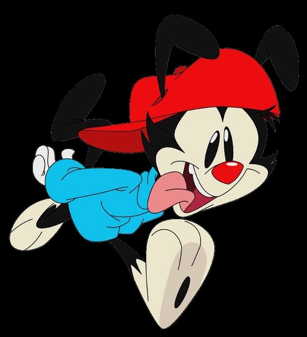


Teeny bit of a ghostboo redesign compared to my old one! I think imma use my old one only in less detailed drawings of ghostboo! #ghostboo #ghostboofanart #dsmp #dsmpfanart #dreamsmp


Mel adores History, but sometimes that passion overwhelms them and they feel too small compared to the universe around them :(


I'm watching a whoisthis git video about the multiple bad endings in the 2nd Nonary game and when I saw Alice(1st pic) I was kinda shocked. Automatically compared her to someone else from the 1st game cause...oppai.


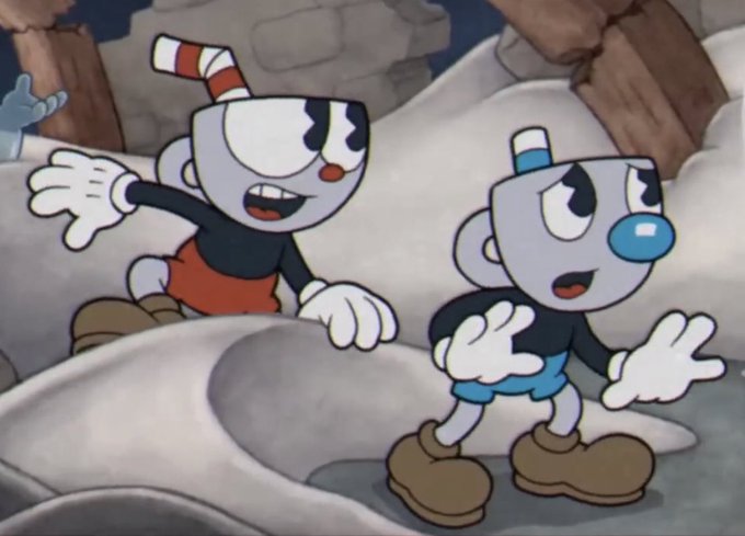
the most standout example is the cups themselves, their heads have a yellowish tint to them compared to the completely silver heads they have in the game


y'know what, why not, let's compare improvement for multiple characters.
Vlad?
2015 - 2019 - 2021 - 2022
(and no, that first one was never finished)


@Philoceratops mama and baba, let's see how i did compared to a skeletal...

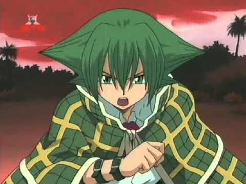

And hey, it's unique to compare it to how his son sounds!
I mean, could y'all imagine if 4Kids had seen Kevin Mask's flashback, the fact he was CLEARLY IN LONDON; even having a "Big Ben"-themed attack, and just made him sound accentless? What a silly thought!
Pics unrelated.


PFP redraw I do every year. It's so crazy to compare this to last year and the year before.
.
.
.
#pfp #portrait #digitalart

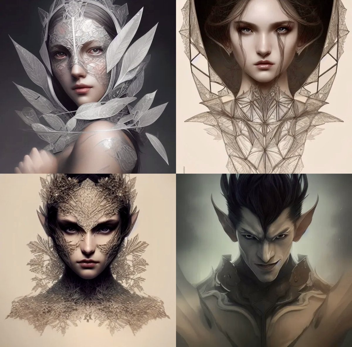
#ai #aiart #aiartcommunity #AIart #AIArtwork #aiartist #digitalart #stablediffusion #portait #fantasy #NightCafeStudio Made with @NightcafeStudio Compare and contrast. I swear I changed one measly word.



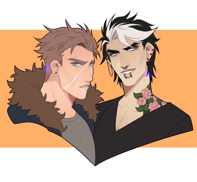

And lastly, these two together...
I have a lot of bat/demon/werewolf/vampire OCs but they're rather plain compared to my other Halloween-y OCs


Anyway jinx was fairly minor compared to everyone else only appearing in 3 actual issues of the old run. The cartoon ended up being more popular and it raised what little profile she had

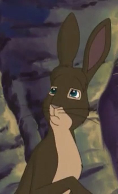
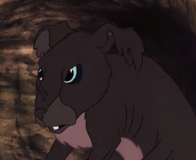

I find it funny in Watership Down how different the tv series Blackavar design is compared to other deisgns. You got two designs where it’s a beat up rabbit that got his ears shredded and then you got this design. Maybe the tv series was trying to be more kid friendly? Not sure


@cynoimpact I JUST KEEP SEEING HIM COMPARED TO LEN
AND LIKE
YEAH-


Ehh i don't think i improved at all sadly
I got good at soft shading but kinda dropped the ball on the backgrounds and sharper details
Nowadays they feel flat and simple compared to what i could do before https://t.co/KSTVZg3iwa


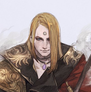

@sleeplustre Not just his enshroud form but in the concept art for his normal form it does look like he got a haircut when you compare his EW art with his SB art.
Kinder makes me sad that in game they just let his old hair clip into the coat rather than make him new hair :(


"Seamlessly translated from Spanish, this book compares favorably with The Three Musketeers, but in a fantasy setting." says Stephanie. 'Traitor's Blade' by Sebastien de Castell Alonso is our recent #staffpicks #fridayreads
Read the full review: https://t.co/427kcWtcjW


@Magician_chan LMAO Thanks! Your ass is nice too, Sarah! Wanna compare sometime? ,;,v,;,