FaultのTwitterイラスト検索結果。 175ページ目


There’s a current Glitch in Pokémon Masters where some characters are stuck with a straight face default expression.


Yeah, it's obviously the fans fault, it's not like you guys suck a it so hard that all you can do are annoying little prick characters, fucked up stereotypes and stone cold characters that share the same personality and feel as a peace of stone in the desert... oh wait. 😑 https://t.co/Qu2x9McEvp


@isla_kawaii It's okay Isla-sama, please don't blame yourself, it isn't your fault that your ISP is being dogwater right now.
Please get some rest, and we'll see you tomorrow. 💙


@isla_kawaii It can't be helped, Isla-sama. 🥺💙
It's not your fault. Have some rest for now. We pray the best for tomorrow. 💙


finally finished!!✨🥺
‘the artist and the critic’
brushes:
basic round (default)
graphite
watercolor wash, soft


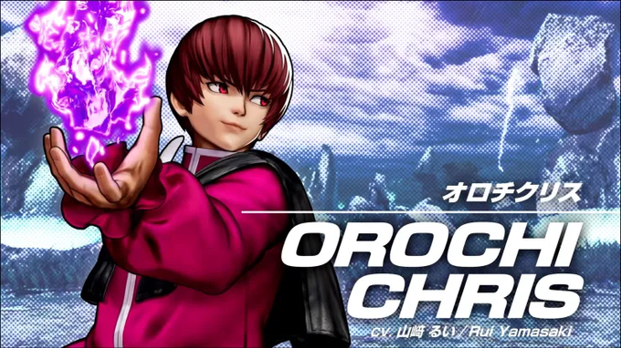
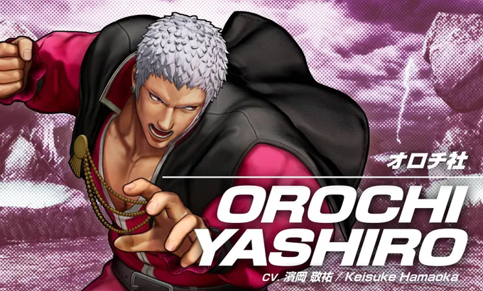
Team Awakened Orochi's default outfit is based on one of their ending illustrations from The King of Fighters '98.


Second to last commission, this time from @minominoten ! I’m glad she chose to go with the outfit for a younger Ritona from Silence the Pedant. Thank you so much for the lovely artwork 🥰
#faultseries


🎶When I scare the last away,
all of the fault will be my own🎶
#fnaf #fnaffanart #blueycapsules #blueycapsulesfanart


@SNKPofficial Too bad they don't have dark skin like in KOF 2002 for their default :(
Nona's artwork of them is still one of my favorites.
I like his artstyle.


Anyway, about the extending neck thing. Midjourney's default aspect ratio is 1:1. It's pretty good with wider ARs, too. But tall images sometimes look like the machine tried to fill up the space by doubling the image. So I tried 3:4 and 1:1. Why did these turn out so creepy???


we got lovely Alora. she designs FASHION and outfits. Shes also Remi's ex girlfriend. she's quite bitter toward remi. theres a reason for this, but I cannot just simply reveal why yet. but lets just say.... It's remi's fault...... #HelluvaBossOC #HelluvaBossFanart #helluvaboss


Enough grayscale, though! Let's try some color stuff. Left: "color". Right: "colorful". Unsurprisingly, both are brighter and more stylized than the default Obamas, and "colorful" moreso than just "color". Top-left Obama is acting weird again.


That "::1" bit defines the weight or importance of the term (1 being the default), "--ar 2:3" is the aspect ratio, and "--seed 1" sets the seed for the generator so that I can get more consistent results. Running the same prompt again produces ALMOST identical Obamas.


Tsunomaki Watame: It wasn't her fault @tsunomakiwatame
#つのまきあーと #hololive #Vtuber


Thanks, Patho! I'mma do this tag because the picrew is adorable, heheh.
Contrary to popular belief, I do not crave hotdog water. My default go-to is poutine, pulled pork fries, or chili cheese fries! 🍟🍟🍟
Tag: You're it, ovob ✧*:・゚
🎨: https://t.co/Tpx8Ve2WYW https://t.co/L2pfFlKung


Just bought 2 new brush packs to try out! I’ve been using the default for ages, so I figured why not try something else for a change? If you want the link to either just let me know, they were each $5.


Ok, I know the Fredbear design debate is basically over by now, But I would like to say that its kind of everyone's fault for thinking Fredbear wouldn't look like Golden Freddy when both of these nerds look exactly the same.