compareのTwitterイラスト検索結果。 22,409 件中 175ページ目


Lately I've been having some problems with the design of my robot characters, so I made these drawings trying to see various options and compare them with the original design (I would appreciate if you could give me any advice or opinion, it would be of great help) #robotart


'War' and 'Move that crucifix a little to the right...'
by John Heartfield for AIZ (Arbeiter Illustrierte Zeitung), 1930-37.
Who's our best political montagist now? Does anyone even compare?
https://t.co/zmbr2ahgWq


#TGIF my perfectly coiffed Booties!
Today we disappoint our moms.
Compared to every other day when we exasperate her.
Tapas: https://t.co/Ms7cvxYAkj
Webtoon: https://t.co/t2sZ0SFYSp
#comic #webcomic #bootlegcookie #shiro #mamashiro
![[lysithea voice] no, YOU'RE baby *unmakes you*さんのプロフィール画像](https://pbs.twimg.com/profile_images/1817742831412240384/tlaCTQaO_normal.jpg)


old morpho knight art exists for the game back when it still known as "kirby gcn" (though with some differences, compare the sword designs between the prototype on the left and the star allies design on the right)


Sad I don't have a full recent Lin illustration to compare but there u go! https://t.co/9NFczcEKeM



Its amazing to compare how much the artstyle improved over the months :o


My attempt at this sunfish. Trying to get the hang of drawing him again but it is proving to be quite hard. Nonetheless, there's improvement compared to the first...
Can't nail down his hair.
#orv


Conceptart of an Alnare from my headworld, his name is Eòghan. In lore he & his family are a variation of red dragons, their colors are less saturated compared to the standard red.
#conceptart #conceptartwork #twitterartist #art


got around to filling out the otome twit intro ♡
there's a lot more LIs i could have included but honestly none of them compare to my top fav 2
#otometwtintro


not finished but i wanted to compare the proccess
Like rendering makes it a whole lot better, but whenever im cleaning up the art it usually loses a good amount of character/personality expressed in the original sketch


Hello everyone! Im happy to announce i finished Rayzee's ref sheet after a good while (had a break), and as i promised, in this thread i will expand on more info about Rayzee! He has changed quite a bit, and alot if you compared him to his old design which i could show later on!


Okay no it needs to be said
Myaxx was a fuckin' baddie in the Original Ben 10 Series
Idk what's compelling me to say this but
it feels *right* compared to her redesigns in later series
Like, they're not bad but...
Y'know??

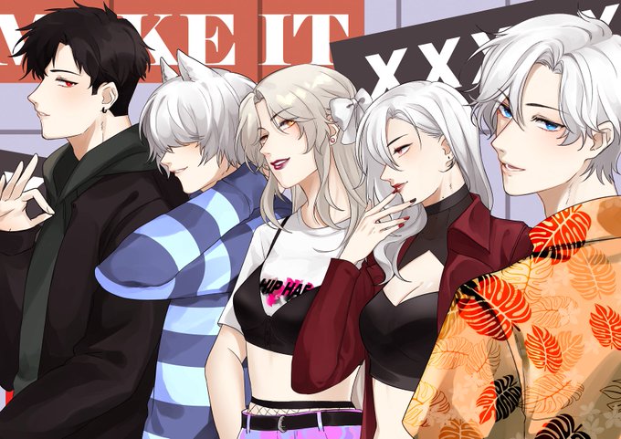


2020 > 2022
I don't actually remember what i drew in 2020. I drew more OCs I think? dont think there's much improvement compared to now ( ゚_ゝ`) https://t.co/LCM5JCGaTQ


Let's start with the sona herself, Jellybeep! Not really sure what there is to say about her aside from she's kinda like like a gryphon but her beak isn't like... hard? I compare her to Muppets a lot. She's just soft all the way round and probably made of dreams and cotton candy.


@peridoxikal Spea Tatsuya, younger sister to my main OC Ansoni. She is quite a spunky individual that aims to look good while kicking ass and to do what she can to be her own person as to not be compared to her brother all the time. But like Ansoni, she belongs to a now extinct alien race.


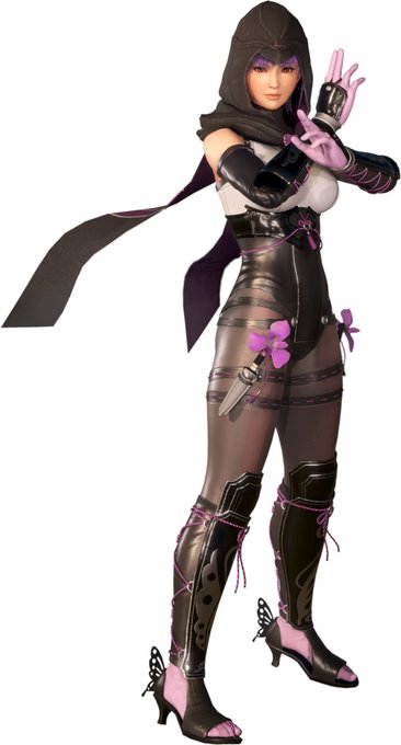

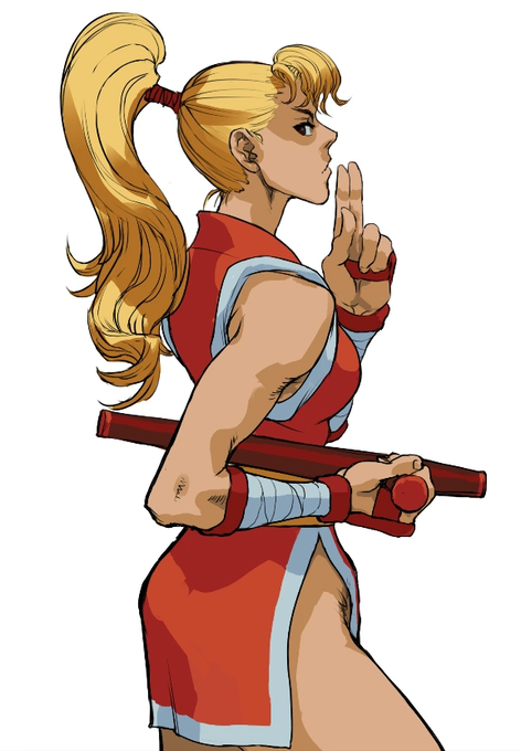
She doesn't have anything that makes her identifiably a ninja ngl, she looks more like a shrine maiden more than anything (which she probably is knowing Overwatch). Compared to some examples here, she really ain't it.


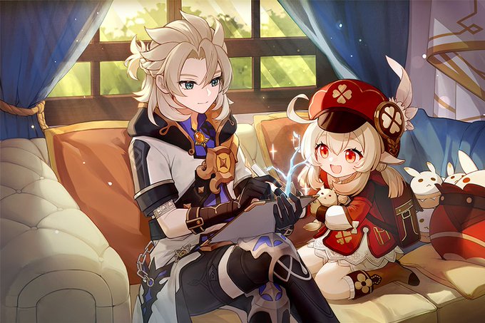
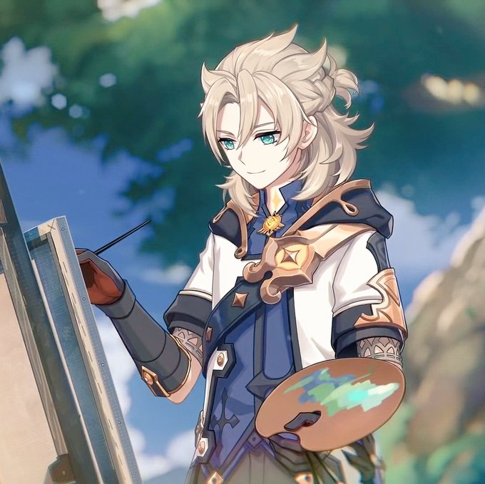

@chrollophobic1 exactly like,, his birthday art looks so weird compared to any other official art of him. they really need to get a different artist to do the birthday art cause this is insane


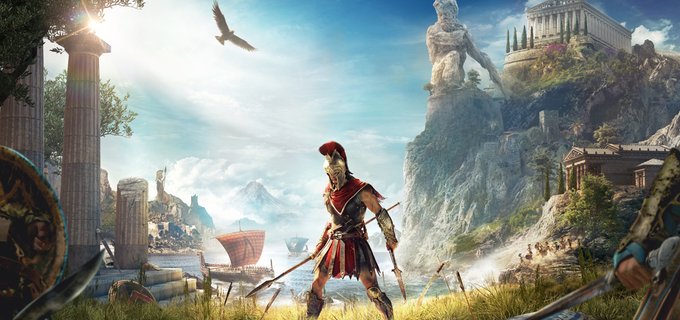
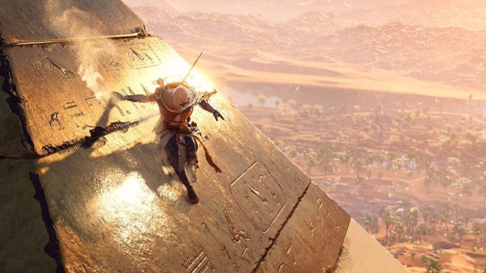
Indeed, the way in which AC simulates the past has grown in complexity together with the series' success. Compared to more recent entries like Origins, Odyssey, and Valhalla, the first AC seems simplistic both in its virtual reconstruction as on its treatment of historical info

