ContrastのTwitterイラスト検索結果。 10,510 件中 178ページ目


did a study to squeeze out more XP from that last render
left is a more reality grounded lighting situation, right is more stylized
ive found that DB chooses to let character tones have priority over lighting colors.. probably for simplicity, contrast and readability

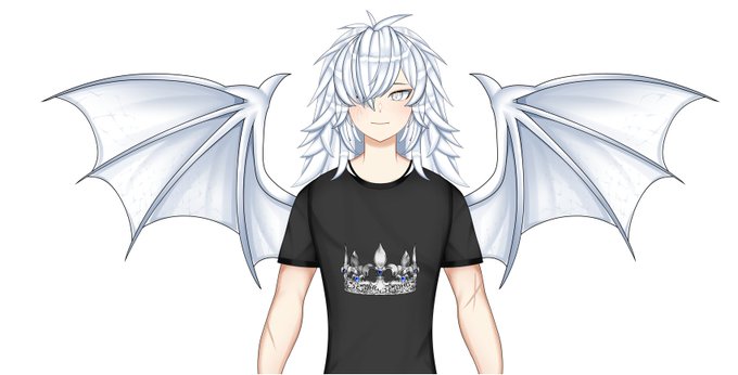
@martianmeghan Man I love that I can finally participate in these kinds of posts😊
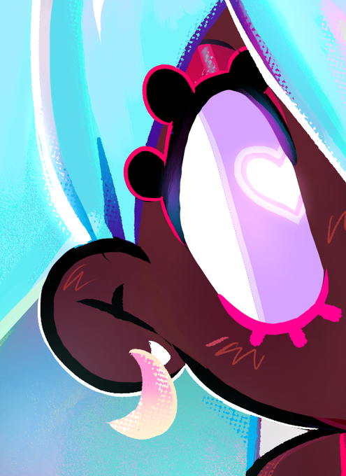
I'll start by saying I love your eyes, they're really pretty. The gentle contrast of the purple, pink and light blue really make them look nice


Stage 3)
🐦Second layer of colour for more contrast
@winsorandnewton #cotman #watercolor #painting #artwork #instaart #drawing #fabercastell #illustration #worldofpencils #sketch #artist #artes #pencils #arte #pencil #draw #carandache #sketchbook #pencildrawing #winsorandnewton

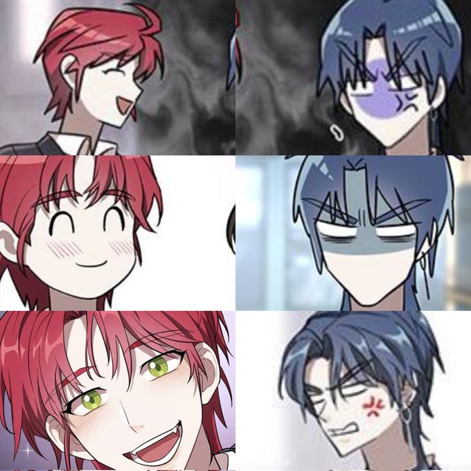


for these I’ve used Grain from the Camera Raw settings, and I can see it doesn’t give me the rounding effect even with bright higher-contrast pieces (unlike the Filter Gallery > Texture > Grain @gijothehydroid uses that works fine for the low-contrast works)


Quería ponerlo junto con el anterior pero me dio cosa el contraste de los dibujos jalksfjak #Volkacio

One thing i found i couldn't get down properly throughout the whole painting was the face and eyes. I struggled bringing definition and shading like @/toorurii does and she also makes the eyes pop out a lot more with high contrast colours.

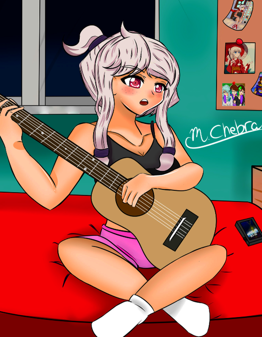
Quando eu fui postar no twitter, eu fiquei brincando com os ajustes e contraste e acabei fazendo ela pardinha e EU AMEI


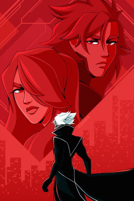
@AndresFColl hi hi! i’m blue, i make a lot of art with vibrant colors and strong contrast! 🫐


I know I’m still not very good, but I wanted to draw something based on Jenna’s new instagram post because the contrast between Tyler and Jenna’s eyes is stunning!
#cliqueart @tylerrjoseph @jennaajoseph



Even I feel that my line art are more better than before hehe(The other one has a higher contrast) #metalsonic


It also contrasts with the chelicerate-like neuroanatomy of Alalcomenaeus, a megacheiran supposedly more distantly related to crown-group chelicerates, which possessed homonomous limbs posterior to a pair of 'great appendages'. More info: https://t.co/fOhKpcNl9n


Colour theory!
I suggested adding blue to compliment his theme of yellow, to make those detailed areas pop more.
His hair has a blue sheen and he has bright blue eyes, which makes his yellow cyborg eye really pop in contrast when he takes off his glasses.


Steven Universe with the Venom symbiote!
Idk why I wanted to make this but I guess I just wanted to see the big contrast between their personalities together
Program: ibisPaint X
#Venom #StevenUniverse #digitalart #symbiote


Daily JoJo Fact N301:
The battle theme made for AU Diego in the JJBA game “Eyes of Heaven” is actually an arrangement of DIO’s theme from the same game.
This obviously due to contrast how this version of Diego shares a lot of similarities with the original DIO.


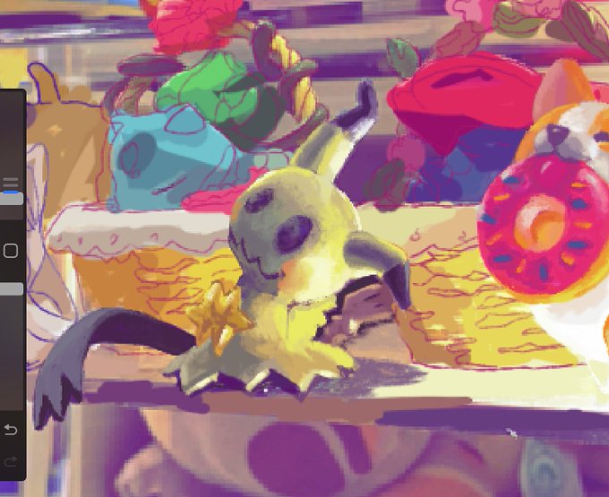
more tv catch up (too sick for boba fett last week so caught up + newest episode then put on mando again) and more painting noodling, mostly deciding when im gonna copy my photo ref (which im working on top of) & when i’m gonna push for more contrast (the first image w/shadows)

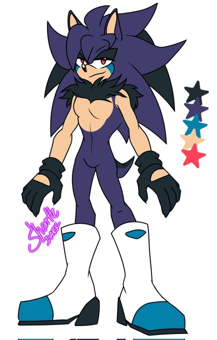

#SonicFc #Fancharacter #Custom para @panpan97945401 🥺🤧❣💖💖💖💖 el elegido es el azul pero quise poner ambas opciones para que se viera el contraste aca somos simps de los erizos azulitos🥰


