CONTRASTのTwitterイラスト検索結果。 179ページ目

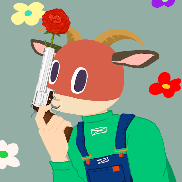
@rugpullfrens Picked this poor guy off the floor a while back, and he's probably actually my favourite. I just love the way he pops off from the contrasting background. Plus the guns and roses are cool. He's my only goat too!
Now he has lots of Frens.
Love it. <3


Warren & Eudoria for @sara_rokhov!
I'm in a Witchlight campaign with these two and it has been an absolute *delight* to see the bubbly/stern contrast ❤️

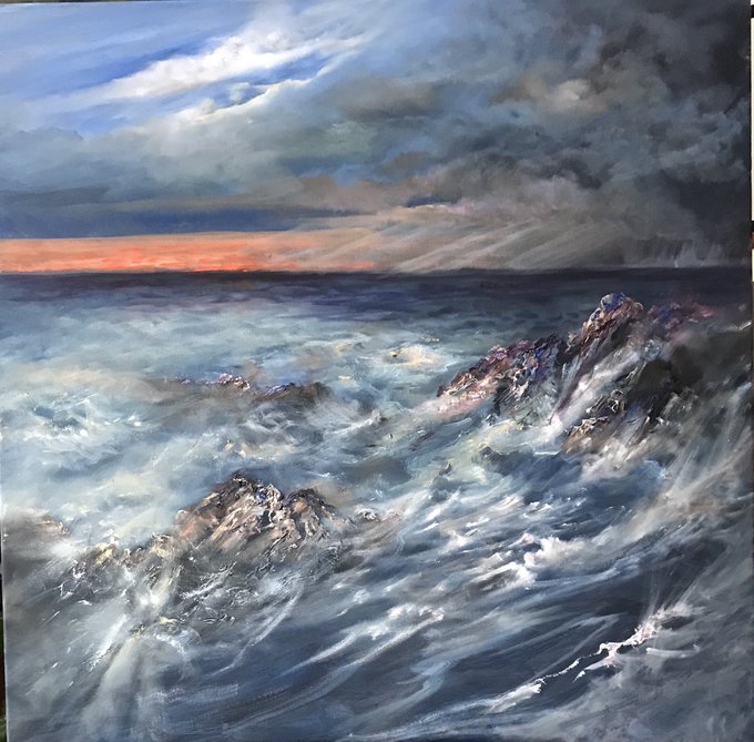
Some wonderful colour contrasts with our stormy and very mixed weather. Oil on canvas 100 x 100 cms

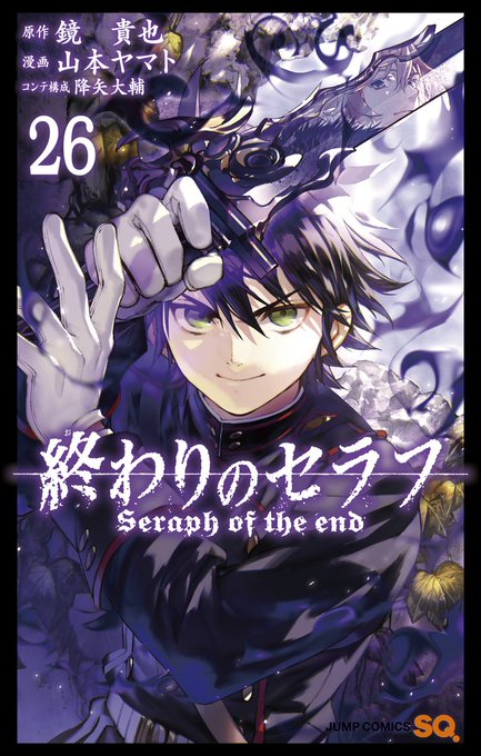

The warm and cold colour contrast between the last two covers is making my brain tingle



@Tigenki Dog keeps most but loses his hair markings like so
Wraith would lose a ton but still have his piebald sections contrast with the rest
Quince would lose most apart from the darkest sections
Nexus keeps his but some are way less noticeable
Ivor loses almost all of them save like 1


I made a new character in my absence, this is Emma Harding alias Jack Henry, i tried to make her color design be "high contrast" with a hint of purple
she wears a fake mustache!


Synchronicity ✨
Colorful contrasts, artwork from 🇬🇹
https://t.co/GkGsxIbINU
https://t.co/RHCVe9p5j0
#nft #drawing #NFTCommmunity #NFTCollection #digitalart #digitalpainting #art


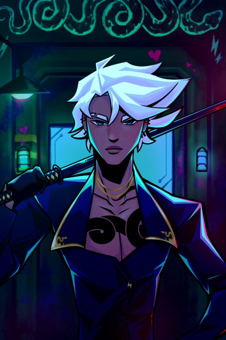


@jiadoodles hello there! i’m blue, i enjoy making art with vibrant colors and high contrast! 🫐


The dark Horsehead Nebula and the glowing Orion Nebula are contrasting cosmic vistas. Adrift 1,500 light-years away in one of the night sky's most recognizable constellations, they appear in opposite corners of the this stunning mosaic [read more: https://t.co/hp6a0GlyvV]

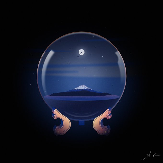


@wildalps @MonikaNFT @spelden @worldofwomennft @alphagirlclub @WoWPixiesNFT @leaf_swan @lonely_leafs @ariafaithjones @cryptopom1 @KatalinaOoma @nftlisa @arlekin_julia @soliiiart1 @NaimePakniyat Thank you my sweet Domi 😘
I'm a 1/1 vector artist, in love with minimalism, contrast and gradients. I create emotions through my art 💖
Here is some of my work ✨
I also recomment @izzzikim @rebellicca and @lunaleonis whose work I love and admire 🥰


some homework I've done. We could draw whatever we wanted : ) I drew the second one first then the first one second. Going between them was interesting. Such a contrast in style. Lots of fun. : )))


In such a lovely contrast, I present this collaboration with @NekosdART 🥰 They provided the lines for me to play with! More experimentation, without the stress of starting (which honestly, I'd love to do more!!).

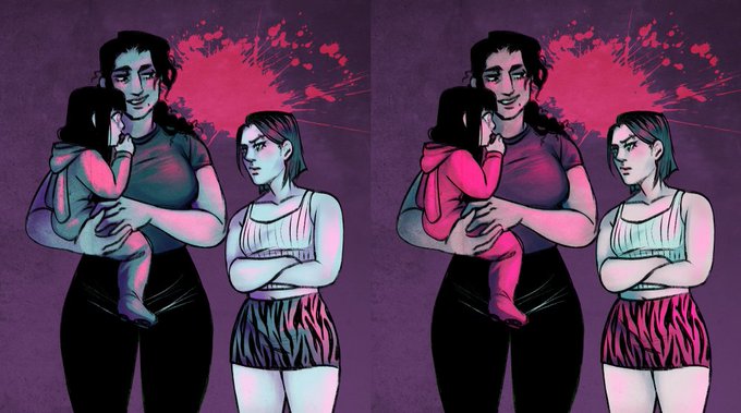
Trying to decide on color techniques for my Hun Bun project. The first one makes my blood splatter stand out more, but the second allows more clear contrast between characters. Would love to take a vote for which y’all think looks better.
Poll in a second. :0


@BajaGryphon i think i really enjoy the way i work with colors and the contrasty look of my work. i'm also proud of the progress i've made over the years!

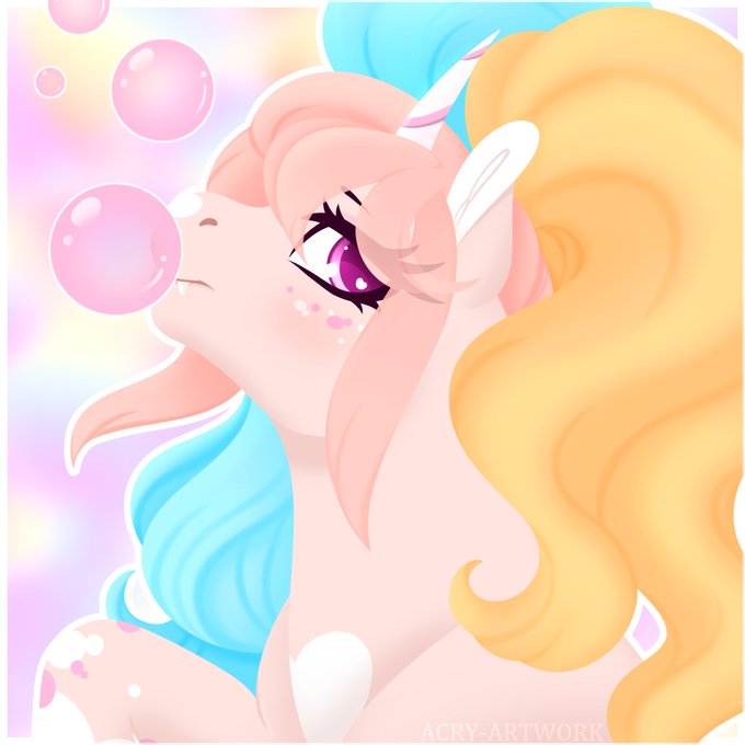


@BajaGryphon I love the colours in my art, the big bright eyes, how I can contrast between soft and harsh, and different themes, it's a lot of fun to experiment!!💛✨


If you like the new Joel Coen treatment of #Macbeth you might like my 2016 graphic novel - compare and contrast. Not cool. @GeekVibesNation https://t.co/zayHs4LmWn #shakespeare


@redwaterburns I asked other ppl for their legit criticism.
I didn't change the base color because I firmly believe that I picked the correct color.
They said it's just lack of contrast that made it look light.

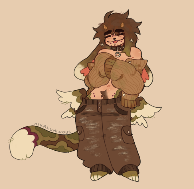
colored the sona redesign from a few weeks back :] i lov earthy tones sm Meek's dirt gremlin look contrasts Lumi's vibrant pastels sm they both represent diff parts of my personal taste tbh so i consider them both equally my sonas