ComparisonのTwitterイラスト検索結果。 22,246 件中 179ページ目


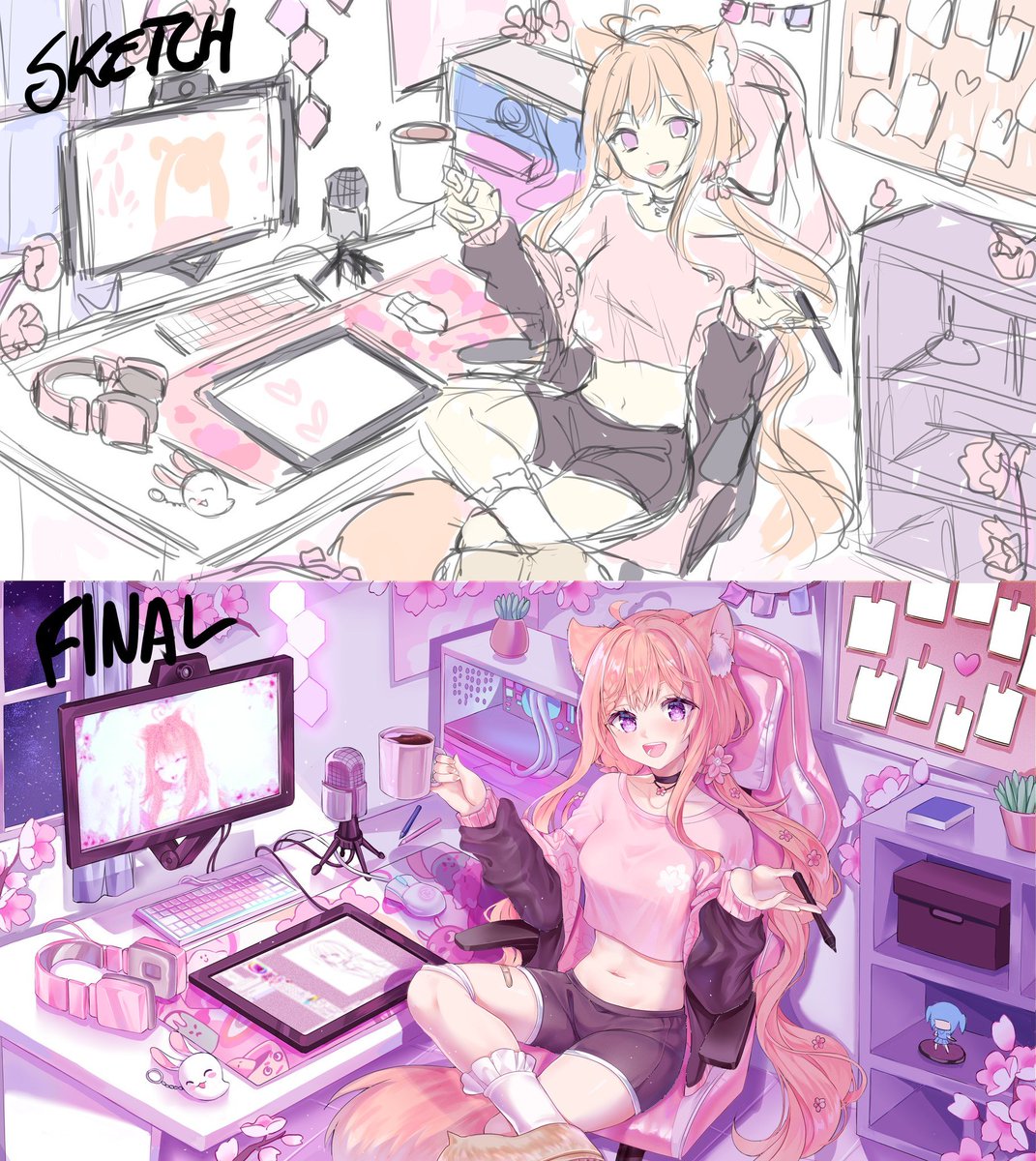
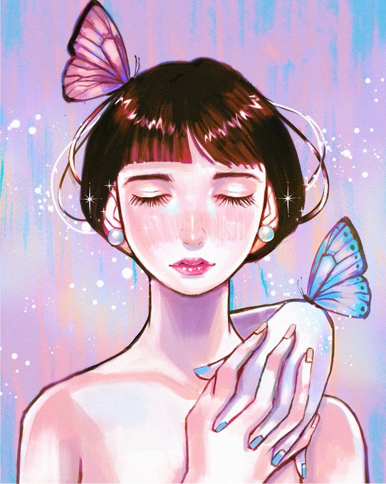
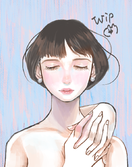
heres a fun little comparison for main and an exclusive sneak peek of a wip... look at how much my particular brand of lineart elevates my work!! i love the way i do it and it always looks so nice and i feel on top of the world rn ngl


if we take this further even silk specters costume becomes a commentary of sorts on the portrayals of women in genre media; that’s an extension of the costume in the book itself, which seems modest in comparison to its film counterpart


i keep changing his design so much aahh
minor change with the neck and jaw colors. before his neck was a lighter shade of grey in comparison to his jaw, now it is the opposite (it makes his face stand out more i think)


@bluwolfblitz Also obligatory comparison to posting this image anywhere, lol.


Decided to revive my Peachette sticker series for 2Dcon so I’ll be uploading them daily with the comparisons. I’m really proud of seeing my chibi improvement! Here is Chompette! 🍄👑⛓
.
#chompette #supermariobros


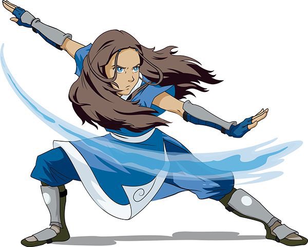
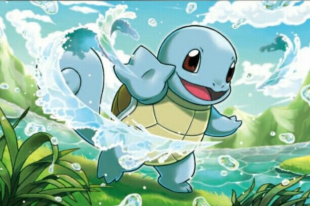
@HOYDYT LOL bruh .2 seconds googling and the comparison is perfect. Avatar = Pokémon people case closed 😂


Inspiration for this came after seeing 6.1's "Secrets of the Realm" patch and realizing, damn, Azeyma looks like some sort of alt-universe Kiwawa. Official art for comparison, Copyright Square-Enix. :D

My painting is about the importance of mental health. When I was young, I ignored my feelings and focused on other people's opinions. I always felt like I wasn't good enough in comparison to others.
🧵(4/5)


I completed another emote redraw this morning!
It's funny because despite wanting to do this, I put it off for so long thinking it would be such a chore to do but I'm actually having so much remaking these and it's really addictive to see the direct comparisons 🤭


Prompt comparison, then and now..
"a painting of an octopus in the style of Salvador Dalí"
Left = Big Sleep, 2021
Right = #stablediffusion 2022


Some ghastly ghoul redesigns! I'll put their old designs in the comments for comparison

