TypefaceのTwitterイラスト検索結果。 605 件中 19ページ目


It's funny with the last two volumes for part 4. In black and white they have different translations because The trio did all of part 4 in black and white and daxing dan put out the last two volumes of part 4 in color because they finished out. Then the typeface was redone


I'm late but the graphic design of the new tour merch is 👌 💯
The Electric Night 2020 logo is soooooooo nice
The typeface
The colors
😤 🙏 Good


“Nichrome” (https://t.co/SzoiIRWeag) by @rutherfordcraze for @mass_driver_tm/@futurefonts “is a display face referencing the typography of paperback science fiction from the 70s & early 80s … not by reviving any single typeface, but by capturing elements of many” #366fonts (112)


Welcome to Future Fonts, @mass_driver_tm! This foundry is in The Hague, Netherlands and run by Rutherford Craze. Check out Nichrome v0.1, a typeface inspired by science fiction paperbacks of the 70s and 80s. Available now! https://t.co/48VH4eRHP3


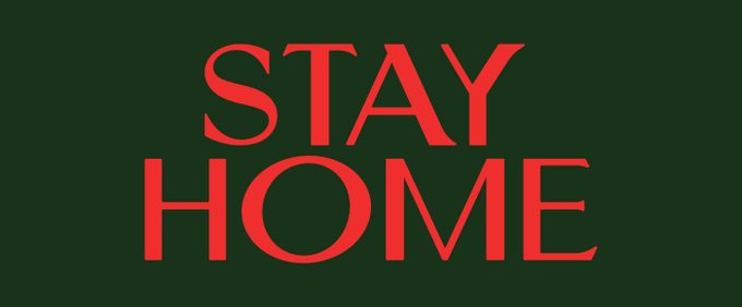

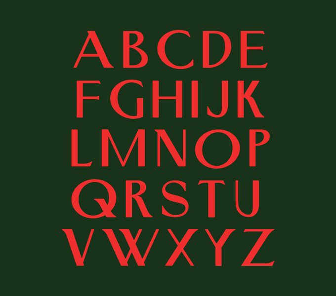

FREE. STAY HOME — https://t.co/WOBcmS4Pkw
#free #freebie #font #typeface #stayhome #coronavirus


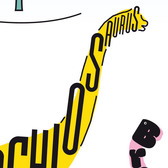
I'm excited to announce a book project I've been working on for children called 'Fontosaur'. It will be available to buy online very soon. Here's a little teaser...
.
.
.
.
.
#fontosaur #dinosaur #colouringbook #booksforchildren #children #book #font #typeface #letters #alphabet

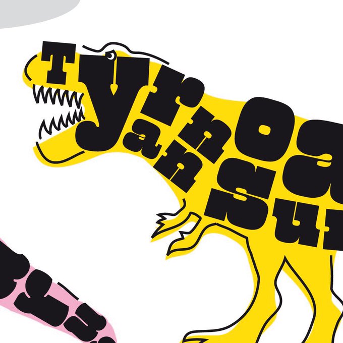


I'm excited to announce a book project I've been working on for children called 'Fontosaur'. It will be available to buy online very soon. Here's a little teaser...
.
.
.
.
.
#fontosaur #dinosaur #colouringbook #booksforchildren #children #book #font #typeface #letters #alphabet


"Carbon" Typeface
A personal favorite.
I am taking commissions on brand design, typefaces, and more.
If you are interested in purchasing a commercial license for this font, or any of my other fonts, please get in contact.


Finished up 100 days of drawing type every day since January 1. Sometimes 15 minutes, sometimes 3 hours—worked on creating 3 typefaces that started from lettering pieces. I chronicled my progress in my instagram stories every night: https://t.co/U7sBnOBNbA
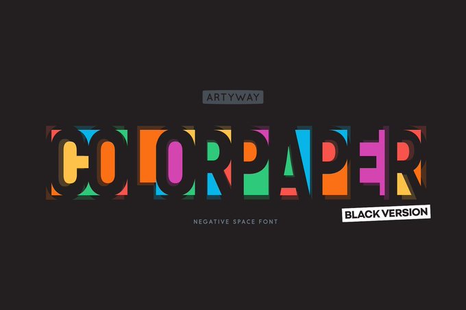
FREE. Negative Space Font — https://t.co/arTnoEBUus
#free #freebie #font #typeface #negativespace #typography


✨NEW RELEASE✨ Ompu, a new typeface from @teotuominen, is a heavy, condensed, sans serif, with sharp angles and tight spacing. v0.1 includes capital letters, numbers, and symbols and is available now for print, web, and app.
https://t.co/wCXrQViquB


In memory of my dad who passed away a year ago today, I designed this typeface called Sawad as an exploration of grief, and the hollowness that follows the loss of a loved one. The font is now freely available to you all, a loving gift in his memory: https://t.co/ToakcY30Du


"Compressor" Typeface
Bold, loud, uppercase counterpart to "Wax."
I am taking commissions on brand design, typefaces, and more.
If you are interested in purchasing a commercial license for this font, or any of my other fonts, please get in contact.


Indépendant specimen, typeface by G. Colette and J. Dufour, Etablissements 'Plantin' (Belgian subsidiary of the Amsterdam Type Foundry), 1931.


FREE. Bigilla™ Typeface — https://t.co/Zegs2eTguR
#free #freebie #font #typeface


“Majorant” (https://t.co/tFbKfoEiwt) by Eduardo Manso for @emtype is a geometric font family that in some ways alludes to classic typefaces like Erbar but is by itself a very contemporary design. Spiky angled terminals, diagonal cuts, & long tittles make it unique. #366fonts (77)


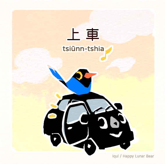
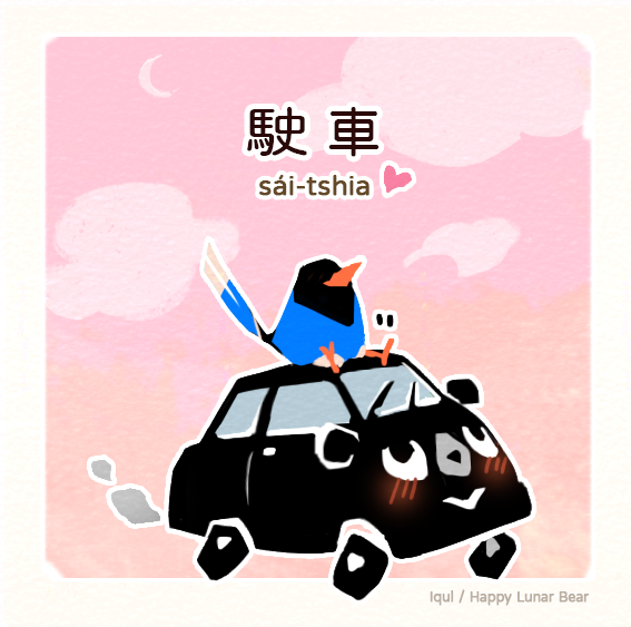
Let's use the Huninn typeface!
Lán tsò-hué lâi sú-iōng Tâi-gí tsuan-iōng jī-hîng -- Hún-înn!
咱做夥來使用台語專用字型-粉圓!
About Huninn:https://t.co/cUP0LJklNs


“Referenz Grotesk” (https://t.co/xDQ7YiruPg) by @StefanieBlack & Dirk Wachowiak for @sudtipos is a neo-grotesque typeface “full of references referring to the type design history of Stuttgart State Academy of Art & Design”. Lots of stylistic alternates, 4 flavours. #366fonts (70)