comparingのTwitterイラスト検索結果。 3,742 件中 19ページ目
IT GOT MEANER!!!
(kidding it’s always been a bitch)
#glassmindVN
[not an entry just comparing the old and new character sheets, I liked the 3rd pic the most. 5 month improvement hell yeah]
This is the best drawing I’ve done of Ivan’s facial proportions xD Maybe I should have art blocks more often if I come out of them able to draw my own ocs 10x better lol.
Comparing it to the last headshot I did of him (and omg the first) is wild
(Comparison in next tweet 🔽)
Aight took some time, but here it is
Kamiya Mizuki V2 render, whatcha think? Comparing to her early render lol
+ Tweak her hair to make more sense
+ Change hair clips position
+ Extra details one shirt and boots
+ More define body
#MizukiOOB #sonicexeoc
@GirlyWolfPup NGL, the Sonic Discourse kinda reminds me of a few years back when people were comparing Demi Fiend's artwork in SMT3 and 4.
I also burned bridges this year. I won't go into those details but I bring that up due to the change I've also had in my OCs. I figure if you've followed me long enough you've noticed Silvia's personality change 😅 Comparing her from the beginning of the year vs now 3/5
i watched a video comparing the half life 2 retail version and the beta version and i wanted to make a drawing of that! :3 kinda janky because of the colours but wathever
@BunkoGenki I couldn't decide between comparing illustrations or a character pose I redid earlier so how about both?
these probably aren't the best images when it comes to comparing progress made because they are out to achieve very very different things. but also the change in art direction for me as a whole is probably a lot more interesting than anything regarding technical skill https://t.co/RSOqnHw5Bf
2020 on the left and 2022 on the right!! Tried to find pieces of the same subject for easier comparing https://t.co/TKoOSI8FrR
#NewProfilePic new sonaaaaa
+ sketch ver bc i love comparing before and after
I feel kinda meh about this, but I know this is my first time rendering (like actually trying) :/ it sucks comparing art to others, bc you feel like urs isn’t good enough
@IvyNyabula Just doodle stuff! Don´t focus on technical stuff etc at the beginning, just draw! When you did that for a while you can start practicing. Comparing my old work w/ my new stuff always helped me stay motivated! (4 year diff)
hi noah! this is past you !! youve just hit 14k tweets, and you have 1,106 followers!! the current date is sept 7, 2022! this tweet is gonna be sent out three months from now, december 7 of 2022!!
i cant wait to see how youve grown !
below is your most recent art, for comparing!
genshin art by me? more likely than you'd think :D especially when it's me and @gaytorarts comparing his piles of muscle and my twinks (aka our artstyles)
#childe #tartaglia #Genshinlmpact #Genshinfanart
Comparing with the same character too from beginning of the year to the end, think my colors are a little better hopefully? https://t.co/Cil8kfU8CN
Comparing these two artwork is so funny, he looks like they bred him to lose his nose like a pug
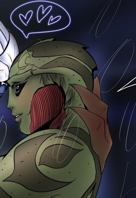
So like saw someone post about comparing your beginning of the year art vs end of the year and decided to just see how my fave alien boys have evolved this past year and :’)
Jan 2022/Nov 2022 differences 🥹
Every time I see a fellow human being comparing an artist's job to a truck drivers' -- or any other type of manual labor job, I get extremely sad. We don't spent decades learning and creating our own expression/style, just to be plagiarized and exploited. 🖕.
#HumanArtists


