comparison.のTwitterイラスト検索結果。 2,234 件中 19ページ目
Here they are, with the originals for comparison.
1 - Ace escaping on her motorbike
2 - Arkhew and the Drudge
So today I'm remembering this thing that Brainz (internet friend) and I dreamed up, an over-the-top space pinball game called Hyperball.
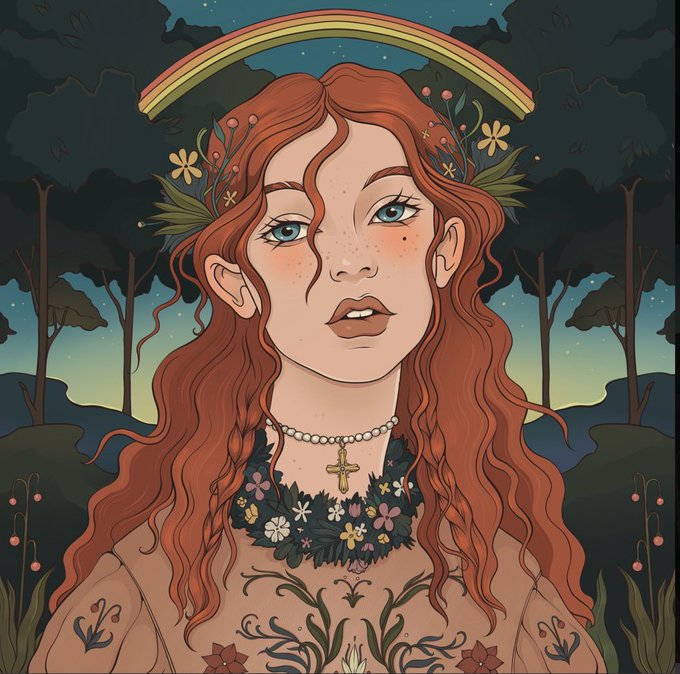
Here's the avatar design I cooked up, with an old-and-new design comparison.
Old: June 2020
New: October 2021
Rework of Bibimba for patreon, old version shown for comparison.
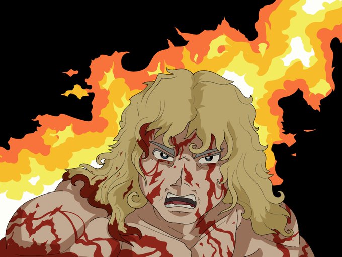
#kinnikuman
People always talk about that one Simpsons Babysitter scene, meanwhile in BTAS' first episode, Harvey Bullock made her look cheap in comparison.
Quick finished doodle of a certain someone 👀
So, the Oni you already know is Red Oni, so meet… Blue Oni.
He wears makeup to cover a lot of his blue hue and markings. He’s also a bit more serious and withdrawn in comparison. Lore to come~ 👹🖤
#vtuber #VTuberUprising #OniFams
This is me having a go doing something more experimental: trying to replicate an old 80s/90s anime style! The kind of thing you'd catch on a bad TV. Here's the OG and the post-composite for comparison.
///i'd understand if they didn't want to pull his design from the anime OR manga 1-1, but the redesign feels VERY simple by comparison. i definitely prefer the hippie dieselpunk rivethead look to, urban guy in a hoodie with gigantic metal arm? its still cute, though
@Creature_SH Combining artists is something that makes #midjourneyai work well, so I ran one of the prompts through a few branching evolutions for comparison.
Prompt: a portrait by simon bisley of lucille ball in the style of frank frazetta
Rework of Terryman from last week, old version shown for comparison. #kinnikuman
@Eisues You're welcome. I had the Batman sprite from "Batman: Return of the Joker" in mind, and using the base sprite and making several adjustments, I think I'm satisfied with it (though I may tweak it down the line).
Here's the original sprite and my custom Eisu sprite for comparison.
Here's the original 2006 version for comparison. The first change I made after publication was Hulk's nose. Because the Hulk doesn't look like the Hulk unless you get the nose right. After that, I kept revising different characters over the years.
For comparison. Credit for the Crabominable sprite goes to the Smogon Sprite Project! They create sprites for all the post-generation 5 Pokémon for people to use.


