contrastingのTwitterイラスト検索結果。 1,045 件中 19ページ目


Another two that are complementary yet contrasting are Cor / Mark, who are meant to be Snide Mage and Cowardly Fighter


Contrasting Designs:
Kent / Uzu are meant to be a Cain / Abel-esque archetype
Ferrum / Blaise are meant to be Noble Warrior / Bastard Manipulator duo of brothers


Watercolor #painting of the dramatic #storm sky, titled "Sky No. 6'" (30 x 40,8 cm, 2017). I just love those contrasting colors!
You can find the original watercolor and signed art prints of it here:
https://t.co/BO4WBzUoE0
https://t.co/cSVqObweKm

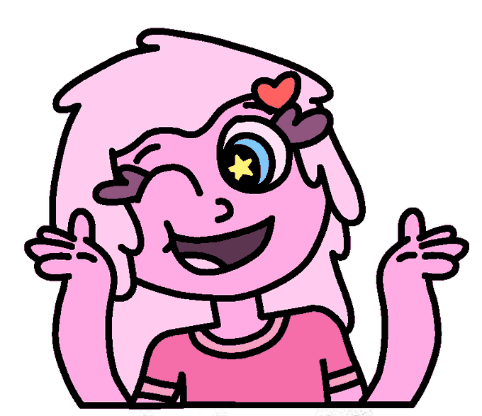

Couldn't think of a title for this part:
Slimy and Squishy
[I mainly made Squishy to just be Slimy's nervous and nerdy little sister, contrasting with Slimy with how Slimy's tall & slim with long hair, while Squishy's short & chubby with short hair]
https://t.co/RtgoTwQdms


Today's aesthetic is Frutiger Aero !
This aesthetic involves glossy materials, glass, vibrant colors contrasting monochrome looks, skeuomorphism, nature visuals and humanism themes !!


feel like I finally have a good contrasting example for that "show your range" trend that was going around a while ago asdffjjkdkj


Happy #LunarNewYear !
Here’s an alternate Triger style test from a month or two ago. I thought he could definitely use more bolder and contrasting shapes but fun to try regardless.
#characterdesign #Procreate



My two JBAC's revealed!
Blue theme, contrasting my PFP's red! 🔥
@JungleBayAC @junglebayio #ApeFollowApe #JBAC


[Pandaemonium spoilers]
Themis and Erichthonios! I've wanted to draw them together for a while now lol I love characters with contrasting color palettes. :D


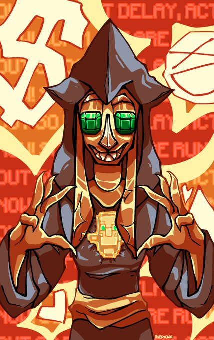

@cedarshade_ // eyestrain eye contact
hihi!! im avery and i like to do really contrasting shading wit the minecraft peoplez :]


snow and white
9/10 love the matching blazers! the contrasting colours! very preppy and nice!! i knocked a point off though because WHY ARE THEY SO TALL IN THIS ART I DONT LIKE IT 😭


Always look forward 🌟 Here’s some contrasting reds and blues for your eyeballs 👀


I love all the contrasting colours that depict the different settings, temperature, tone and motifs. From cool watery pastels and earthy reds (Atreides), sickly greens and blacks (Harkonnen) to opulent golds (The Emperor).
That sweet Freddie Francis cinematography.


Some time ago I saw a girl on the train dressed like this. The huge coat contrasting with her naked legs, the inredibly long dreadlocks in fluor green and dark brown with golden rings... and her attitude. Everything was so amazing I couldn't resist to draw something based on her



Happy year of the Tiger!! 🐯
It was a blast working on this limited design for January 🧡 I wanted to decorate with some festive yellow lilies and a fun contrasting color scheme for this character. What a fun way to start the year!
#LunarNewYear #YearOfTheTiger

Watercolor #painting of the dramatic #storm sky, titled "Sky No. 6'" (30 x 40,8 cm, 2017). I just love those contrasting colors!
You can find the original watercolor and signed art prints of it here:
https://t.co/BO4WBzUoE0
https://t.co/cSVqObweKm

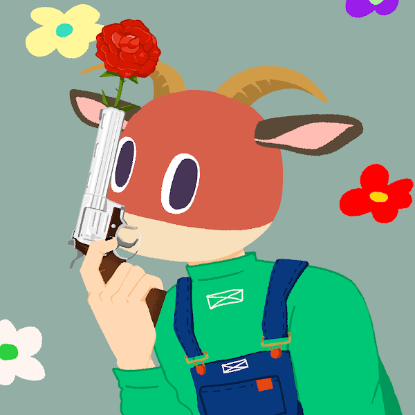
@rugpullfrens Picked this poor guy off the floor a while back, and he's probably actually my favourite. I just love the way he pops off from the contrasting background. Plus the guns and roses are cool. He's my only goat too!
Now he has lots of Frens.
Love it. <3