placementのTwitterイラスト検索結果。 5,428 件中 19ページ目


@MochiMilks Most of those pics don’t really show them in relation to all the other organs so it leaves the impression that they’re right in you lungs or something 😂 but here you can see the placement clearer:


What have I been doing? Lamenting my broken iPad, which has crushed my usual output. Podcast & art on hold until I can get a replacement. I am setting up a Patreon as soon as my new photo ID arrives on my doorstep, as well as other donation accounts. #FML


The HG 1/100 YF-19, scheduled to be released on Saturday, January 28
Designed with the new "Replacement three-step transformation shortcut" by re-examining conversion, form, and movement! It can be easily transformed into Battroid, Gewalk, and Fighter
https://t.co/56FY1igdN1


Don't forget to have plenty of eardrum replacements ready by tomorrow! hehehe


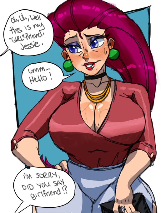
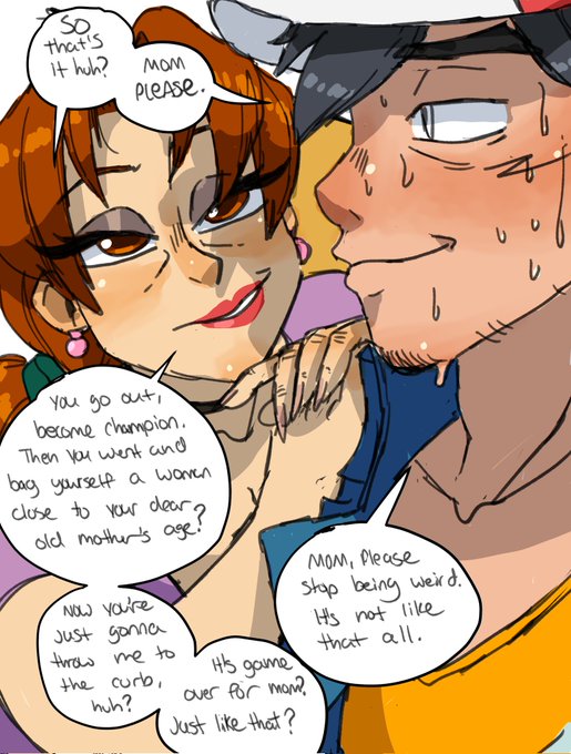
Totally not a repost because I messed up Tyranitar's placement or anything ahaha. #Pokemon #pokemonfanart


cassidy phantomhive, ciel's replacement because he sucks
#OC #anime #blackbutler #digitalart


Extra: The peek-a-boo style is a defensive boxing style where you tuck your hands inward. Provides better blocking, bobbing, weaving and jab placement. Main style used by Mike Tyson. See also: Balrog from SF (inspired by Tyson) and Hajime no Ippo's Ippo (also inspired by Tyson.)


Death is busy chasing a weird cat in Spain so @imkrisyim is being his replacement for now
he is harmless


@koa_alvy How is this? It still communicates the hair strand's original shape, but it no longer has strange placement that makes it look like any part of it is soley the outline of the eye, right?


screw it. valentine's day ych. starts at 40, +10 for me adding hands bc I didn't want to do set hand placements. you can also pay more if you want
taking 10!
https://t.co/Pncczqy786


@webtwsa YES?!
This is a few months of studying it looks like.
If you study it you could place colors together without looking messy.
You can make nice looking art if you know how to place colors.
I didn’t pull the colors out my ass, I used coordinated placement so it looks good.


So the pen that I use to draw is officially broken and commissions will be 100% delayed until further notice!!
I'll open 2 USD slots on here, so I can get myself a replacement!!
#commissions #commissionsopen #Commission


Bruh I hate how twitter moved the view count were the like button used to be, now I gotta rewire my brain just to get used to the new placement of the heart button and not keep accidentally clicking on the view counter...SMH 😤💜 #Vtubers #VTubersAreStillWatching #Twitter #ugh

Vs. exe boss batch pack - Too slow replacement idea


#ブルアカMyClassroom
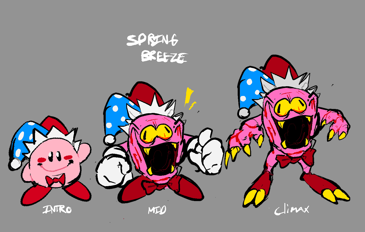
Funny placements go brrrrr
for anyone who also wants to do this ->
https://t.co/ShknESHHjP


I had to replace my middle monitor because i ended up dropping it on its head..
scuff streams till its replacement comes in because now i don't know which way to look for chat with him gone.
i am going to miss the boy so much.


Yay, we did it! Yesterday's stream was so much fun, and we even managed to reach Iron 1 as our placement!