DistinctのTwitterイラスト検索結果。 4,747 件中 181ページ目


“Approach Mono” (https://t.co/Dvj13bmvTW) by Eduardo Manso for @emtype is the monospaced companion of “Approach”. Like its proportional Neogrotesk counterpart, it has got an all but neutral (never dull) character. Comes with a distinctly pronounced punctuation. #366fonts (178)


New #artwork added today: "Distinctive Love" by Rachel McCullock @RachelMccullock https://t.co/2B5mGXOfTw
#heart #purple #abstract #art #decorativeart #artwork #painting #artist


Colour palette of the day
~
26-06-2020
~
#architecture #heritage #impressive #leadenhall #market #london #trade #business #shops #visual #distinctive


Ppl talk a lot about TF2's sillhouettes and how it helps the characters be recognizable, but not many talk about its smart color picking
All characters share almost the same palette, but the color distribution across their body is so good it makes them STRKINGLY distinct


@Raflcoopter Still astonished how Phil LaMarr can make so many characters sound so distinct and fitting.


Distinction1&2の特徴
⑥“意味→英単語”の学習ができるレイアウト
右ページに英語での意味を記すことで、単語帳を開き右側を見ながら学習すれば日本語を介さず意味から英単語を思い出すという学習が可能になっています。
購入はこちら
https://t.co/rJfRde8vGh


if i had to explain the biggest inspirations as to why my artstyle looks the way it does itll be because of four of these amazing artists;
@Rafchu @gerph_art @HiuKelvin @o___8
Theres just a sense of originality and distinction between all of them that justs eyegasmic.


Little shout out to the brilliant & distinctive comics art of Meredith McClaren aka @IniquitousFish! https://t.co/aAJuDbe9WK


4 underpaintings for this mucha-inspired painting series, the Seasons. Working really hard to get 4 distinct but cohesive palettes. Trying to get tweak the gestures and anatomy and we'll see how much detalis I get to add. Work in progress.


Said this before but I think the reason Family Guy promo images get memed, why they have that distinct energy about them, is because of the expressions.
So serene, so calm. The faces of true peace. Yet you can't truly identify that expression, it's nothing you've ever seen/felt.


Hana: (uses her psychic powers to detect the distinct Tom and Jerry energy flowing through this house)


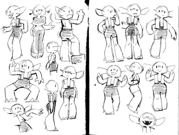


Originally, zulu was short and round, u know; Cute. it didnt represent her character well. she had popeye arms, as did all goblins. it was hard to keep them distinct between all gobs so its been scrapped too.
Pls tell me what you think!


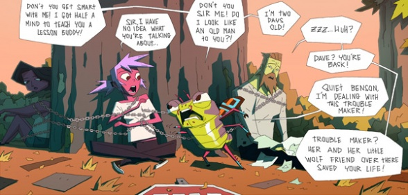
the two best changes transitioning from webcomic to the series is making wolf and benson (yes the green fella) black and with distinct features.


@AtomicRoboto helo! im julls and yet to have a distinct style! here are some of my workss😚😚


@littleraiku Hellooo i'm Karl! I just started last month on digital art and is still imrpoving.I don't have any distinct art style.
Thanks for the tag @viancarts21 , u're stinky too.


At that point, I really think something akin to Kotabe's artstyle could help justify the design modernization and keep the distinctive outlines while also getting a lot more lively with its presentation of characters and giving Mario's 2D artwork the spotlight it deserves


@Idolomantises I do agree 90% of the designs were samey. could count maybe three that were actually distinctive to me. I wanna dip my toes in doing some fanart but im scared the horndog dudebros would riot the moment i make justice the buff butch she was meant to be.