contrasのTwitterイラスト検索結果。 10,765 件中 181ページ目


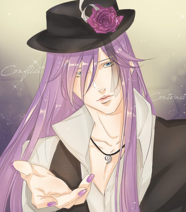


@aiyoyuu This drawing for example has a good contrast with the background because it is a dark color and makes the character stand out more.++


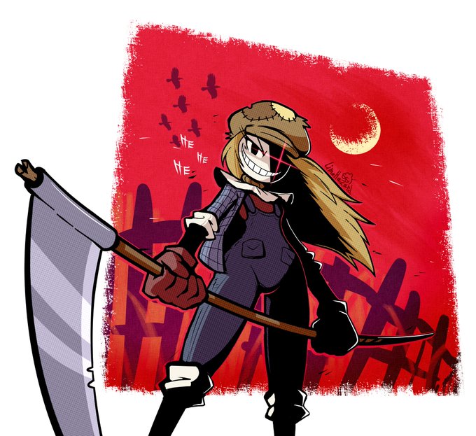
@RasterPlan I just like vibrant colours that contrast pitch black shadows.


Watercolor #painting of the dramatic #storm sky, titled "Sky No. 6'" (30 x 40,8 cm, 2017). I just love those contrasting colors!
You can find the original watercolor and signed art prints of it here:
https://t.co/BO4WBzUoE0
https://t.co/cSVqObweKm


IT'S PYE TIME!
First of two commissions for the ever brilliant @_pyewacket_ . I experimented with a high contrast background compared to my usual muted colours, and I like the outcome! Hope you do too.
[id]
An anthro grey striped velociraptor in alt clothing roaring. Red BG.


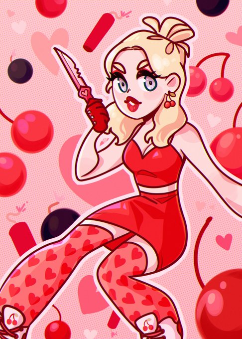


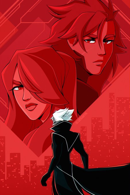
@MegZavala hello there! my name is blue and i make vibrant art with bright colors and high contrast! 🫐


did a study to squeeze out more XP from that last render
left is a more reality grounded lighting situation, right is more stylized
ive found that DB chooses to let character tones have priority over lighting colors.. probably for simplicity, contrast and readability

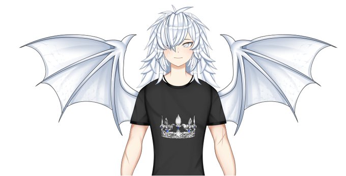
@martianmeghan Man I love that I can finally participate in these kinds of posts😊
I'll start by saying I love your eyes, they're really pretty. The gentle contrast of the purple, pink and light blue really make them look nice


Stage 3)
🐦Second layer of colour for more contrast
@winsorandnewton #cotman #watercolor #painting #artwork #instaart #drawing #fabercastell #illustration #worldofpencils #sketch #artist #artes #pencils #arte #pencil #draw #carandache #sketchbook #pencildrawing #winsorandnewton

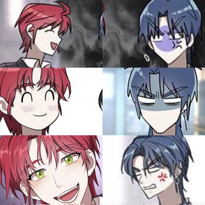


for these I’ve used Grain from the Camera Raw settings, and I can see it doesn’t give me the rounding effect even with bright higher-contrast pieces (unlike the Filter Gallery > Texture > Grain @gijothehydroid uses that works fine for the low-contrast works)


Quería ponerlo junto con el anterior pero me dio cosa el contraste de los dibujos jalksfjak #Volkacio

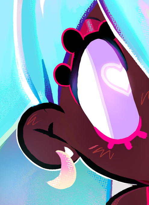
One thing i found i couldn't get down properly throughout the whole painting was the face and eyes. I struggled bringing definition and shading like @/toorurii does and she also makes the eyes pop out a lot more with high contrast colours.

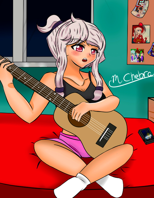
Quando eu fui postar no twitter, eu fiquei brincando com os ajustes e contraste e acabei fazendo ela pardinha e EU AMEI


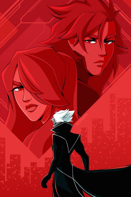
@AndresFColl hi hi! i’m blue, i make a lot of art with vibrant colors and strong contrast! 🫐


I know I’m still not very good, but I wanted to draw something based on Jenna’s new instagram post because the contrast between Tyler and Jenna’s eyes is stunning!
#cliqueart @tylerrjoseph @jennaajoseph

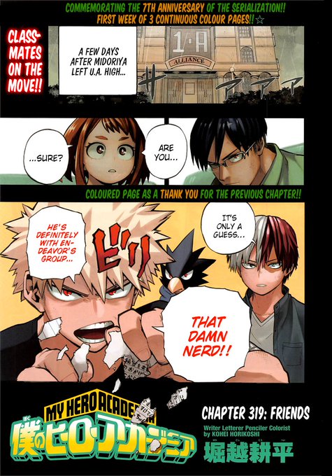


Even I feel that my line art are more better than before hehe(The other one has a higher contrast) #metalsonic