ContrasのTwitterイラスト検索結果。 10,816 件中 182ページ目


More golems? Yes, please! We love the stunning contrasts between our Celestial Guardian and Abyssal Golem. The Abyssal Golem will be part of February's Patreon release. https://t.co/tWsBRL5QC7 #brokenanvilmonthly #brokenanvilminis #BAMminis #rpg #ttrpg #tabletopgame #gamenight


Some time ago I saw a girl on the train dressed like this. The huge coat contrasting with her naked legs, the inredibly long dreadlocks in fluor green and dark brown with golden rings... and her attitude. Everything was so amazing I couldn't resist to draw something based on her


Happy year of the Tiger!! 🐯
It was a blast working on this limited design for January 🧡 I wanted to decorate with some festive yellow lilies and a fun contrasting color scheme for this character. What a fun way to start the year!
#LunarNewYear #YearOfTheTiger


@Lyadrielle hello hello! i’m blue, i love making art with vibrant colors and high contrast! 🫐


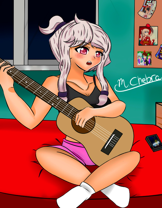
@aiyoyuu This drawing for example has a good contrast with the background because it is a dark color and makes the character stand out more.++


@RasterPlan I just like vibrant colours that contrast pitch black shadows.


Watercolor #painting of the dramatic #storm sky, titled "Sky No. 6'" (30 x 40,8 cm, 2017). I just love those contrasting colors!
You can find the original watercolor and signed art prints of it here:
https://t.co/BO4WBzUoE0
https://t.co/cSVqObweKm


IT'S PYE TIME!
First of two commissions for the ever brilliant @_pyewacket_ . I experimented with a high contrast background compared to my usual muted colours, and I like the outcome! Hope you do too.
[id]
An anthro grey striped velociraptor in alt clothing roaring. Red BG.


@MegZavala hello there! my name is blue and i make vibrant art with bright colors and high contrast! 🫐


did a study to squeeze out more XP from that last render
left is a more reality grounded lighting situation, right is more stylized
ive found that DB chooses to let character tones have priority over lighting colors.. probably for simplicity, contrast and readability

@martianmeghan Man I love that I can finally participate in these kinds of posts😊
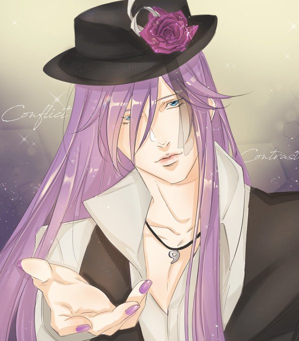
I'll start by saying I love your eyes, they're really pretty. The gentle contrast of the purple, pink and light blue really make them look nice


Stage 3)
🐦Second layer of colour for more contrast
@winsorandnewton #cotman #watercolor #painting #artwork #instaart #drawing #fabercastell #illustration #worldofpencils #sketch #artist #artes #pencils #arte #pencil #draw #carandache #sketchbook #pencildrawing #winsorandnewton


for these I’ve used Grain from the Camera Raw settings, and I can see it doesn’t give me the rounding effect even with bright higher-contrast pieces (unlike the Filter Gallery > Texture > Grain @gijothehydroid uses that works fine for the low-contrast works)


Quería ponerlo junto con el anterior pero me dio cosa el contraste de los dibujos jalksfjak #Volkacio


One thing i found i couldn't get down properly throughout the whole painting was the face and eyes. I struggled bringing definition and shading like @/toorurii does and she also makes the eyes pop out a lot more with high contrast colours.

Quando eu fui postar no twitter, eu fiquei brincando com os ajustes e contraste e acabei fazendo ela pardinha e EU AMEI


@AndresFColl hi hi! i’m blue, i make a lot of art with vibrant colors and strong contrast! 🫐