ContrastのTwitterイラスト検索結果。 10,510 件中 182ページ目


Stage 4 of the Imperial Camel Corps. I think I’ll go with black leather tack to add a little contrast, otherwise it runs the risk of all looking a bit flat and “sandy” coloured


Contrast in how my OC boy scouts River and Ice greet their respective dads


Image PJ38_14 from @NASAJuno on Nov 29, 2021. Enhanced & approx true color/contrast. Enhanced ones experimental using new photometric params to correct for varying illum in the image. Worked way better than expected, for the first time I'm now using params that vary with latitude


Probably a good time to point out that TT's latest MP #Raiden silhouette is inaccurate...on the left is their original silhouette (contrast enhanced + color added by me). On the right, they are now overlaying mis-sized mis-angled images of the "revealed" parts. WHYY #Transformers


@YOG3NSHA @SatayPollo_EXE Heck you know what, in F-Zero, I actually could sympathize with this notorious gang leader, because he still honors his late parents by listening to rock and classical musics, the latter I would say is a contrast to his character. I thought it was heartwarming.


The pairing of the insecure and clumsy Sam with the articulate and agile Kurt also, of course, creates a key foil effect that emphasizes just how far Sam is from his goals. It also creates contrast, however, between insecure (Sam) and confident (Kurt). 4/8

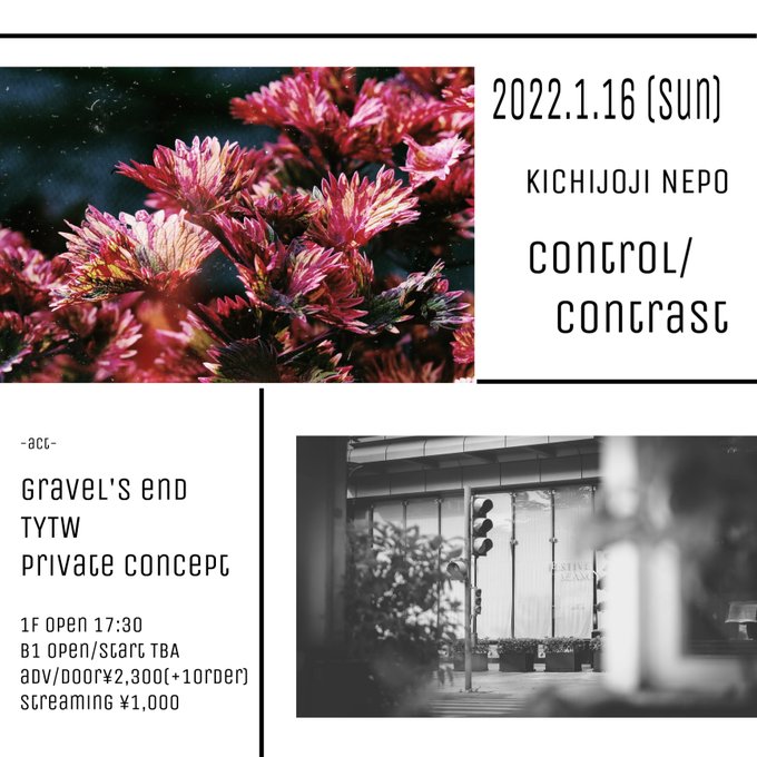

今年初DEATH👿
1/16(日)
control/contrast
場所:NEPO Kichijoji
前売 2.300yen(+1d) / door 2,300yen(+1d)
配信 1.000yen
開場 / 開演 17:30 / start 18:00
出演:
18:00-18:30 ATACAGA
18:45-19:15 private concept
19:30-20:00 gravel’s end
20:15-20:45 ilyons
21:00-21:30 TYTW


@pitrepan hi there! my name is blue, i make a lot of digital art! i love working with vibrant colors and high contrast 🫐


Going to be changing the dude entirely
But here is what he might have looked like
I like it, but it doesn't compliment, its a harsh contrast design wise, which there is a reason for, but I'll explain another time
Regardless, thoughts?


Colors are off cuz I used a blending option that makes it more contrasted again ... 🥲

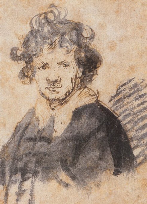
Doodle of the Day: Self-portrait with Tousled Hair (c. 1628/9), Pen and brown ink on paper, Rembrandt van Rijn (1606 - 1669). This is one of the few self-portrait drawings Rembrandt produced. The loose use of ink contrasts with the controlled line work of the pen.


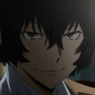


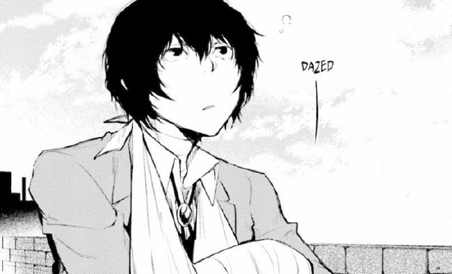
I understand his 'duality' is very prominent but we should look at him more as a complex whole instead of pointing out all the contradictions and contrasts; since that's just how humans are. The same can be said about me and you. We don't make sense and that's just how it is

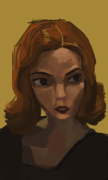

No planning vs With planning
tbf i think i learned a lot from the left one. (mainly colors and contrast) also learned never try to wing it unless you're absolutely able to salvage it lmao
#artph


@felixeitor No puedo ayudarte tanto con esto porque yo de fondos nanai, pero lo he editado como creo yo que lo habría hecho, los colores que has elegido me gustan un montón, te recomendaría poner el dibujo en blanco y negro de vez en cuando para ver el contraste y que no quede muy plano,


The outlined tree line wasn’t sitting right with me to I added a gray wash for some balance. I debated blackening it in for a more stark contrast but went with the lighter gray🤷♂️

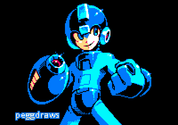


So, I decided to make my own fnafsb OC! Well, this is Selene "Selly" Cottoncloud. She works at the daycare and she was programmed to be calm, patient & understanding, making a contrast to her "co-workers", being the shy kids fav. animatronic.+


@TarzTweetler In this digital drawing I used a high contrast between light and dark to intensify the mood. The contrast is a powerful tool that creates drama and commands attention. That way allows viewers to concentrate on the way light and shadow fall across the surface of the figure.