typographyのTwitterイラスト検索結果。 183ページ目




Calendars designed by Jan van Toorn for Amsterdam printer Mart.Spruijt #graphicdesign #typography



Got a lot positive feedback on my icon I made, so that good.
Pros: HD Quality, blending options not bad,
Cons: Work on Typography and blending options
Might practice more on icon making and icon letter logos too!



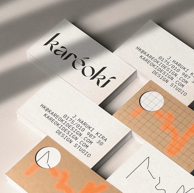
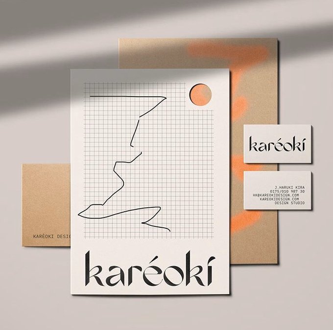
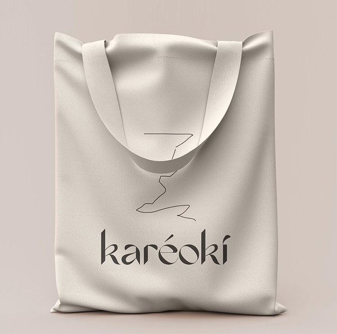
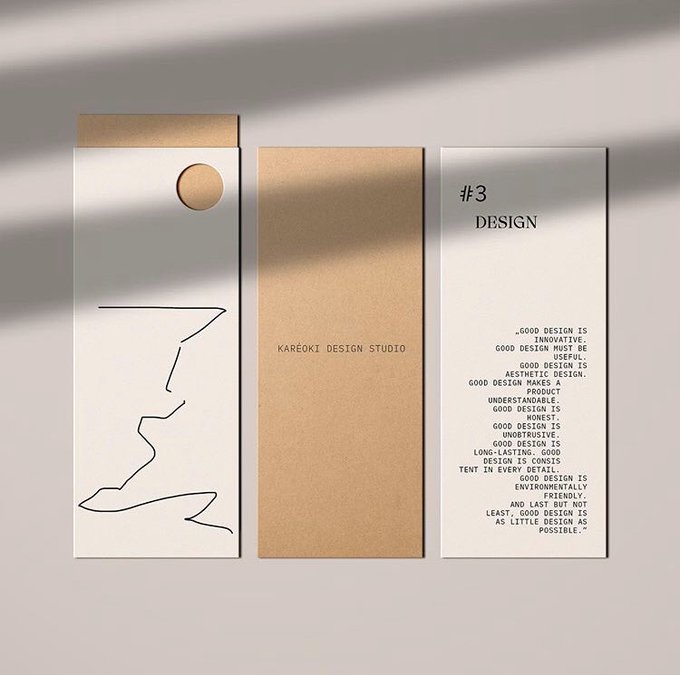
Karéoki Design Studio Visual Identity by @byira.de
Logo Typeface: @_hardal
⟶ https://t.co/MWKvFWDzxm
For More Inspiring Graphic Design and Visual Culture
.
.
.
#grafikmedia #graphicdesign #branding #visualidentity #typography

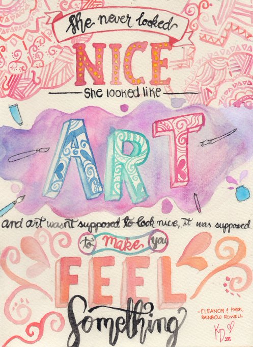
Was cleaning my external hard drive and found some of my scanned typography pieces. Already posted some of them on my ig account back in 2015, figured I should post some of them here too
Here's my favorite quote from Eleanor and Park ✨
#artph #ArtistOnTwitter #watercolorart



I found project binders and shit from when I studied graphic design 10 years ago. Here's one of my typography class projects



Natural Portabella by Stafie Justprince
https://t.co/OX9KUhOhyN
#typography #freefont #font #handwrittenfont #brushfont,

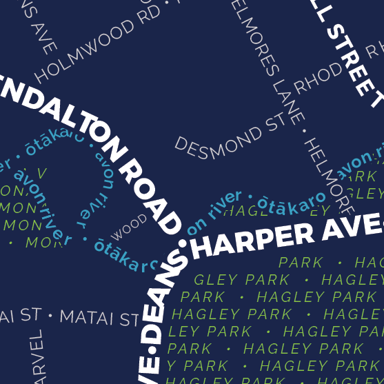
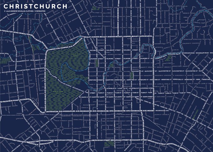
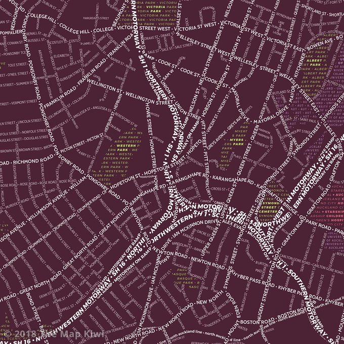
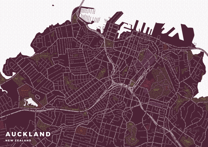
Day 12 of #30DayMapChallenge - Map not made with GIS software
Auckland and Christchurch Typography maps (from the archives) - made with #OSM data and Illustrator.


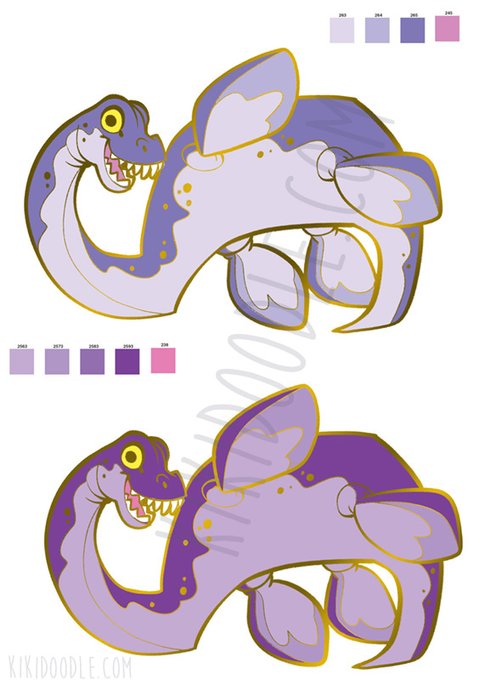
I definitely hope maybe 2022 it happens again. I had done the typography (MY WEAKNESS!) made lineart for tote bag designs, had a procreate drawing video for the advertisement image, annnd even had a pin design in progress to be given out in goodie bags.
</3


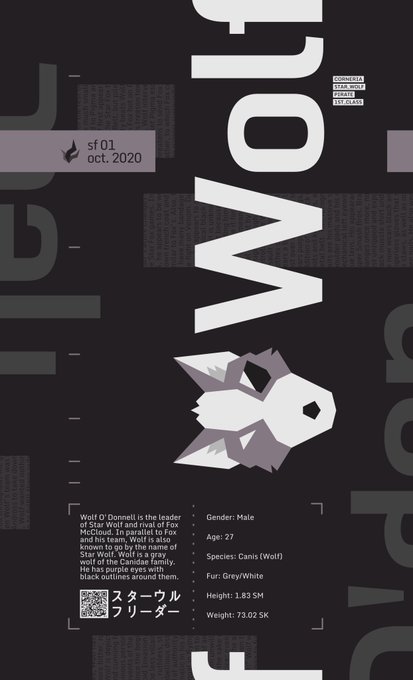

~ [STAR FOX CHARACTER POSTERS]
Featuring Wolf O'Donnell and Fox McCloud.
Created on stream.
#starfox #wolf #fox #nintendo #design #graphicdesign #typography #art #vectorart #furry #kelpy