ComparisonのTwitterイラスト検索結果。 22,095 件中 184ページ目


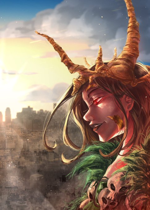

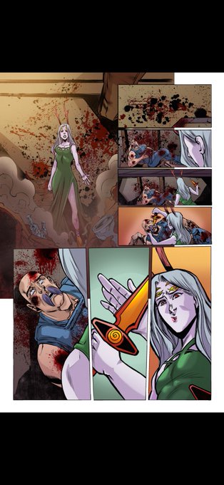
@keepingitgeekly There's always work being done on my series Lost Between Worlds! Check out these 2 connecting covers that will be for issue 3! Also got the first page of the alternate issue 2 done, which you can see alongaide the main version for comparison! Read LBW 👇
https://t.co/5Eps6qWzJZ


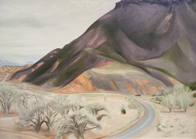


I am Santa Fe satisfied! Art and creativity are everywhere. @okeeffemuseum is a happy place for me. What an amazing artist / American / woman. Check out the comparison between one of her paintings as we head out of town. @enms_art @KinaneMrs @bmchsd @JGDPride @DeniseFisherNB

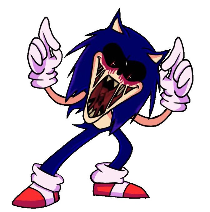
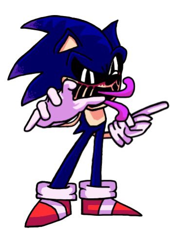



This must be one of my favourite concept vs. later comparison so far. 💀
Messy comic drop in a second, has been a while!
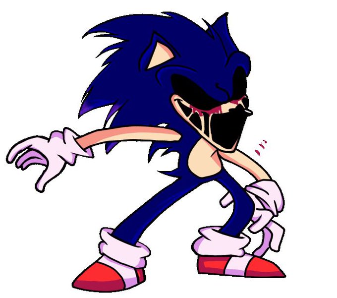
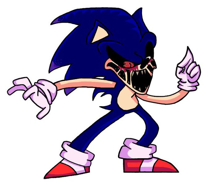


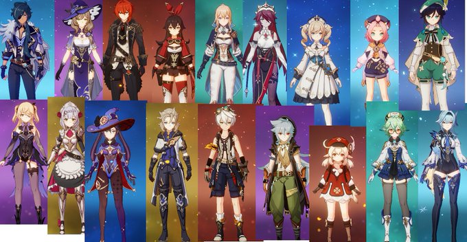
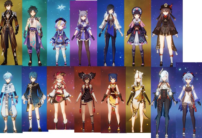
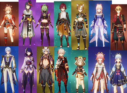



@whalies_ in case anyone was curious and wanted to make a closer comparison, I tried ( not very cleanly ) to make the images in the same kind of format


Random height comparison between him, Paimon and Stolas:
(Also, I think it’s important to note just in case that he’s only Stolas’ older brother in the Hellaverse.)


height comparison of every person that you will probably find in the doctor's office regularly https://t.co/mZ5Bs1N4vT


For comparison sake here’s Mahiru’s Summer Attire featured in Volume 5
LN Anime


(1/2) This is very messy in comparison to my last post, but I had to make these.
#homestuck #home22tuck #splatoon

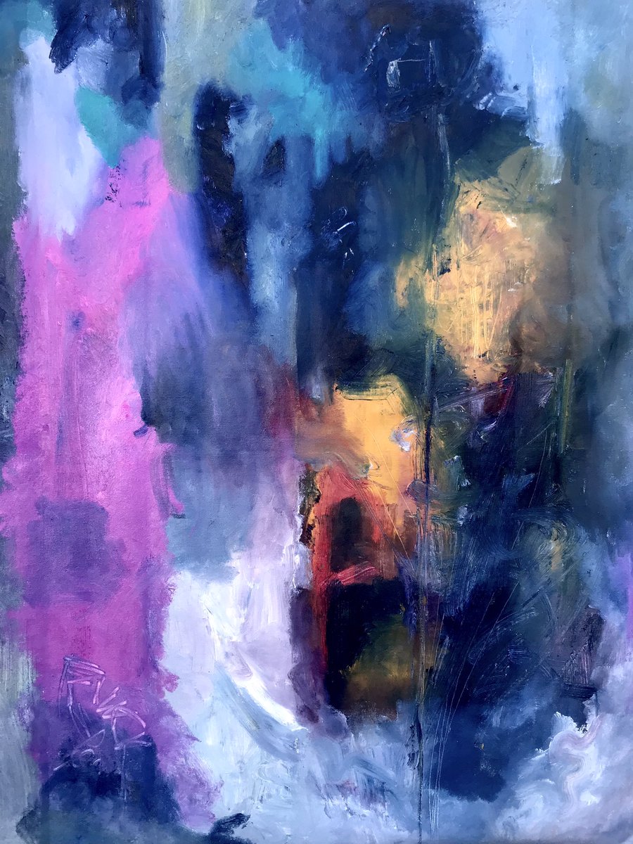
There is no comparison. No life is the same. No experience can be replicated. You are undoubtedly unique. 💎


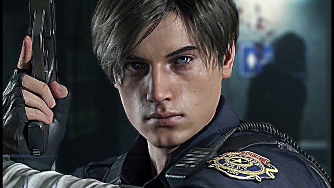
Finally got around to playing the remake of Resident Evil 2 and I do NOT like Leon Kennedy's appearance. He was cartoony in the original, but he was pretty in 4 and smoking hot in 6. But now...his mouth especially, it's weird :( (Pics for comparison: 4, 6 vs remake of 2)

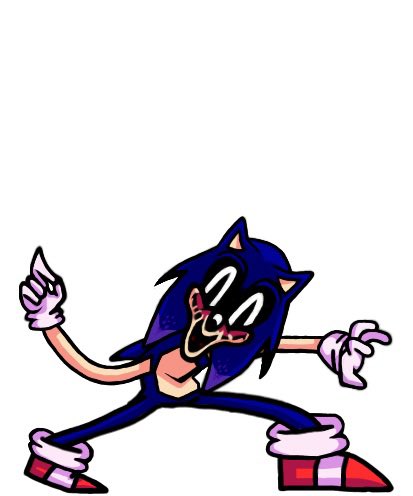


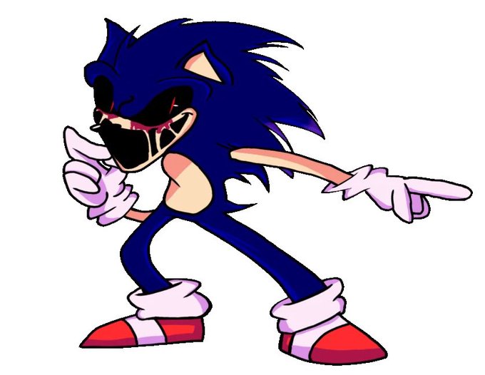


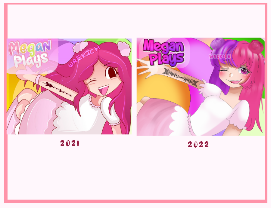
I like seeing a comparison of my work this year and last year!
I’ve focused a lot on pushing past the “cute” veneer of my stuff and aimed for a more mature, but cheerful, vibe