TypographyのTwitterイラスト検索結果。 6,955 件中 185ページ目

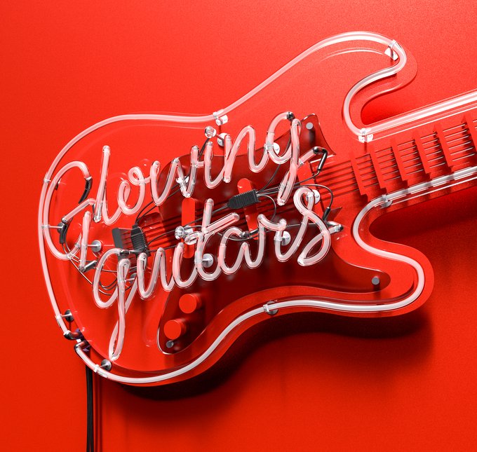


After I did the EMI cover I worked further on the concept and did a few more variations adding the guitar element. Not sure which one is best 🤔#albumcover #maxon #cinema4d #cgi #illustration #C4D #redshift #Illustrator #cover #CoverArt #3dart #typography #illustration

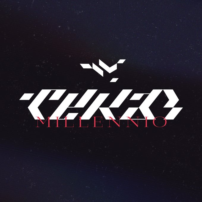


Terzo Millennio 🐮
Typography and Illustration for the @Lamborghini Terzo Millennio !
https://t.co/4lXwiuRO4J
Hope you guys like it :D

‘Glowing guitars’ album cover artwork for EMI records..🔥🎸#albumcover #maxon #cinema4d #cgi #illustration #C4D #redshift #Illustrator #cover #CoverArt #3dart #typography #illustration





A recent color sketch commission by @FuzzmanArts. I like the relation of the creative typography to Jane's mood!


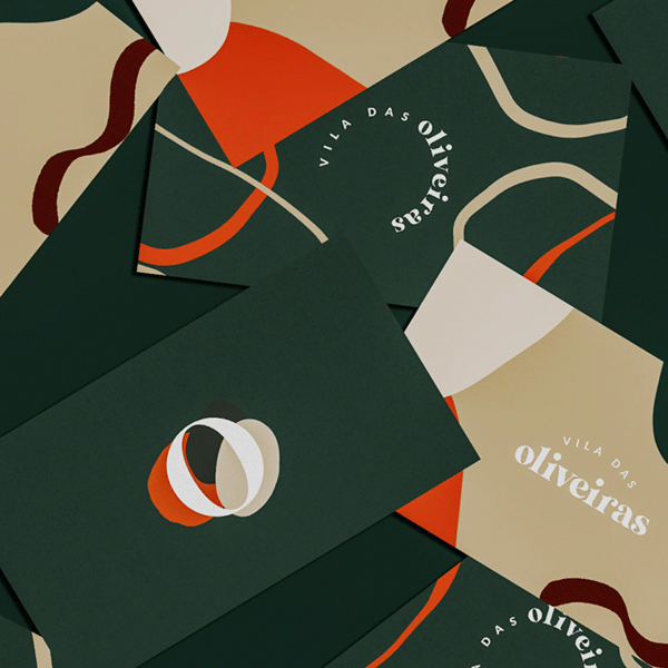
Vila das Oliveiras Identity Design
The colors & typography grabbed my attention of this identity design. I especially appreciate the labels of the packaging and pattern illustrations. Just wonder why they didn't go for the slanted O as icon. https://t.co/HetTjciX6U


New project for @AlphaDeltaBeer - one of the UK’s top craft breweries. They gave me free rein to express myself on each can release 😍
#illustration #graphicdesign #typography #packaging #packagingdesign #packagingproject #design #alphadeltabrewery #beer #candesign #microbrewery






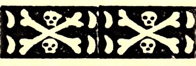
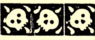


It’s almost Halloween and there’s no better way to celebrate on a #TypographyTuesday than sharing some borders featuring skeletons and devils from 'Specimens of Printing Types and Ornaments Cast by James Conner & Son,' printed in NY in 1852. Learn more: https://t.co/jnT6ISHM4r



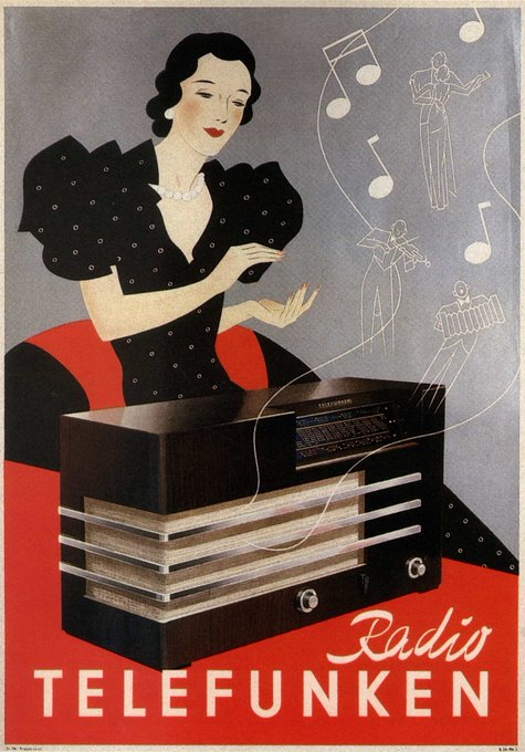

So you know my catoon go-tos, but graphic design and typography are mega-important to me too
Anyway there's so much more but I guess these were the things the jumped out at me looking through https://t.co/3eOOR5EtO7


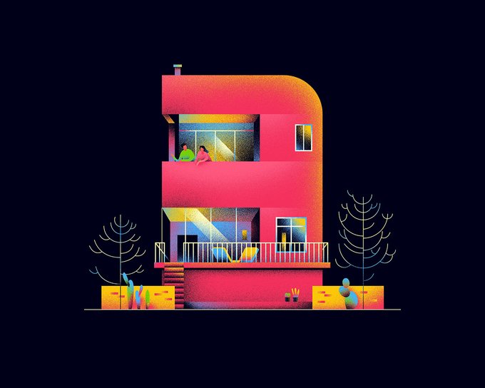

Numerical Architecture - 36 days of type - Muhammed Sajid
36 days of type es un proyecto que invita a artistas visuales y diseñadores a crear diferentes tipografías durante 36 días para mostrar las posibilidades infinitas de la tipografía.
#graphicdesign #typography #architecture


Typography : タイポグラフィー
- 血猟犬 // BLOOD HOUND -
(ブラッドハウンド)
@TitanfallBlog
@PlayApex
RT&FAV
良かったら拡散お願いします!
#Typography #タイポグラフィ
#Apexlegneds #エーペックスレジェンズ