VerticalのTwitterイラスト検索結果。 4,977 件中 188ページ目
Toriyama's Spine Illustration for volume 2 of Dr. Slump's original collected release (1980/10/09)
Making excellent use of physical format, the three Norimaki are vertically aligned like a totem pole.
Listen, I need to find more people that wanna use, abuse, feed and breed Yordles and various other vertically challenged women! Please RT <3
Or yknow, just slip in my DMs and just, yknow, earfuck my cumbrain and breed my eager needy pussy and ass #lolrp #shortstack
So after looking more into the Taroth, I realize the eye is horizontal shape like a goat instead of vertical. But I like the vertical more so I keep the vertical.
So here is the what if the eye shape is like that.
Nanu : "I still sad and now you making fun of my eyes?"
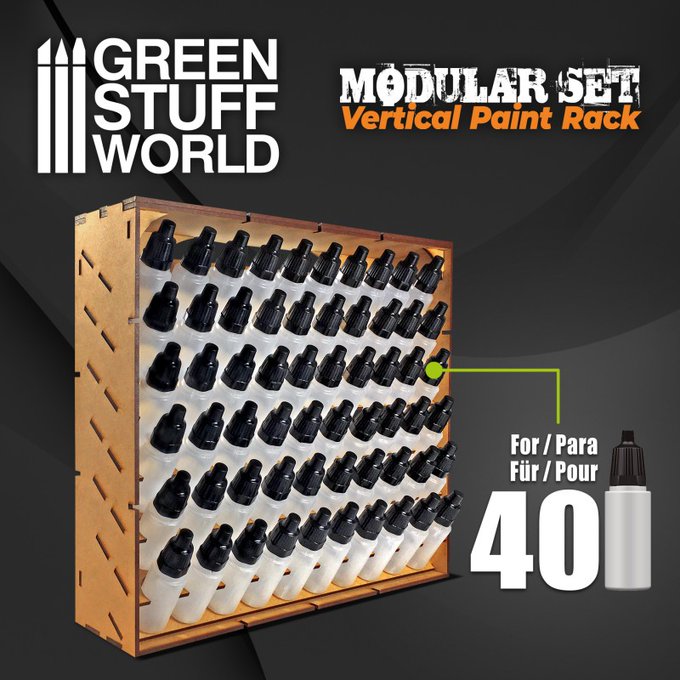
Modular paint pot display organizer made of high quality MDF wood. Multiple of these modules can be combined horizontally and vertically to increase capacity.
https://t.co/8HBcIqMvtu
#Warmongers #PaintingWarhammer #paintingminiatures
⏪ since it's nostalgia day, here's one for the books...
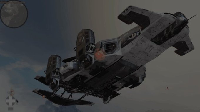
before skydiving in APEX was a thing, we used to have drop pods when starting a match. They would mostly drop vertically once you chose a spot on the map 🗺️
4/ Now, the char. I do a vertical symmetry so I can see the mistakes in her pose. I fix them with the liquify tool, a powerful warp tool if you work on an unique layer for your character. Then I go back to the flower field. These back and forth help me to take a step back.
Afterlife water tank dancers, verticals
#Cyberpunk2077 #CDProjektRed #RTXOn #VGPUnite #TheCapturedCollective #ArtisticofSociety #WorldofVP
Hey PMC Zine artists! Just a reminder to send us your finished art for the Zine Project featuring PMC mascots at pencilmileageclub@gmail.com. Deadline: 3/8 @ 11:59 PM PST
Artwork Specs:
-Resolution: 300 dpi
-Dimensions: 8.5” x 11”
-Vertical orientation
-File type: JPG or PNG
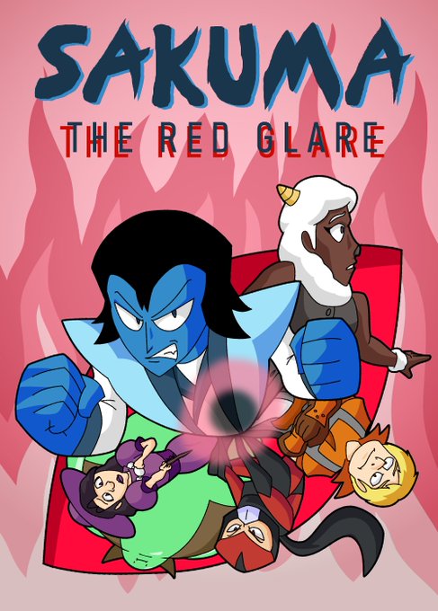
@DeputyRustArt Sakuma is a shonen-inspired action fantasy about a cursed man with a troubled past trying to find his mentor and facing anything that gets in his way. The action uses the vertical format and is balanced out with strong character moments and interactions. https://t.co/UXyRZleayR
Difference.
(vertical)
#GPOSERS #FF14 #ffxivsnaps #前角倶楽部 #アウラ #パンデモ神社
@MLaftalia thx🖤
Dailyknights #32
I've been thinking of changing the format to vertical instead so I could have more room for drawing, but I'm not so sure. What do you think?
#Arknights #ArknightsFanArt #明日方舟 #アークナイツ #プロヴァンス #スカベンジャー #レッド
@dharlequin_vp @SonySantaMonica @corybarlog I know...😭
I still wanted to try to work some high rez that'd look not too bad, just for the fun of cropping some verticals where we got limited camera movements. (which shouldn't be a thing. Ever.)
original
cropped
reworked
I think I've finally settled on a design for Holloway that I like. He's still Big Bug but now decidedly more vertical
my blog post,
January 28, 2021 - Yesterday's Horizontal Art Mess Looks a Lot Better Vertical, Even if Still Not Good Enough https://t.co/BfE4uMYSyQ via @FelipeAdanLerma
Lost to @jakarotto 3-7 ft7 hero dittos! Ggs to that man! Awesome hero and my goodness, I really need to master LSK! It's so good against vertical recoveries! Man, I want that runback big dog! Lol!
I love how the Dr. STONE anime adapts BOICHI's art style so well but adds even more details since he often draws with narrow vertical panels, such as these close-ups with Gen. The anime's details are 👌👌!#DrSTONEspoilers
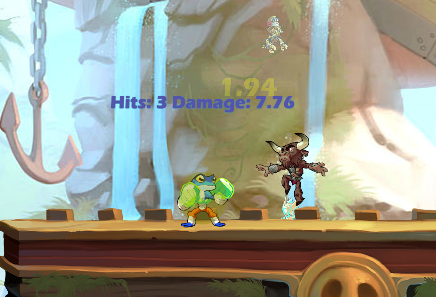
also gauntlets got shadownerfed this patch. nair deals 8 damage instead of 12, recovery hitboxes are way smaller vertically.
Something slipped ig. https://t.co/hKRtpaarGu
Creo que me decanto por este formato. Es un poco complicado de enseñar en twitter por su verticalidad, pero me mola bastante el efecto visual que hace.


