ContrastのTwitterイラスト検索結果。 190ページ目


The difference between Yahwi and Cain is too vast. You can clearly see the contrast of their characters from the way they treat Jooin alone. That being said, you can see who actually tries their best to prioritize his well-being rather than their own satisfaction and gain.


people keep complimenting the shading on the statue of godtons drawing and first of all genuinely thank you but it's also so funny to me bc my shading process is literally just 'fuck around and find out' and also 'fuck realism, just push the contrast as far as possible'


hello and welcome to learning contrast! in this episode- the difference between man, machine, and goop overtaking the body aka how do i use weird brushes i downloaded for some reason
#viktorarcane #Arcane #arcanefanart


@SOLPlayboy @catalinawhales tbh, i think the art is some of the best quality on solana rn. shading is great, opacity in the glasses is great, awesome contrast, good facial expressions.
also, the resolution on these is amazing.


It's been so awesome seeing so many new Western Deep readers checking out the comic!
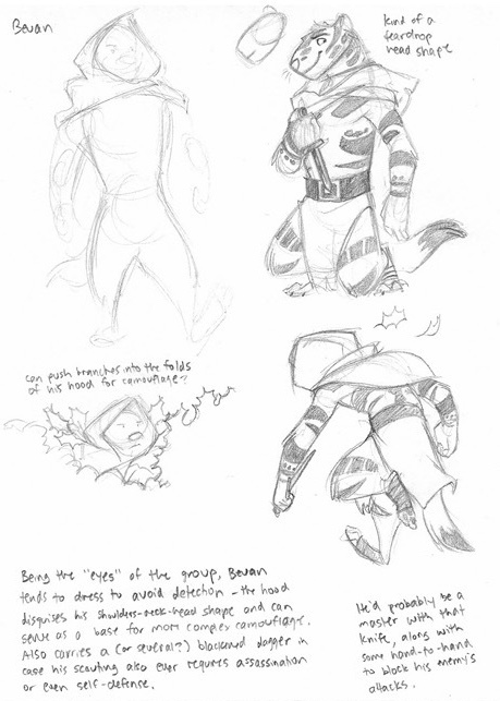
As a little behind-the-scenes treat, here's some of the very first Bevan concepts from early 2010... contrasted with his current look in the comic (with bonus Kenosh)!


It's not a bad instinct, and it can result in very appealing versions of the character, but I can't help but feel it misses out on the best, most unique characteristics of her, and on the sheer power of the contrast she can have with others who aren't like her.


Author Miles Booy argues that in early portrayals, Wolverine is symbolic of a primitive masculinity (through “ferocity”) while Storm symbolizes, in contrast, “feminine grace” through her primitive closeness to nature (26). Sort of Adam and Eve of the X-Men. 3/7


Posting this here early, in celebration of my wonderful smug bitch's creation day! Sharp teeth Oliz was the first version of his design (I barely changed it), though I had to change his personality to better contrast Theia's. Found them silly to draw them together :]


It seems like often artists draw themselves the least detailed and base how they draw others by what contrasts their features. I wanted to try drawing my face as if it was someone else's to see if I could look at what aspects others might exagerate if they were to draw me.

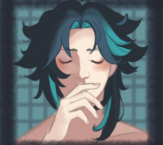

I did this with Ganyu too- I coloured her but fell in love with her without colour T^T (I think it’s the contrast :0) https://t.co/6S0mZbySaY


Algo que me llama mucho la atención de Azmuth es el tremendo contraste de su promera aparicion con las demas
Al inicio era el tipico viejo cascarrabias, para luego en Fuerza Alienigena ponerlo como el mentor sabio
Ojo que me gusta el personaje pero la reescritura se siente fea xd


Trying yet another brush technique. While this is too high contrast for my tastes, I do see potential in having cel shading as one of the randomized color options.
🌸Efflorescence // Curation 20211216
#genArtClub #generative #p5js


Comics: Cute Bug / Compare and Contrast /Social Ponies / Phantom Me #51 / Phantom Me #50 - Post up here: https://t.co/2ZTUCPki5C #brony #mlp #Mylittlepony #mlpg5


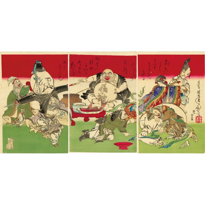


NEW ITEM / Yoshitoshi
Yoshitoshi / 7 Gods of Fortune
A beautiful contrast of the bright red color and green color on the background. Seven Deities of Good Fortune is holding a fun banquet.
More information:
https://t.co/iW1s1JMVwC


Chuuya reaching and punching Dazai to life,them together inside a sphere making them float in the sky while the world collapsed around them,the contrast between their blue and red glow was striking,Chuuya just destroyed a dragon and yet could control his strenght to wake up Dazai


J-POP
ヴィヴィド・サウンド/HIGH CONTRAST
[パレード(7インチレコード) [Analog]]が本日アマゾンランキングのトップ300にランクインしました。
詳細はこちらから
https://t.co/JW3382z763
画像引用 Amazon