comparison.のTwitterイラスト検索結果。 2,019 件中 20ページ目


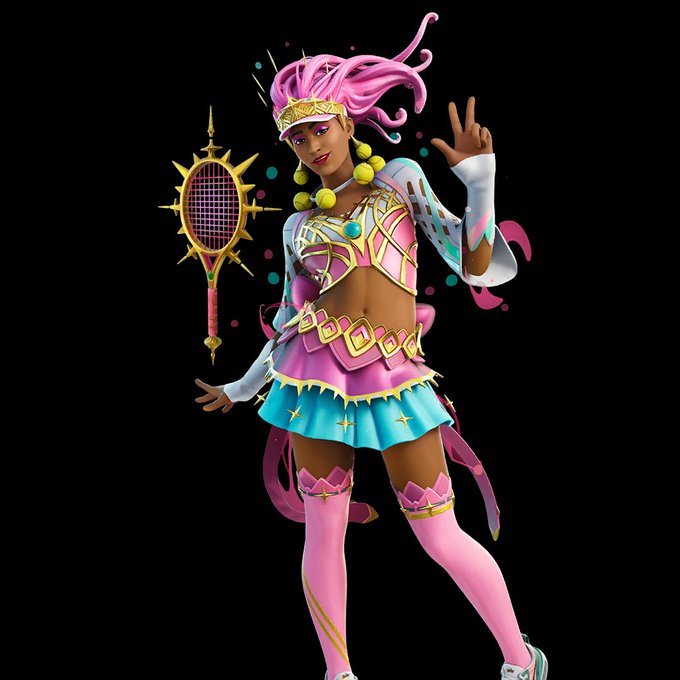
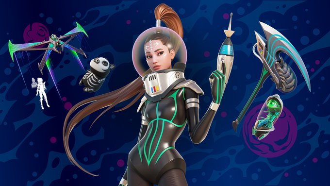
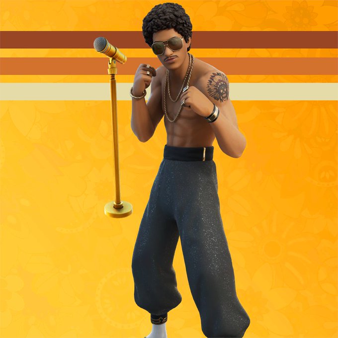
Usually when real life celebrities collab with Fortnite they get to do something fun with their design, but Harry Kane and Marco Reus are just...themselves, but in Fortnite? It's really boring in comparison.


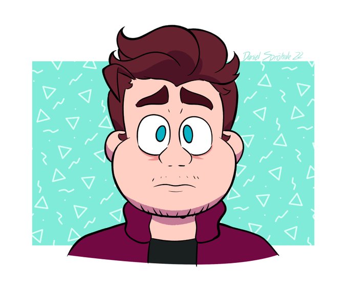
Few days ago, I decided to 2D-fied my favorite #Darksiders character, Death. My first try, by the way.
(#TheOwlHouse Luz Noceda for comparison. He's really meant to be tall. Taller than #MegaManX , too.)


Warriors Beginnings 1st and last page comparison.
.
.
#art #drawing #digitalart #oc #ocart




Check out the side to side comparison.
1/1 original watercolor and the digital edition.


Finished the NMJ render wip I had sitting around. I kind of just wanted to get it done and over with lol
I added the original flat coloured sketch for comparison. It's always interesting seeing the changes
#niemingjue #mdzs #mdzsnmj #nmj

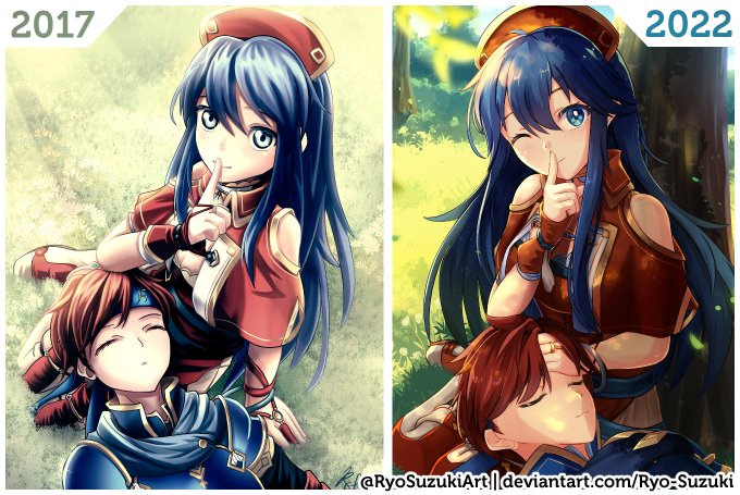
@GalarianFjorm Oh. of course I forgot to upload the side-by-side comparison. 🥲Thanks for reminding me.

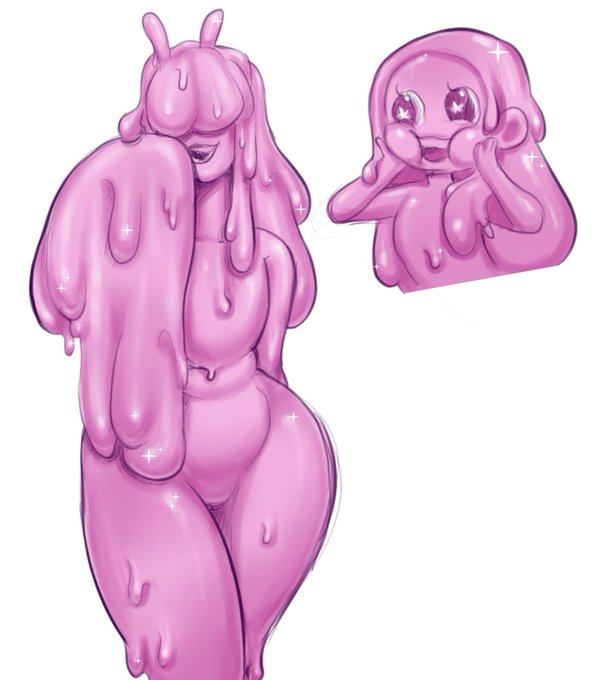
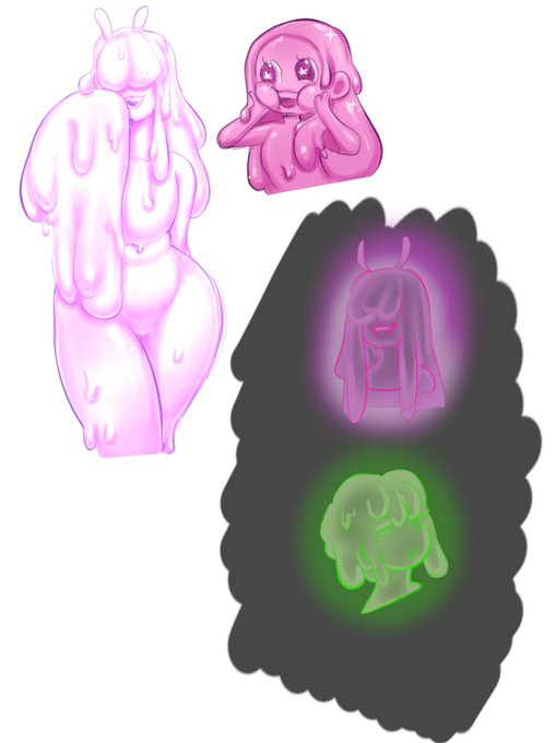
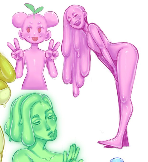
I had to color adjust because I was painting based off UV’s first design but I updated the colors. I also show her and Melon’s glows for comparison. I think that UV would give off a more intense whitish glow and melon would just have a plain green. https://t.co/AGtDTVKn16


⠀⠀⠀⠀⠀❝ It simply means you are special , and everyone is jealous of someone they can't relate to.
See your uniqueness as a gift , not a curse , then perhaps you will see the value in yourself rather than feeling the rage of comparison. ❞ https://t.co/kwmi09YYT2


For comparison. #MurderDrones #MurderDronesOC #Art #Artist #OC #DigitalArt #DigitalArtist


Early this morning (staying awake pretty late at the time), I decided to finish off a pixelated version of my sona's FNF icon that just happened to be sitting in my desktop for weeks.
Putting the original version here for comparison.
Original icon by @Dracobot950


“Whoever Smelt It…” #Gold Vs #Crypto Emissions Comparison. Drawn for @dtnsshow #artprov Friday! Get it right now @Patreon (https://t.co/fdIgGz9G8L) or at my online store: https://t.co/LKkRJRr96D cc: @acedtect @sarahlane @Snubs @jollyroger


Had a go at rendering a Quadstar and putting it in a random hangar I found on art station by seankernerman. Artie by @ZKabbit is not authorised Tribunal flight deck personnel and should definitely not be there for a scale comparison.
Security has been called.


@ElRhymesWithHel It makes a big difference imo. Here's it without (left) and with (right) for comparison. All I did was draw a bunch of messy hatched lines on a clipping overlay layer and dropped the opacity to 30% so it was pretty simple! Curious to see if the same thing will work on the shirt.

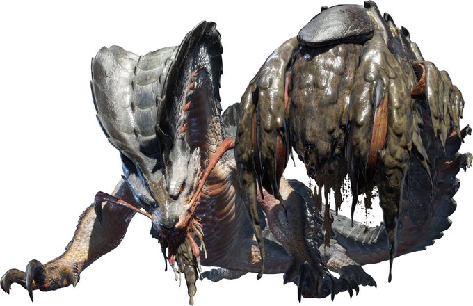
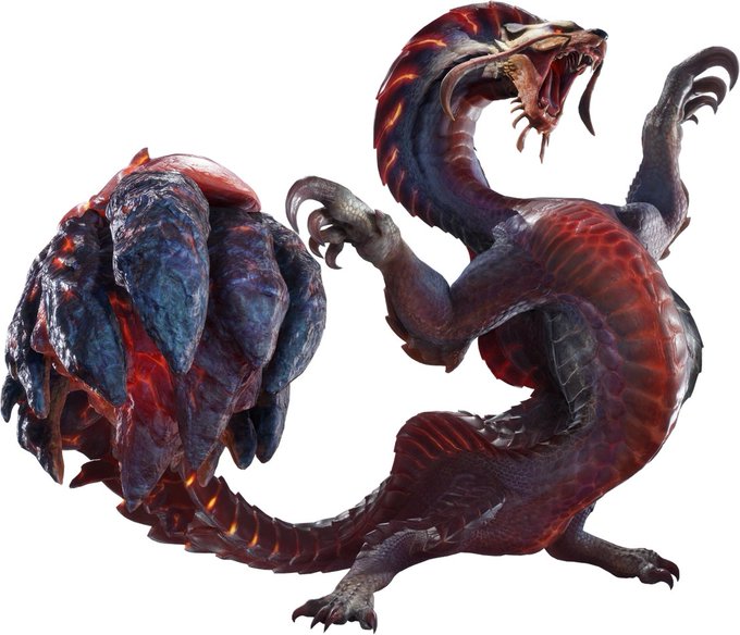
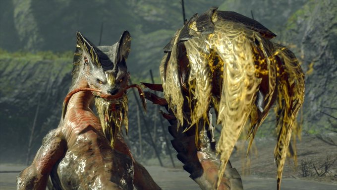
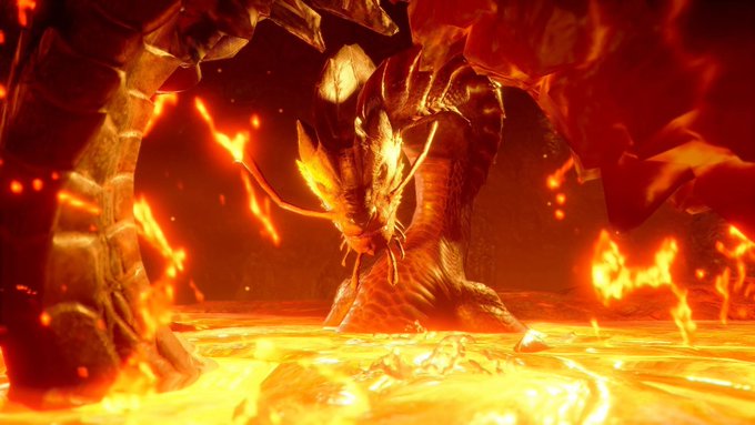
I don't hate Almudron at all (I think it's a good monster that needs a little more tweaking), but considering Uroktor (Which is in Rise) and Agnaktor, it feels odd to give Almudron a fire-based subspecies that can swim in lava.
Comparison.