typefaceのTwitterイラスト検索結果。 600 件中 20ページ目


Early Bird @TypographicNYC tickets are now on sale! Join us @CooperType @lubalincenter in June! (And let's applaud the award-winning typefaces -- Infini by @SNugue and Minérale by Thomas Huot-Marchand @ANRT_type !). Tix: https://t.co/hIFGSQdJZo


Noted no. 96.
Tom Gauld commission for St Bart’s Hospital, Elda Broglio’s ‘Amor de Verano’, Yuri Suzuki’s The Welcome Chorus, the On Design podcast and a typeface for the Shoah Memorial wall in Paris, https://t.co/v63VDLPIJb

Early Bird @TypographicNYC tickets are now on sale! Join us @CooperType @lubalincenter in June! (And let's applaud the award-winning typefaces -- Infini by @SNugue and Minérale by Thomas Huot-Marchand @ANRT_type !). Tix: https://t.co/hIFGSQdJZo


“Allotrope” (https://t.co/A9nMbqMM9z) by @KosticType is a 100-font sans-serif family with 5 widths. This typeface has both technical and woodcut-style design characteristics. Its squarish forms reflect its intended use as a UI font for pixel-based displays. #366fonts (48)


Another nice font choice for a last-minute #ValentinesDay card: “Cal Roman Modern” (https://t.co/fFCFiJpYeH), a beautiful 1950’s/1960’s all-caps brush typeface designed by Serbian type designer, Lazar Dimitrijević, for Posterizer KG. Rhythmic, informal—yet elegant. #366fonts (46)


Specimen for Schönschrift Mozart, typeface by Georg Belwe, Ludwig Wagner Type Foundry, Leipzig, 1927.

Early Bird @TypographicNYC tickets are now on sale! Join us @CooperType @lubalincenter in June! (And let's applaud the award-winning typefaces -- Infini by @SNugue and Minérale by Thomas Huot-Marchand @ANRT_type !). Tix: https://t.co/hIFGSQdJZo


Specimen for Estro (typeface by Aldo Novarese), Società Nebiolo, Italy, 1961. See more of this and other Nebiolo specimens in the Online Archive: https://t.co/TCqFc4cEvg

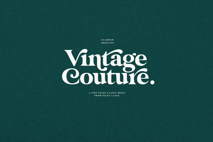
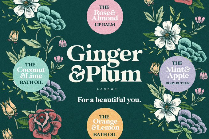
Glamour Absolute Modern/Vintage Font — https://t.co/bX84YQZmB8
#font #typeface #vintage #serif


Aprila Font Family — https://t.co/BUIkpeT4xF
#font #typeface #display #typography

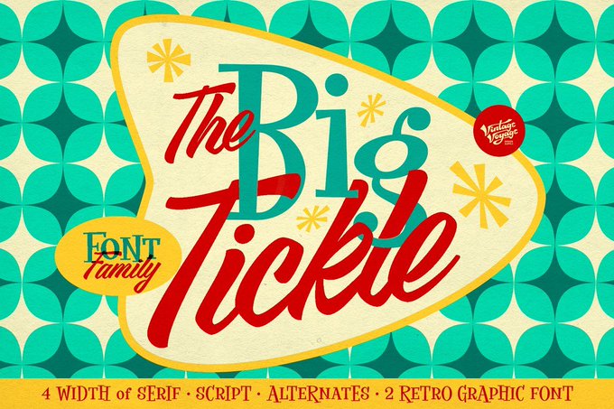

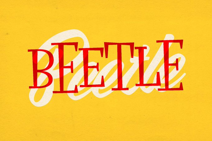

The Big Tickle • Font Family +Extras — https://t.co/fifJtpNn83
#font #typeface #display


Glamour Absolute Modern/Vintage Font — https://t.co/usnMpPlC2L
#font #typeface #vintage #serif


Logotype design — Family Portrait magazine. Redrawn from Alias Asphalt typeface, used throughout the magazine. Creative direction Sarah-Jayne Todd. Front cover pic Glen Luchford See more at https://t.co/ITBBGpHZCw

Kicking Horse. 4 Font Family — https://t.co/Q0rPBkXi7z
#font #typeface #slab #serif


the 7 typefaces and 7 colors symbolizing 7 eras and or 7 members across time this is DELITHES


Zinho Trial 01/ 2020.01.01
Making Time: 90min
Category: Logotype / Typeface
#ZinhoTrial
#logo


“Have you ever tried to domesticate a wild typeface? Christian Vargas has & the result is magnificent. I can’t deny my admiration for those who leave behind…anything that seems to be a safe path in the type industry.” @tullida on Salvaje #typefacesof2018 https://t.co/ANJZ8Kz4Px


@ChappellTracker Top stories from 2019 🏆 What’s the difference between a font and a typeface? Take our new + improved ultimate typography quiz > https://t.co/zUnW0TGiD7

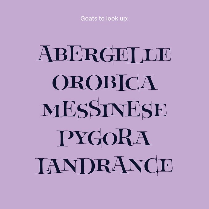


As seen in The Archive Occasional, @typethoughts’s interpretation of David Klein’s lettering is now on @futurefonts as a beta typeface. You can support its development by buying this early version. https://t.co/7Zcw4BvRVt